


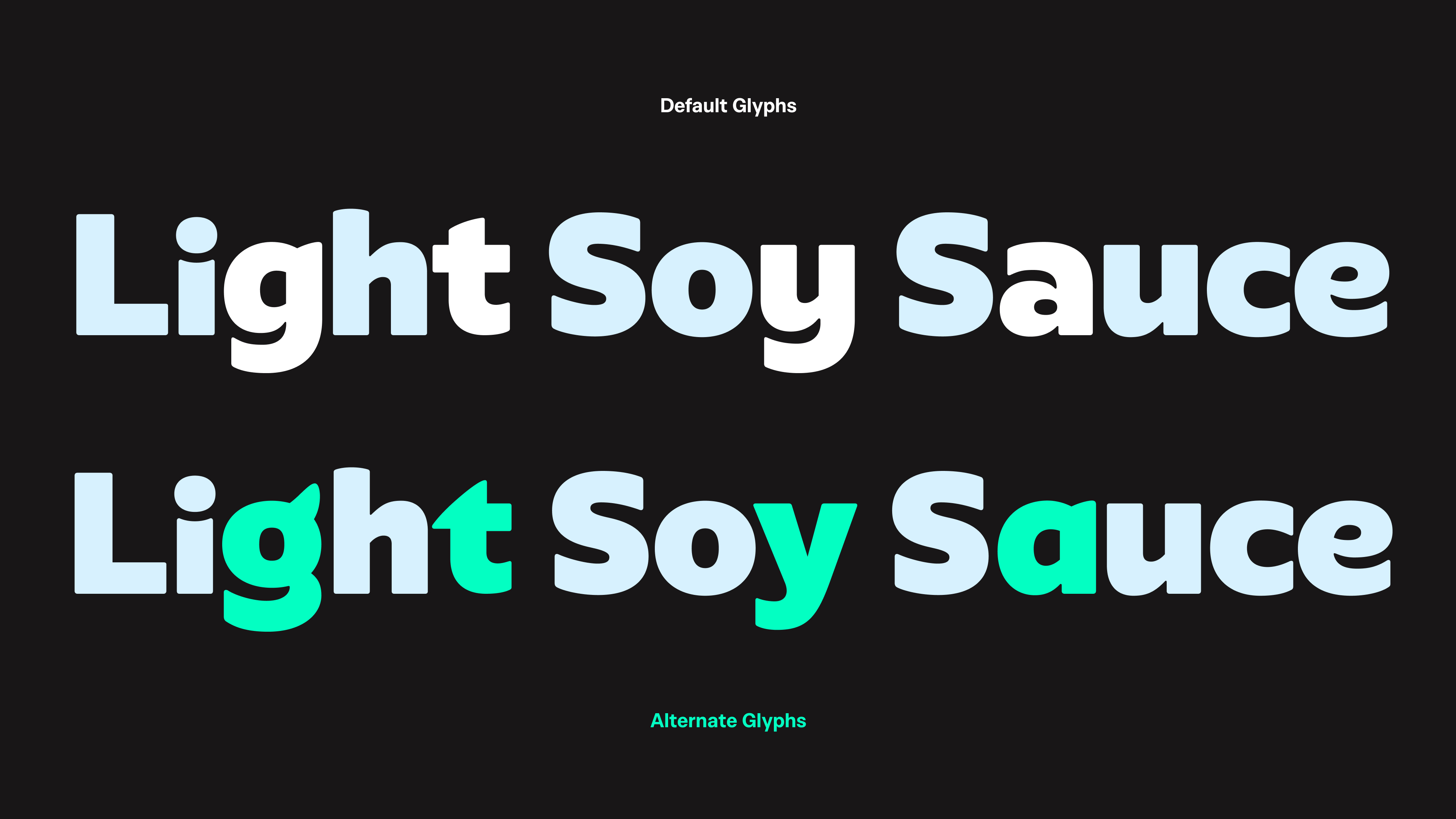
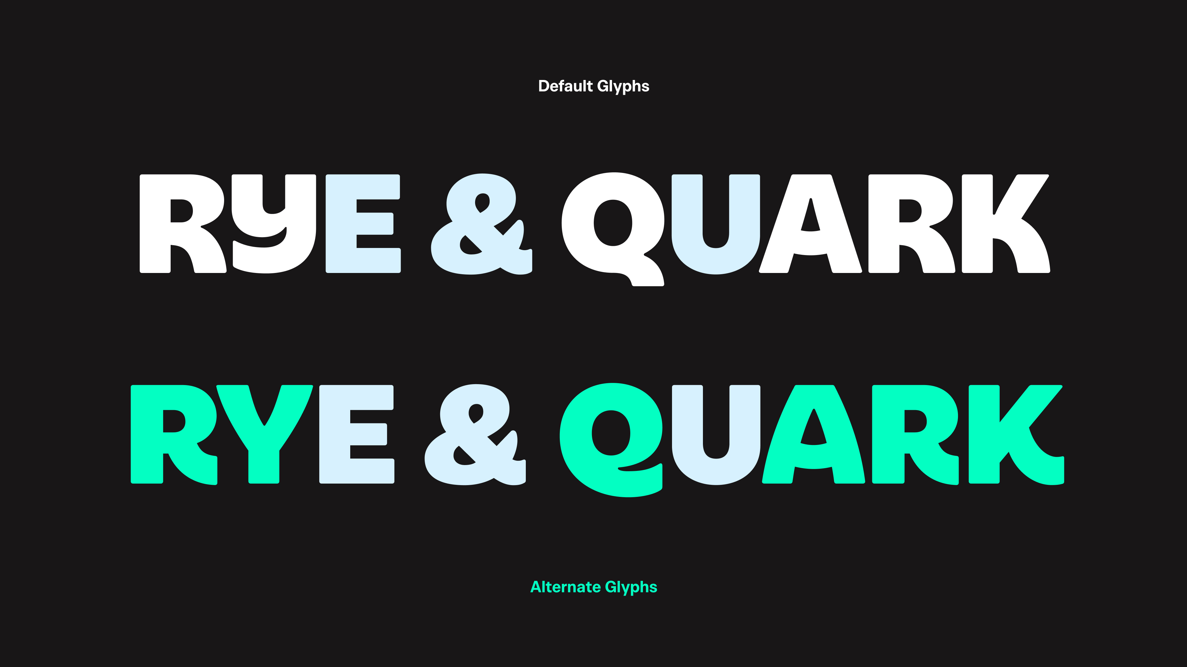
Even though wider overall proportions and generally low contrast might trick you into thinking it's a geometric sans typeface, design of Yazio Sans is based on a humanist construction and stroke logic. The "Good Dopamine" mantra is achieved with heavy weight, rounded inner and outer corners and paying attention to negative spaces. Inside some of the letters one can find hidden claw and horn shapes, while curve tension resembles the Yettie character.
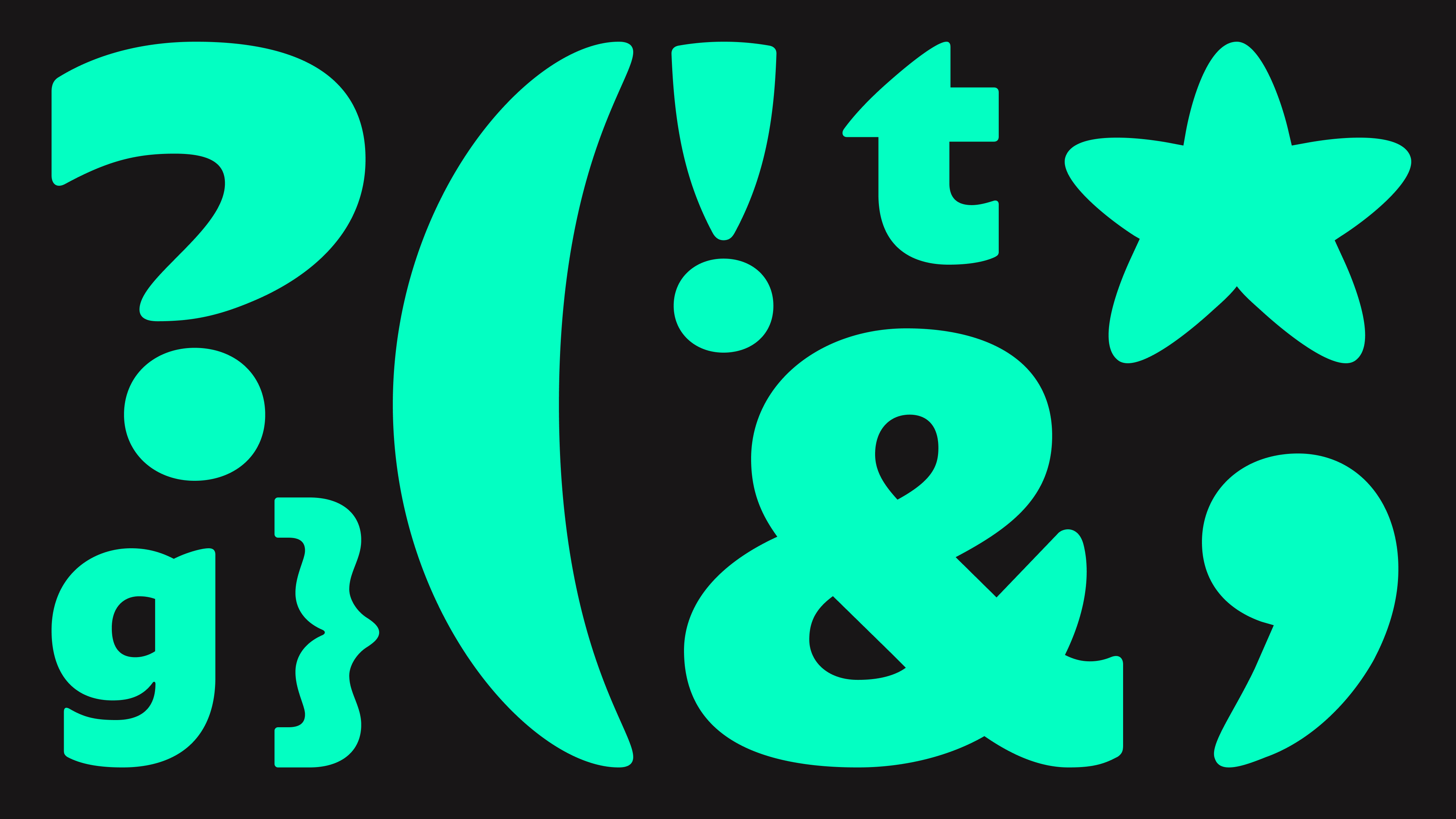
Punctuation in particular departs from the usual approach of smoothly fitting with the design of the letters. Quotes, comma, question and exclamation marks, ampersand, asterisk etc. are all quite brave in showcasing the brand character. With pointy but rounded terminations they further expand upon the Yettie anatomy present throughout the character set.
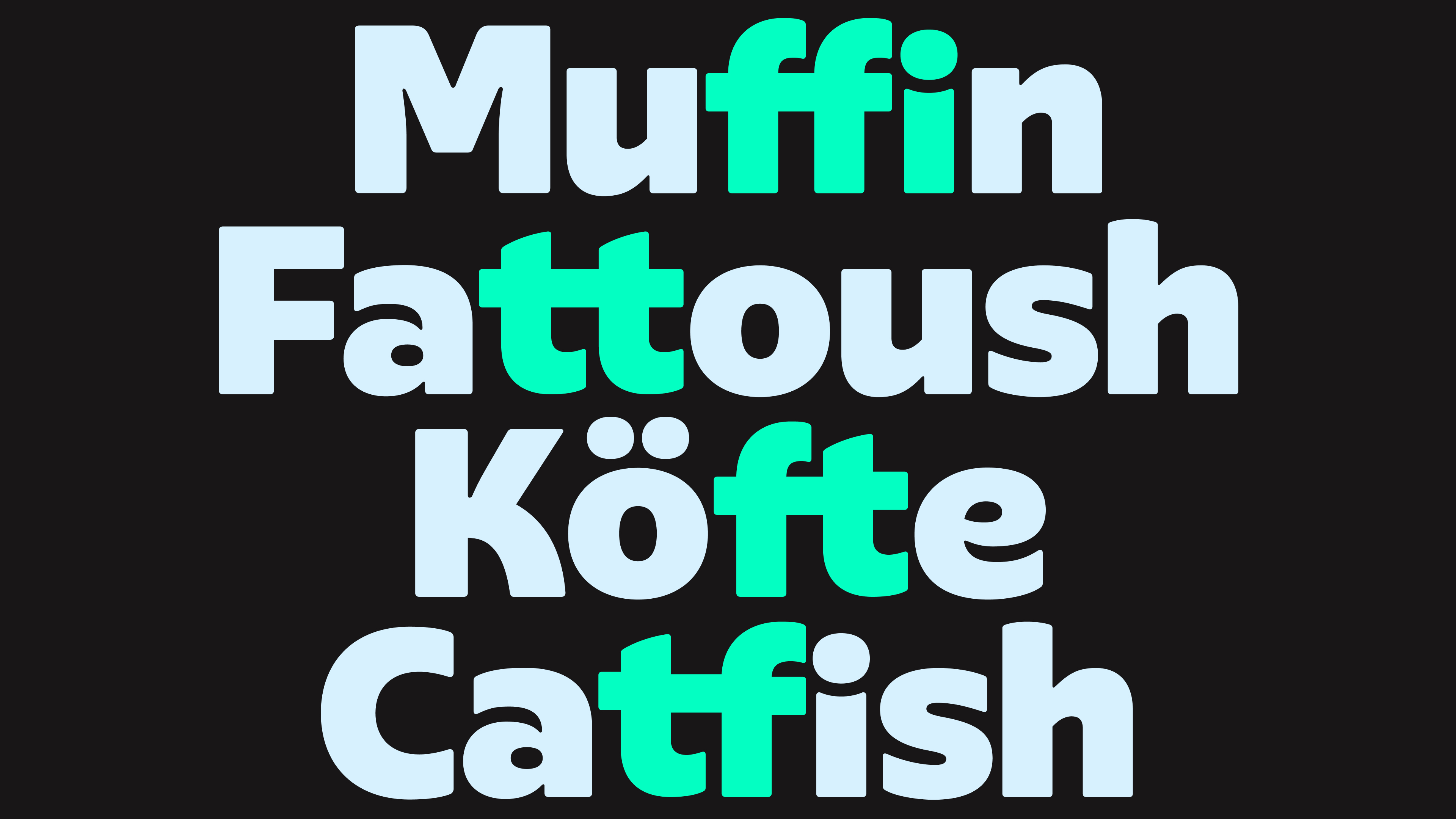
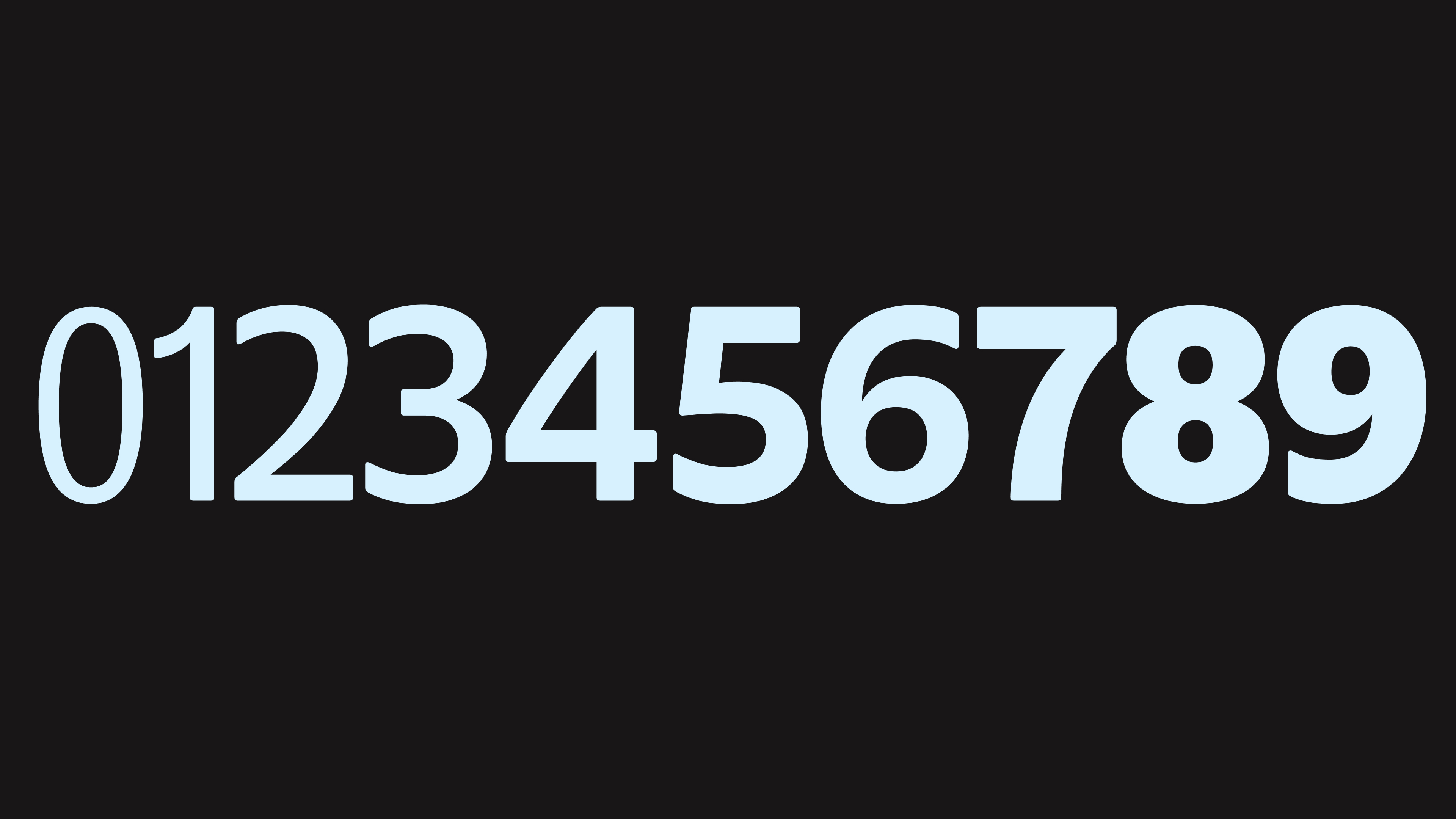
Yazio sans is loaded with discrete ligatures to ensure harmonic and tight rhythm inside words. Another feature we embedded into the font software is variable numbers — for in-app animation purposes we designed a 4-master digits set. This way the client can design seamless motion pieces for hitting the target weight, milestone achievements and many more.
Credits & details
Hot Type
Type design: Marko Hrastovec, Mihael Šandro
Cyrillic design: Anna Khorash
Type motion: Matko Mijić