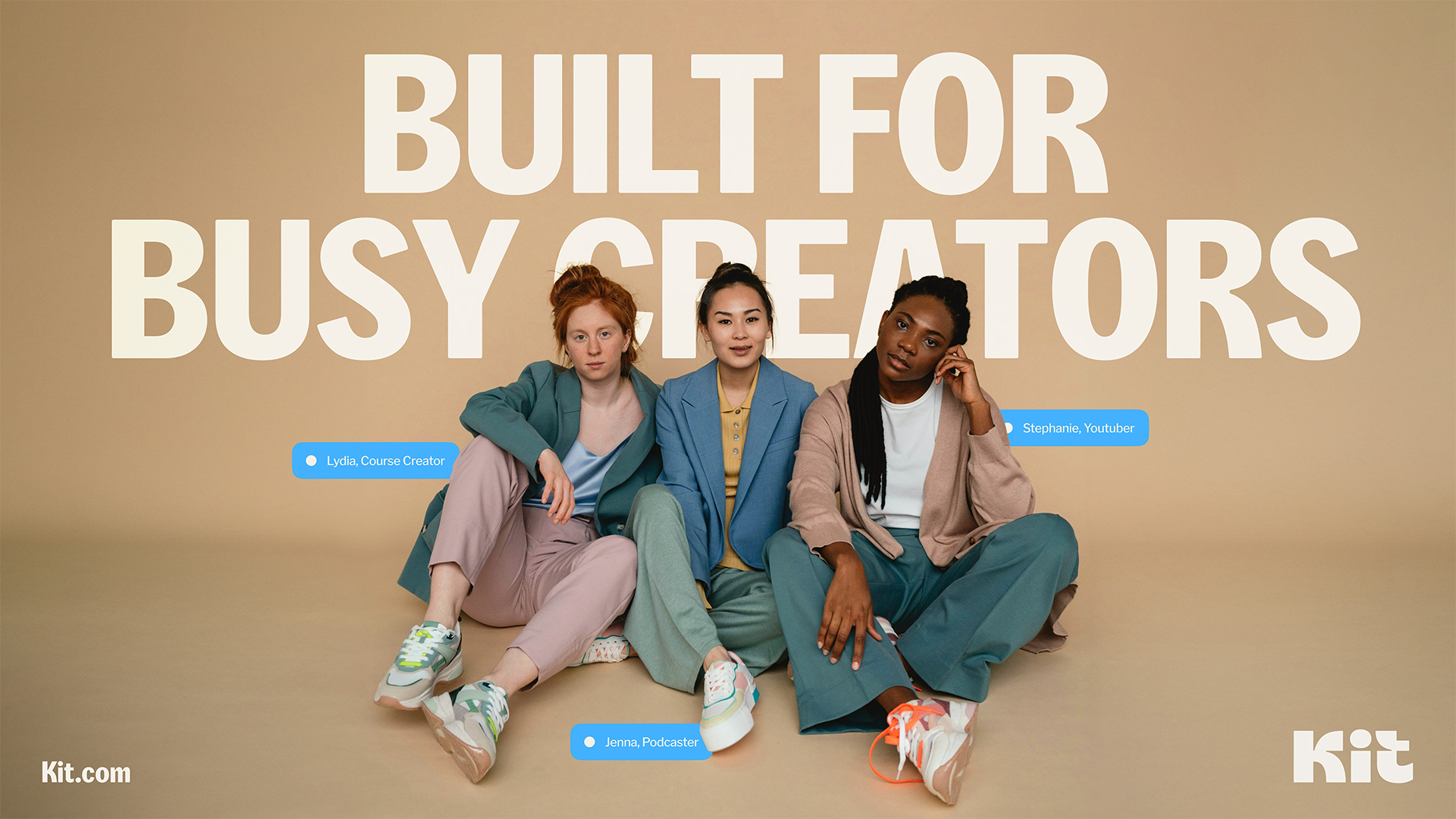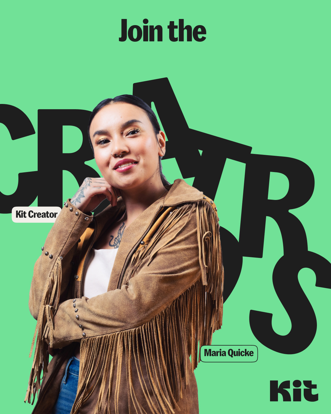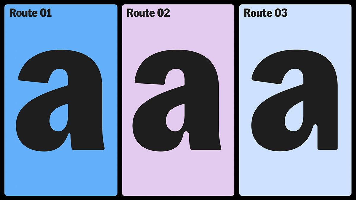
Together with Koto design team, we worked on developing three concepts for Kit headline typeface. Creative direction was already in place, and it was clear that the typeface has to be based off the Franklin Gothic model, particularly more condensed and bold cuts. Extra tight spacing and rounded corners complete the list of requirements defined in the brief.
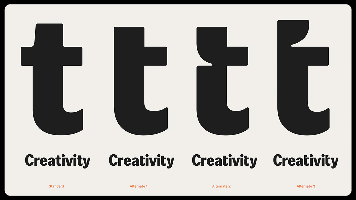
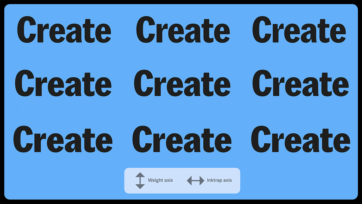
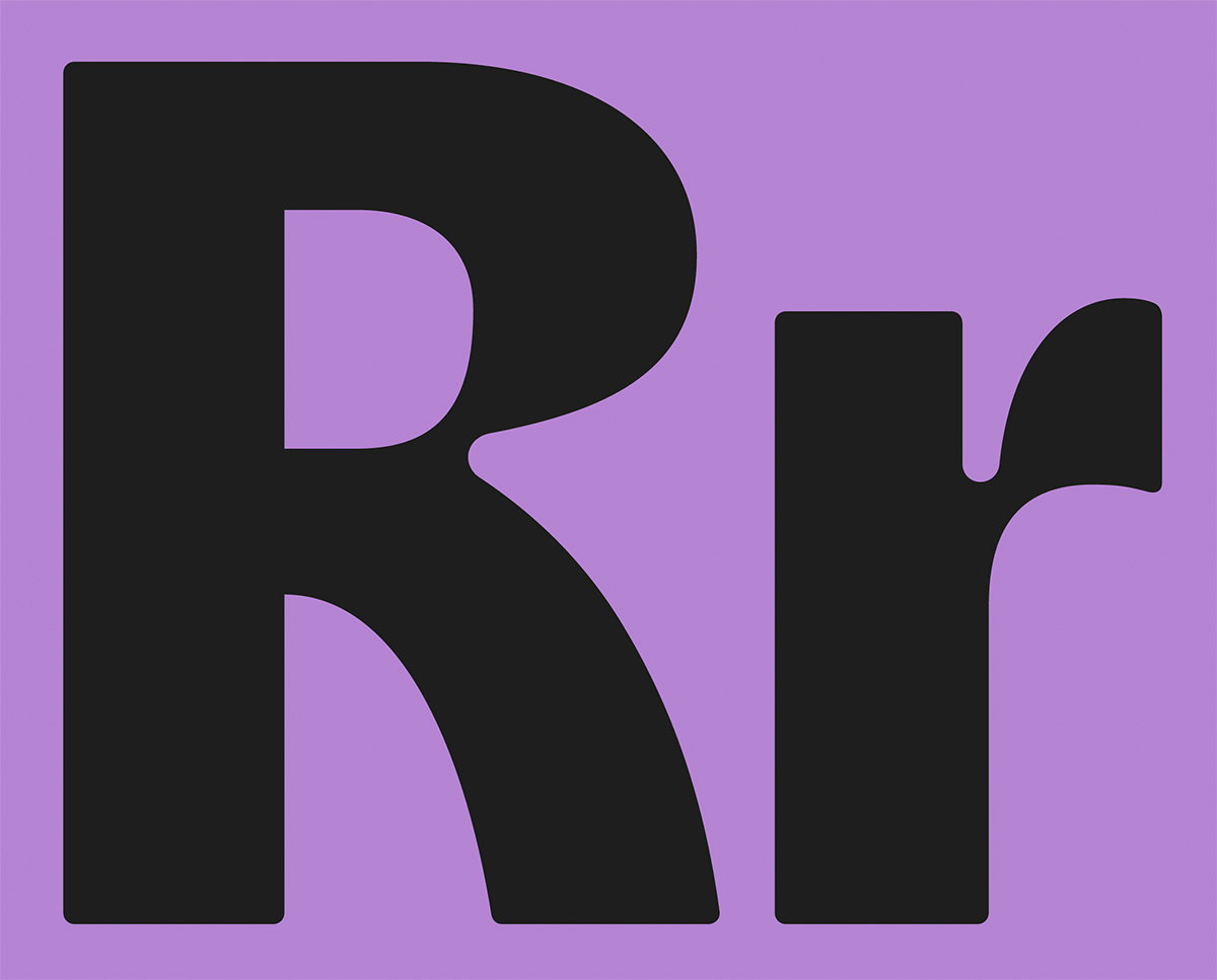
During the process, we continuously explored different versions of some letters. For instance, lowercase l grew the tail to differentiate better against uppercase I, while lowercase t incorporates an alternative shape that directly resembles the Kit logotype. Variable font technology helped us to determine the right weight and also to find the corner radius that works best.
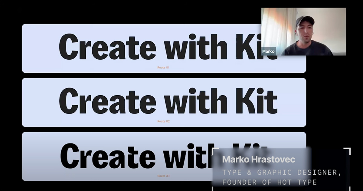
Kit team had this idea of "Rebranding in public" which means they published a video series about their re-branding journey. If you want to learn more, you can watch the video documentation of the entire process here.
Credits & details
Hot Type
Type design: Marko Hrastovec, Mihael Šandro
Type motion: Matko Mijić
Koto
Creative Director: Sam Howard
Design Director: Luke Dodridge
Senior Designer: Sienna Mark-Brown
Mid-weight Designer: Joel Huntley
Designer: Lydia Murray
Illustrator: Niall Unger
Senior Strategy Director: Tom Moloney
Strategy Director: Cassidy Moriarty
Strategist: Jake Khan
Motion Director: Santiago Avila
Motion Designer: Maria Munguambe
Client Director: Rose Kerr
