Vizkultura Magazine

Concept

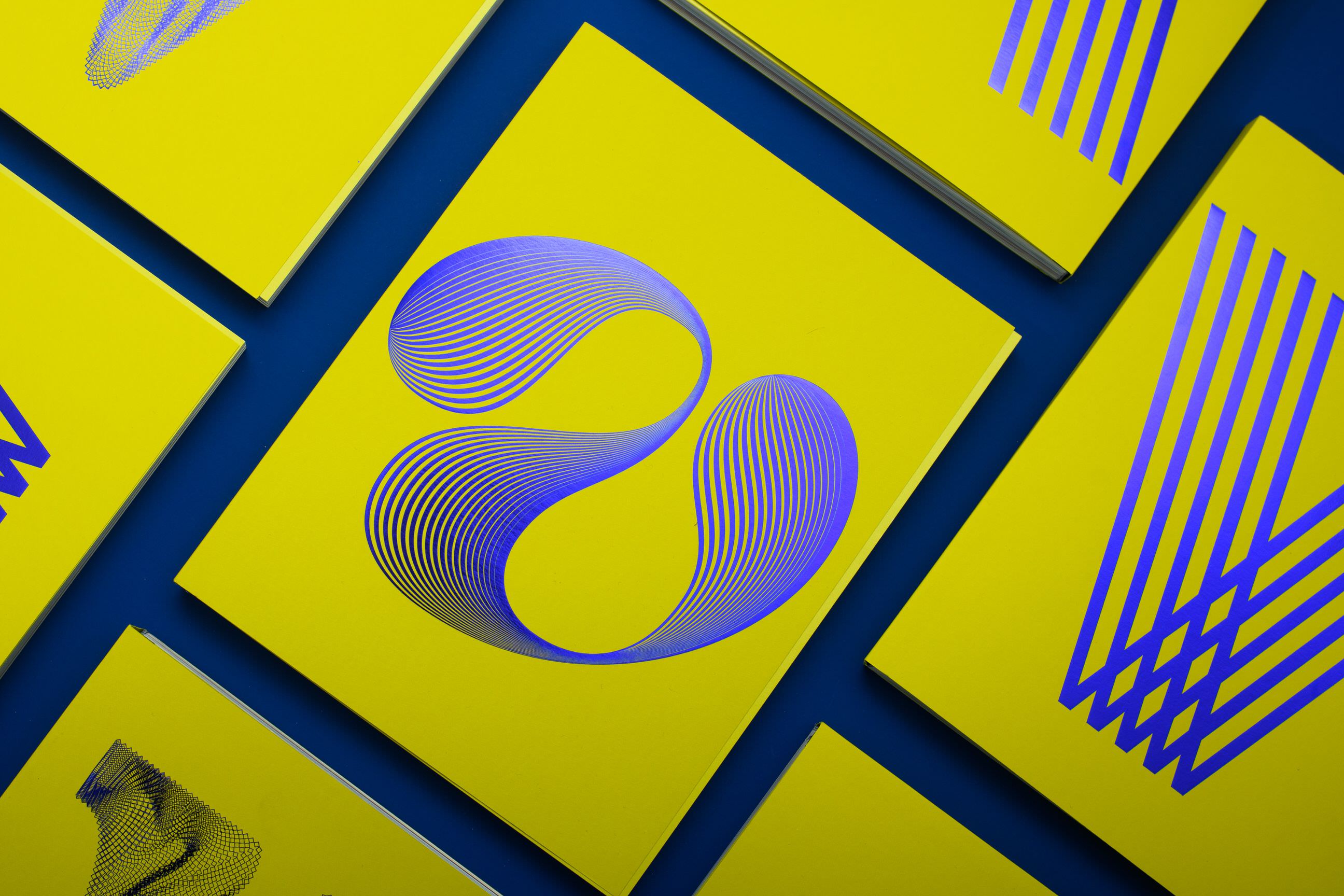
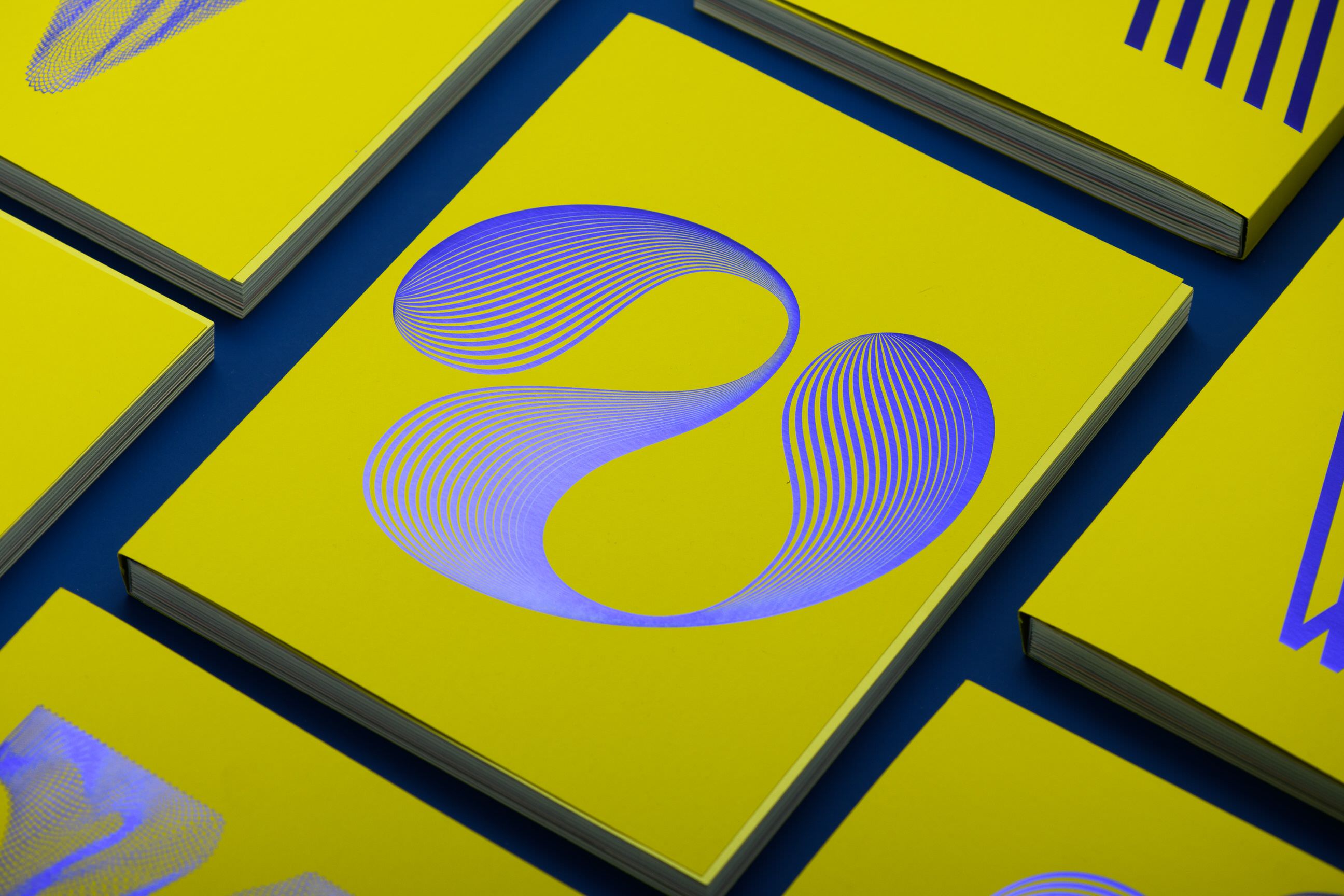
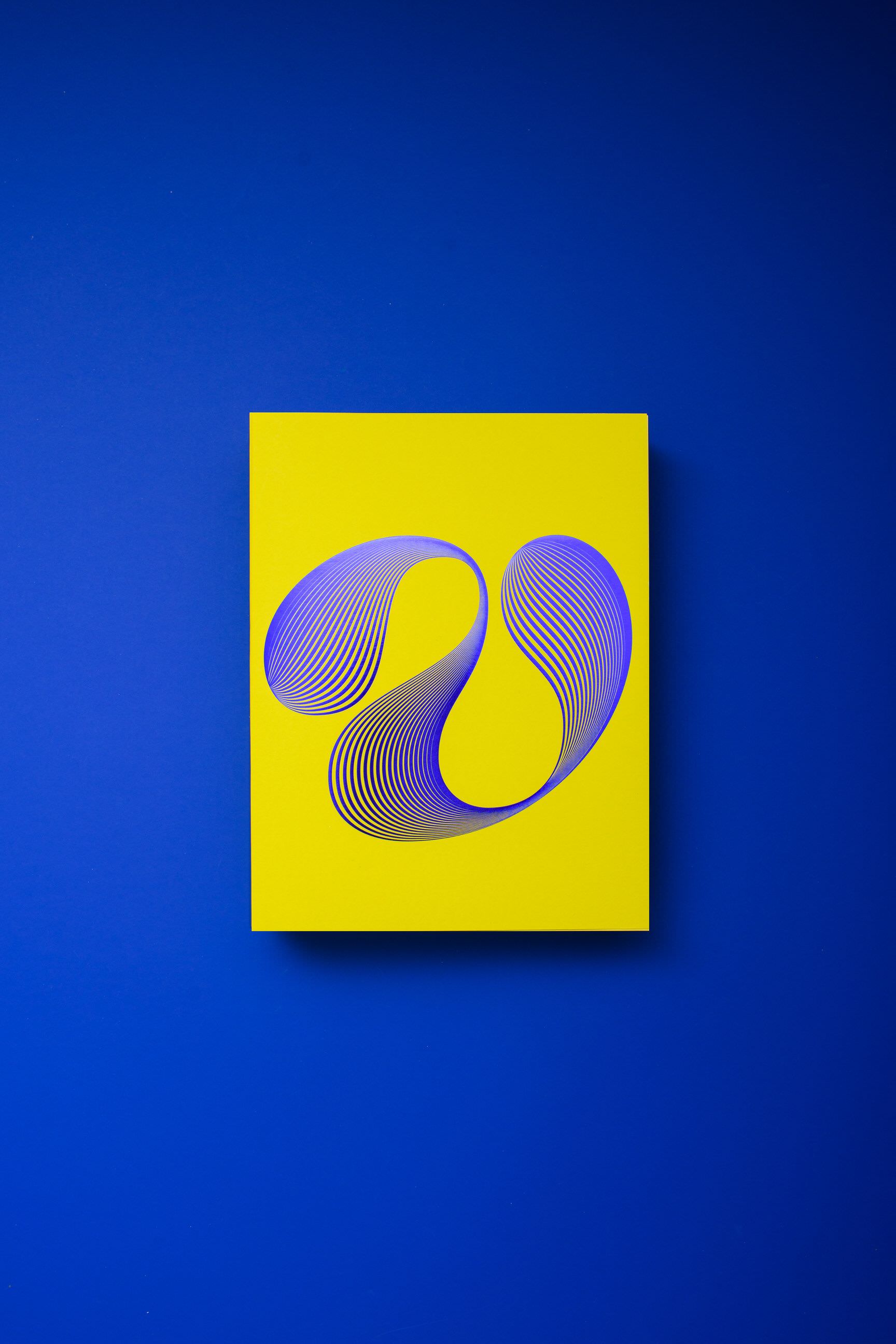
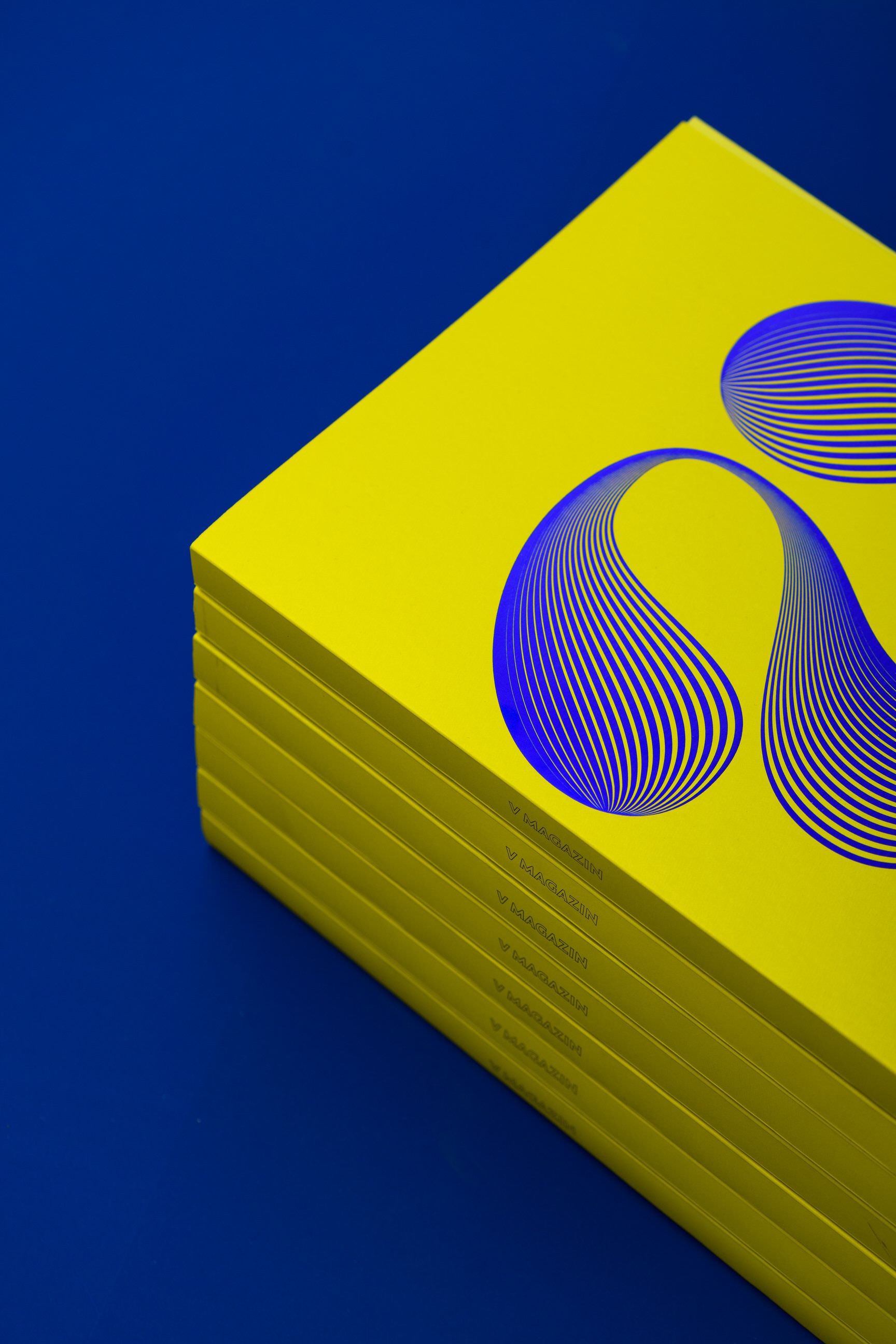
Vizkultura celebrated 5 years of digital publishing by creating their first ever printed issue. We were invited to come up with a cover page lettering piece and the only brief was it has to be a letter V - which stands for both Vizkultura and Roman number 5. Unusually curvy and assimetrical letter V gets the op-art inspired line treatment that gives it sense of dimensionality and internal visual tension.

More info +

Previous Next
Close

Vizkultura Magazine

Design Concept

Vizkultura celebrated 5 years of digital publishing by creating their first ever printed issue. We were invited to come up with a cover page lettering piece and the only brief was it has to be a letter V - which stands for both Vizkultura and Roman number 5. Unusually curvy and assimetrical letter V gets the op-art inspired line treatment that gives it sense of dimensionality and internal visual tension.

Design notes

V shape departs from the expected diagonal symmetric construction we usually associate it with. Instead, it’s calligraphic roots bring in curves and dramatic play of positive versus negative space. Experimenting with effects and different line density options immersed us into world of op-art. Final design utilizes classic typographic inline raster, and takes it to the next level by creating illusion of third dimension within the shape. Already vibrant design is enhanced with foil printing technique in shiny blue color. While holding physical copy of the magazine, one can play with the angle under which light hits the foil.

Credits & details

Editor & Art direction: Ivan Dorotić
Magazine design: NJI3
Photography: Marija Gašparović