Design notes
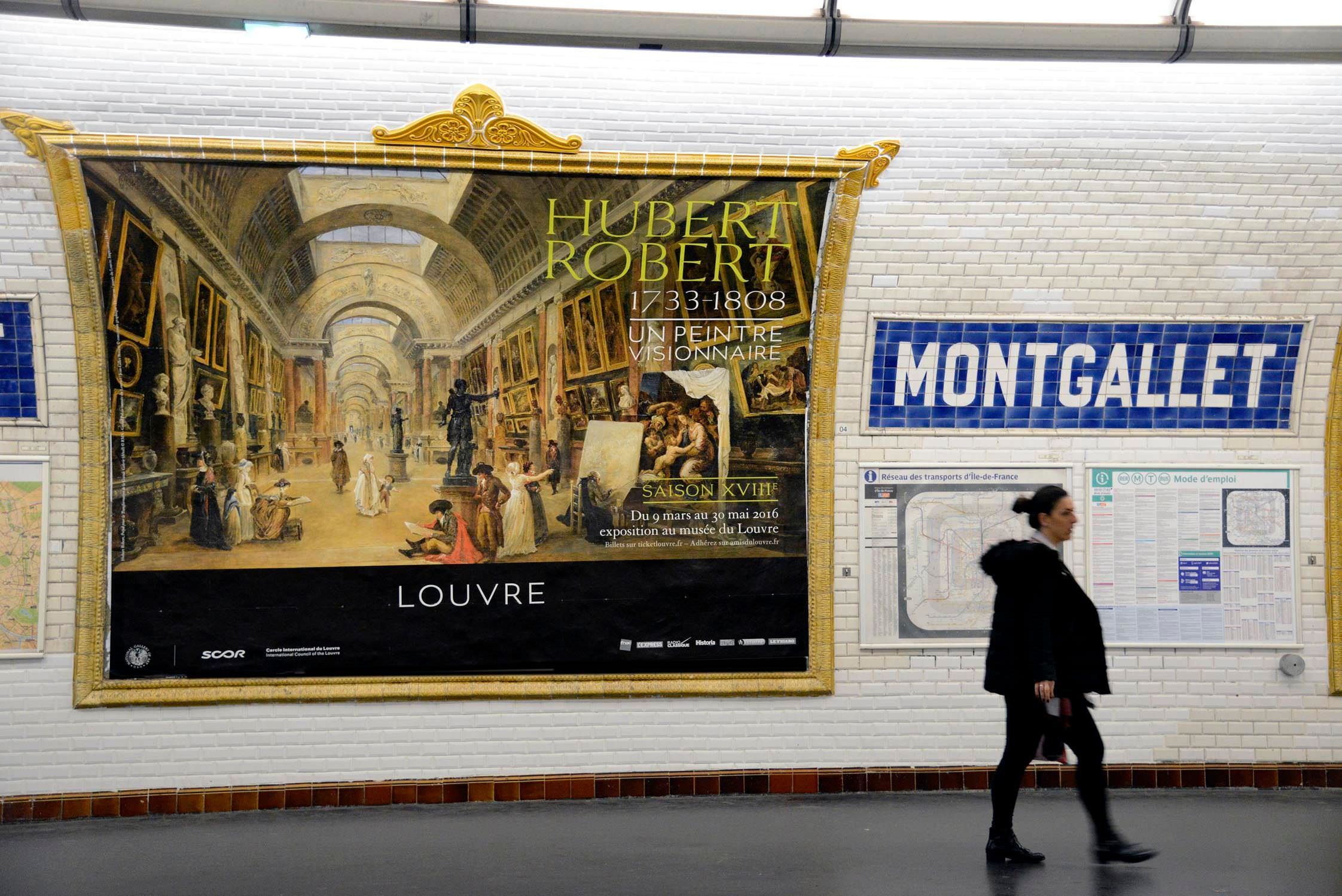
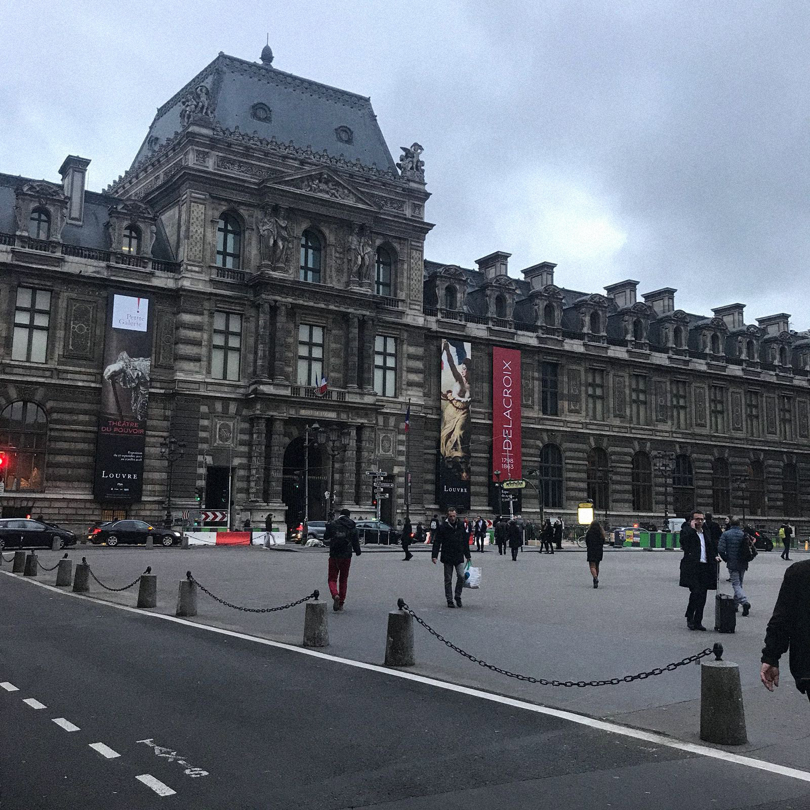
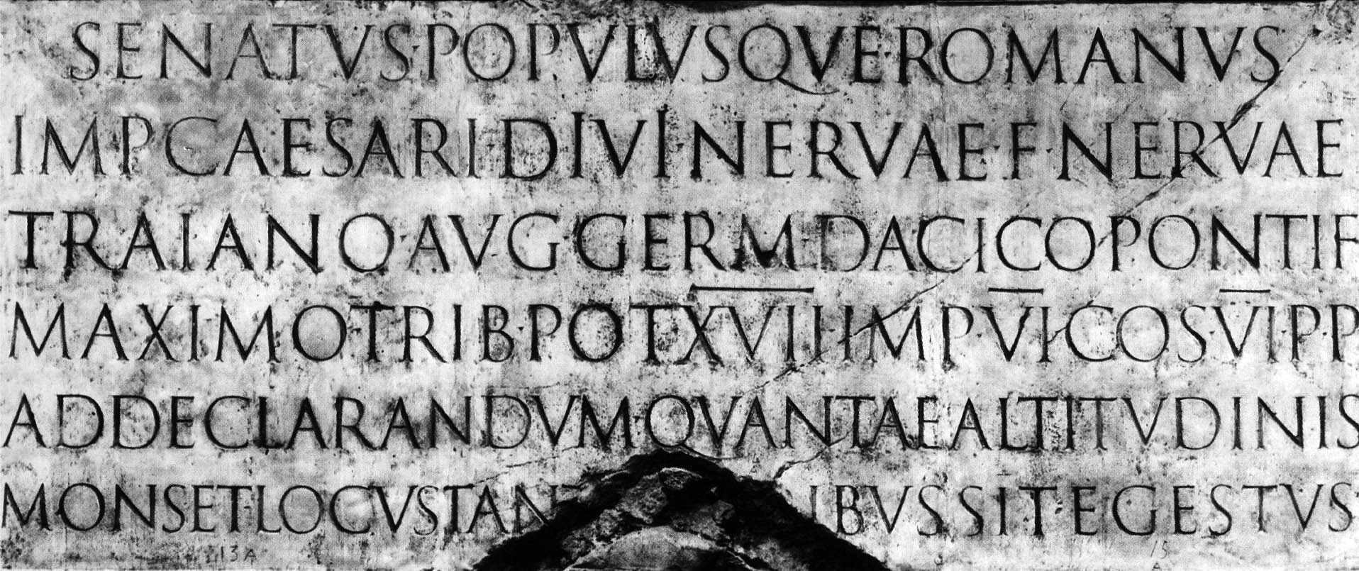
Louvre Museum is home to some of the world’s capital works of art. Diverse collection ranging from the Antiquity up to the mid-nineteenth century offers a lot to look into, but from typographic stand point there is nothing more remarkable from that period than the classic Roman capitals, known as ‘The Eternal Letter’. Roman capitals are foundation for all type we use today and it seemed like a logical point of departure for this project.

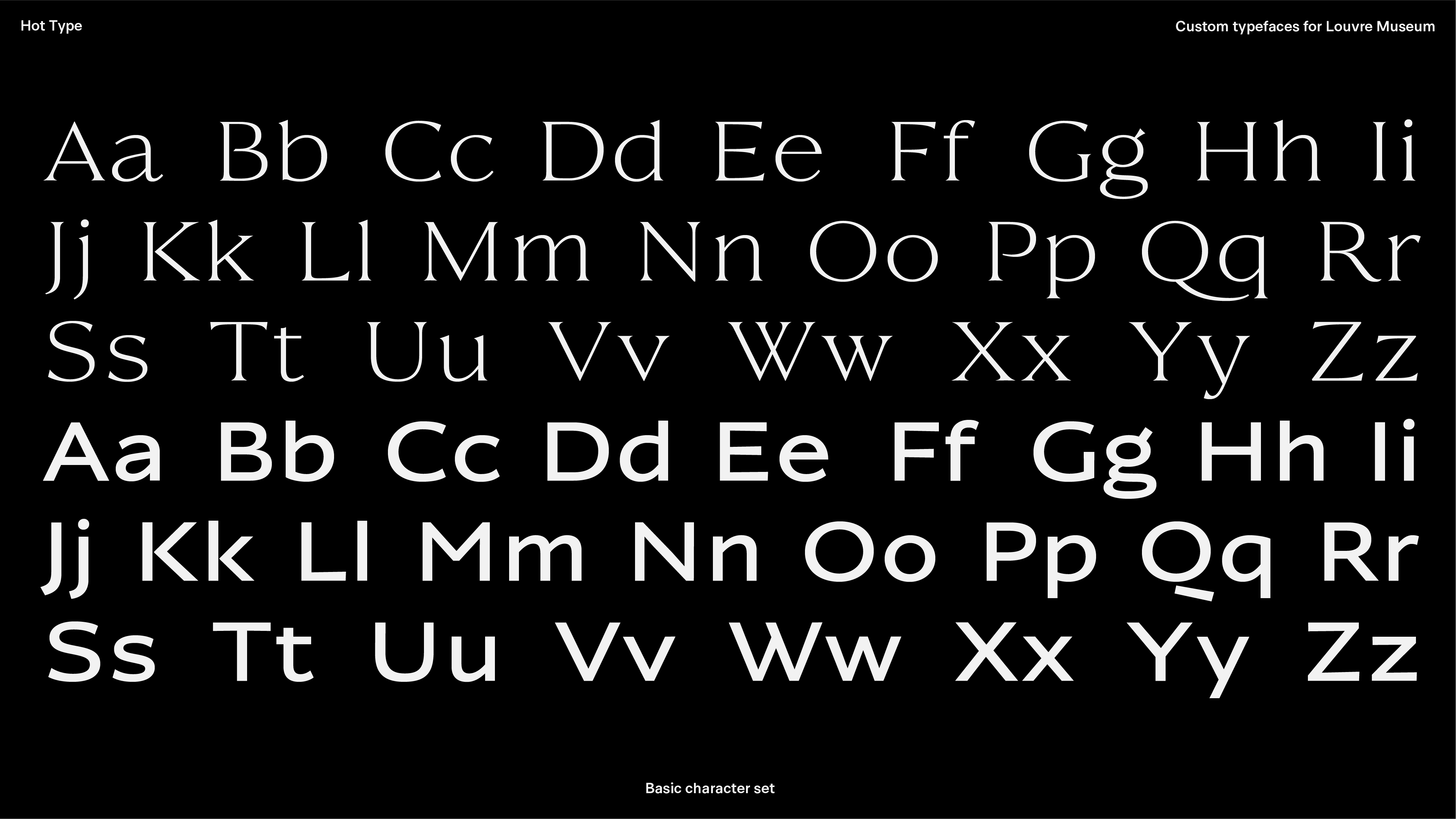
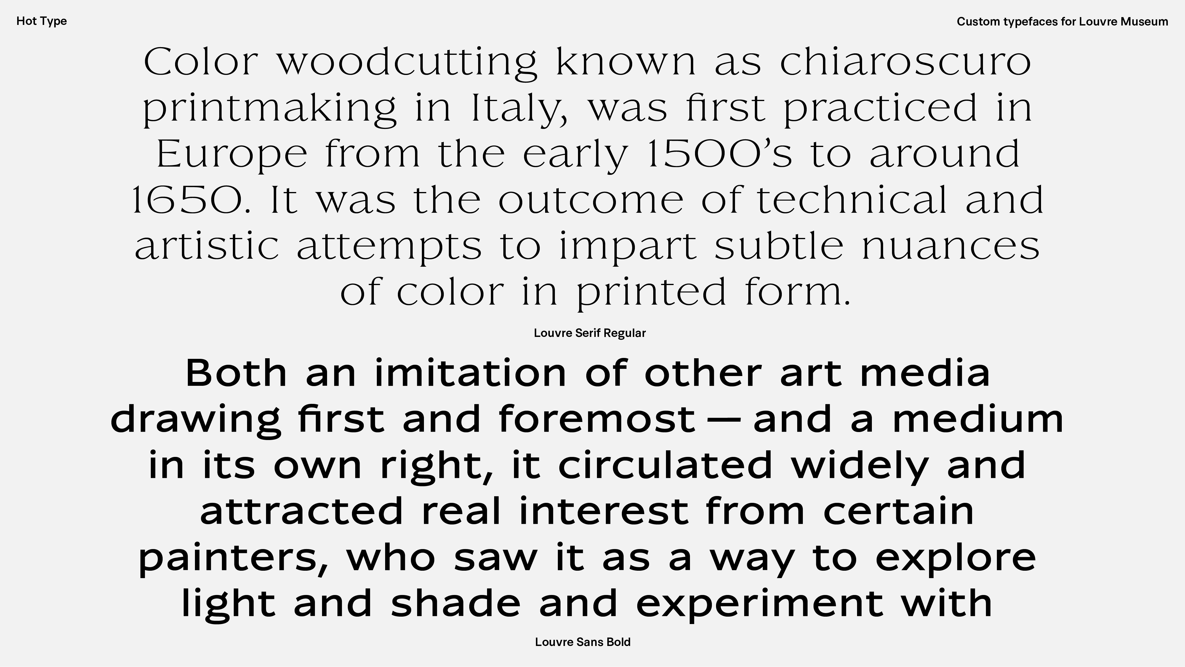
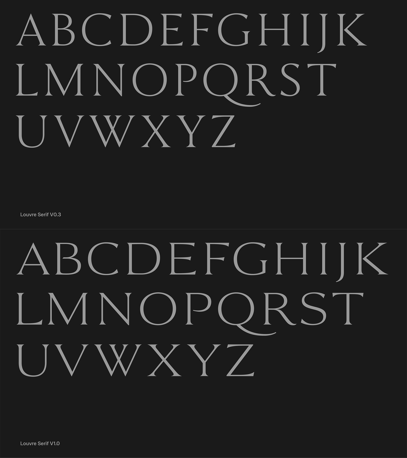
Shapes are best described by influence of flat brush calligraphy and letters cut in stone based on the written model. Early interpretation of the historical examples naturally had rational, humanist proportions - letters such as B, E, F, L, P, S were all relatively narrow compared to their final versions. Very soon we discovered letterforms would benefit from more generous width, making titles and big signs appear more confident and contemporary.
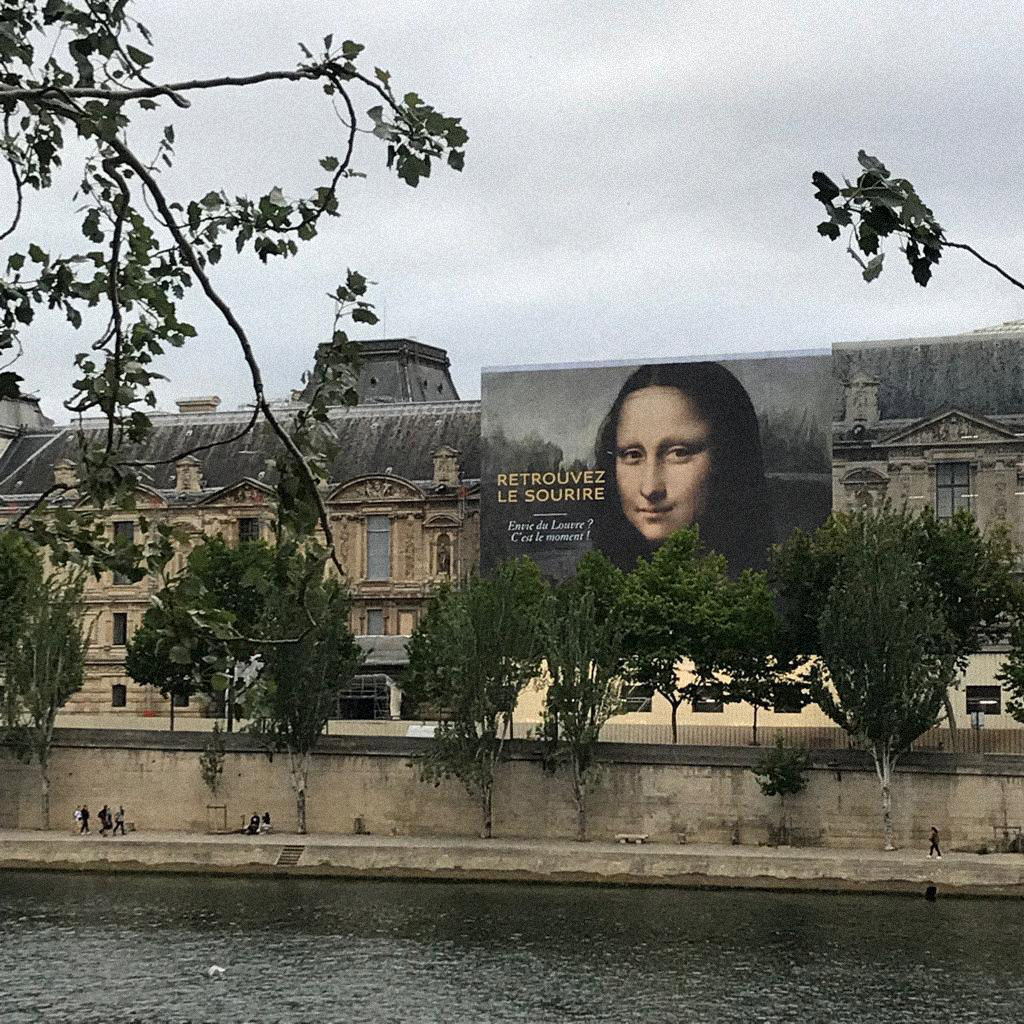
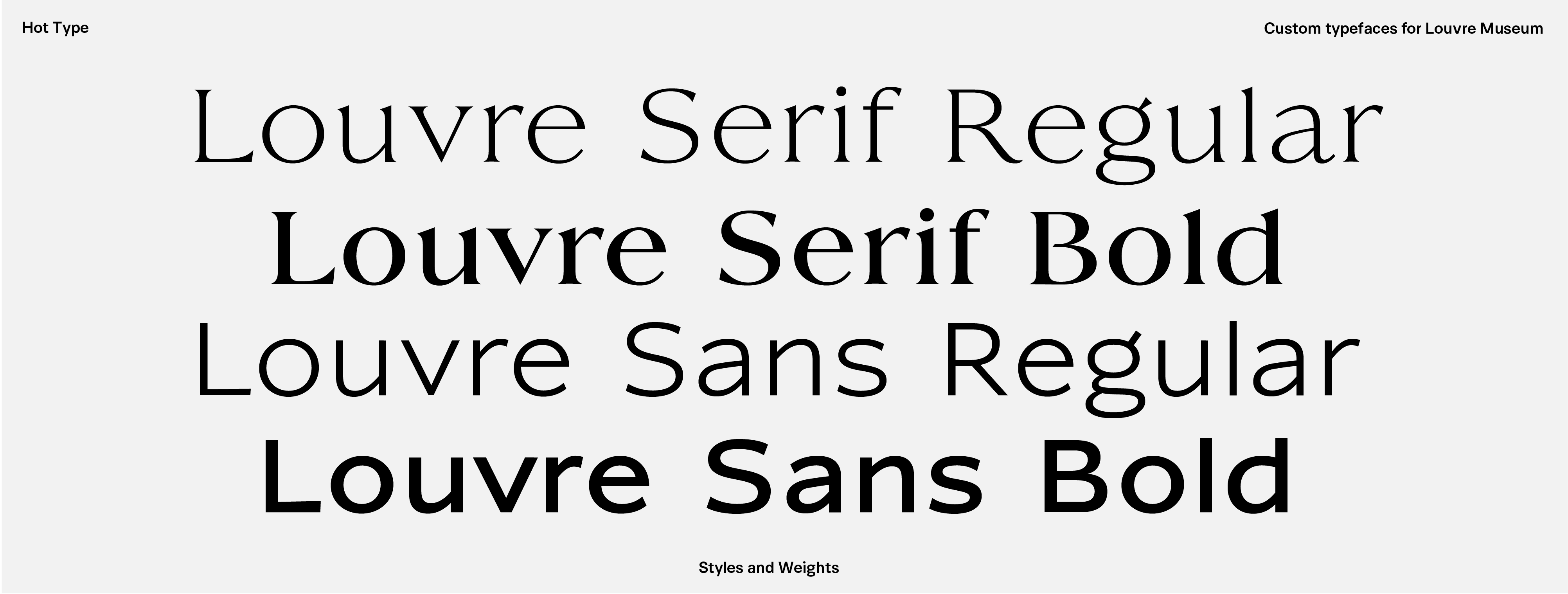
Louvre Sans is a clean, low contrast, humanist typeface that follows the same horizontal and vertical proportions of the Serif. It’s subtle irregularities connect the two designs, and bring in warmth to otherwise almost geometric shapes. Following the uppercase pattern, lowercase are characterized by quite wide proportion and pronounced upstrokes that connect two stems.

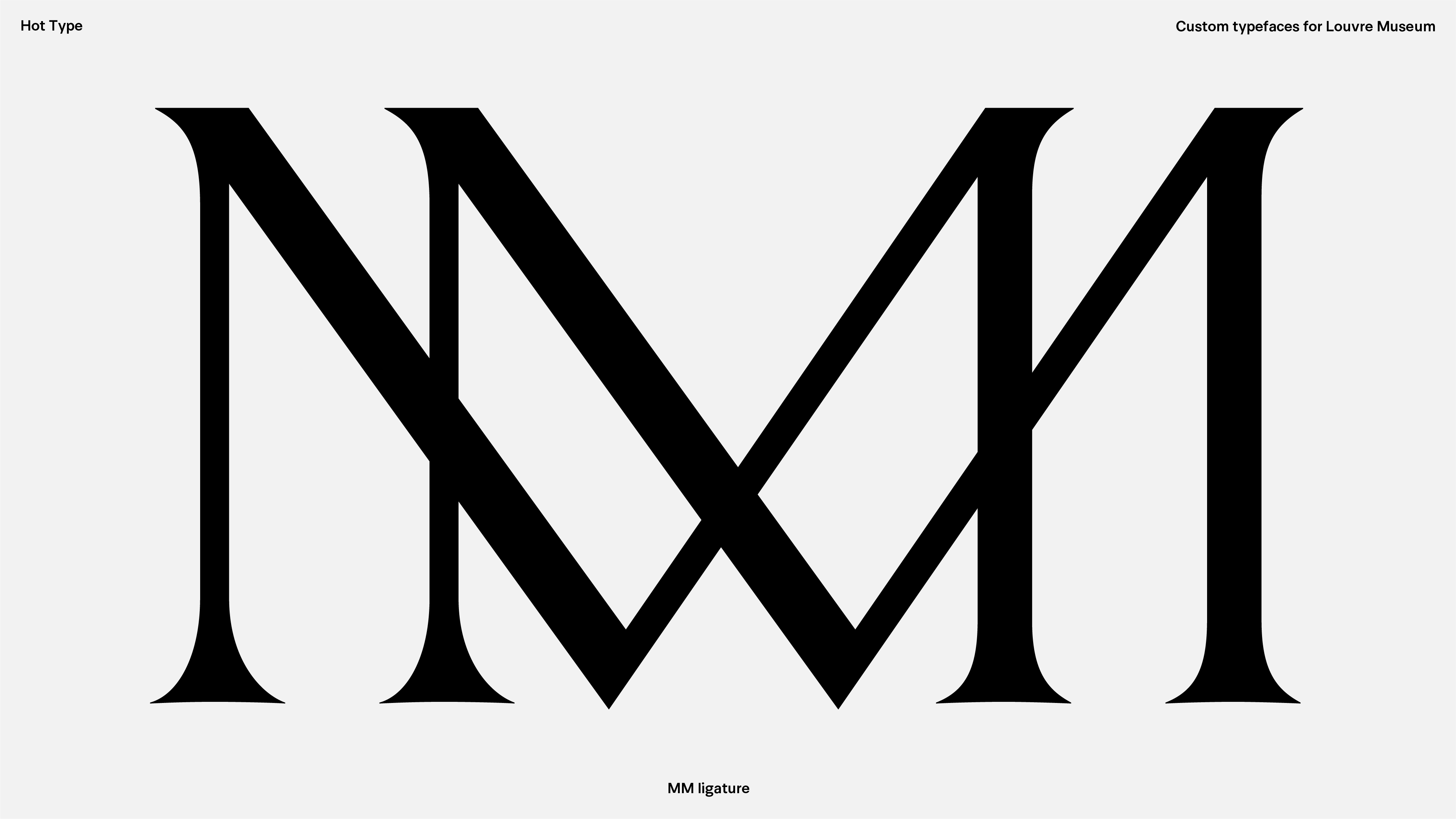
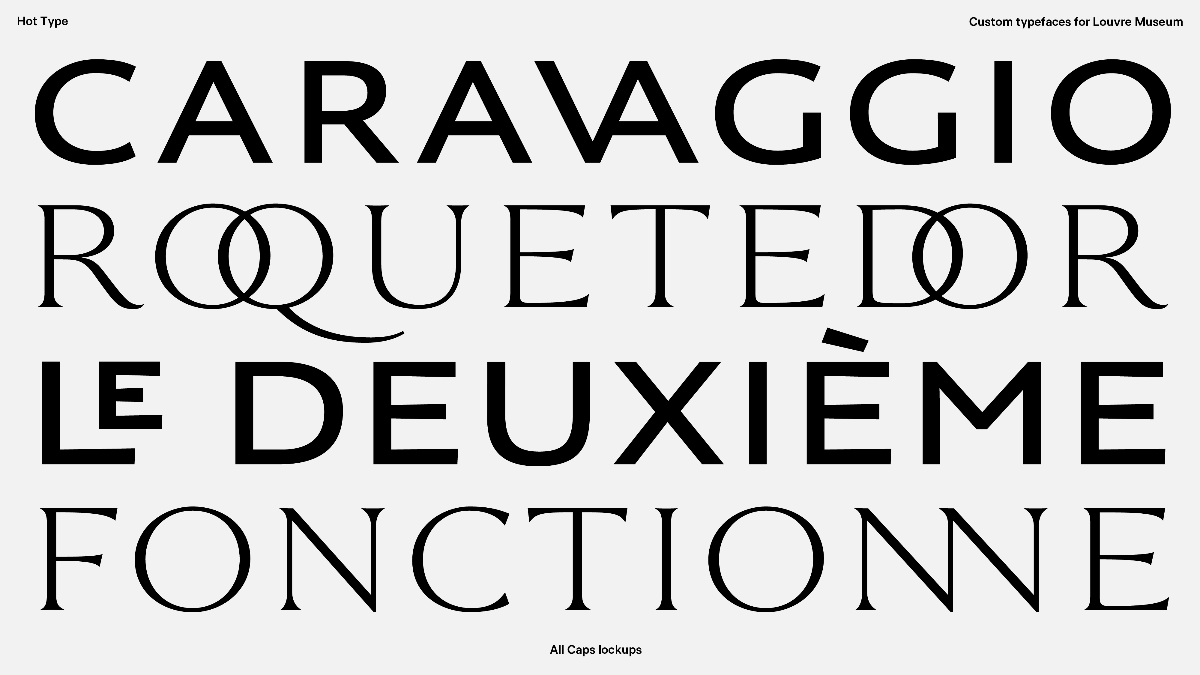
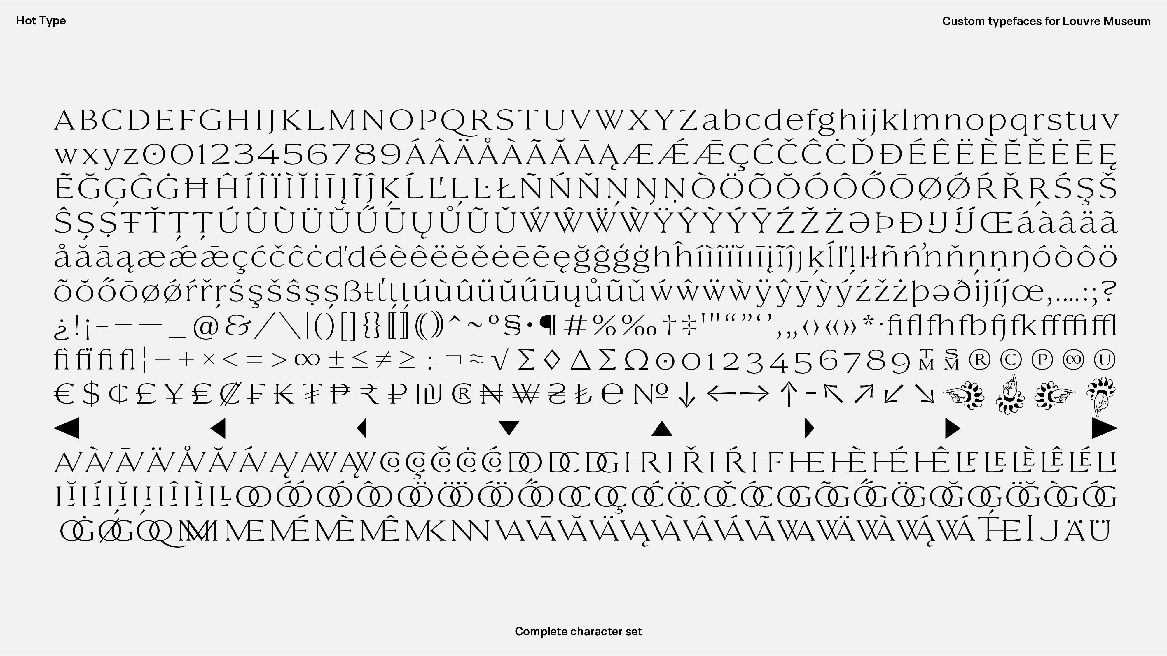
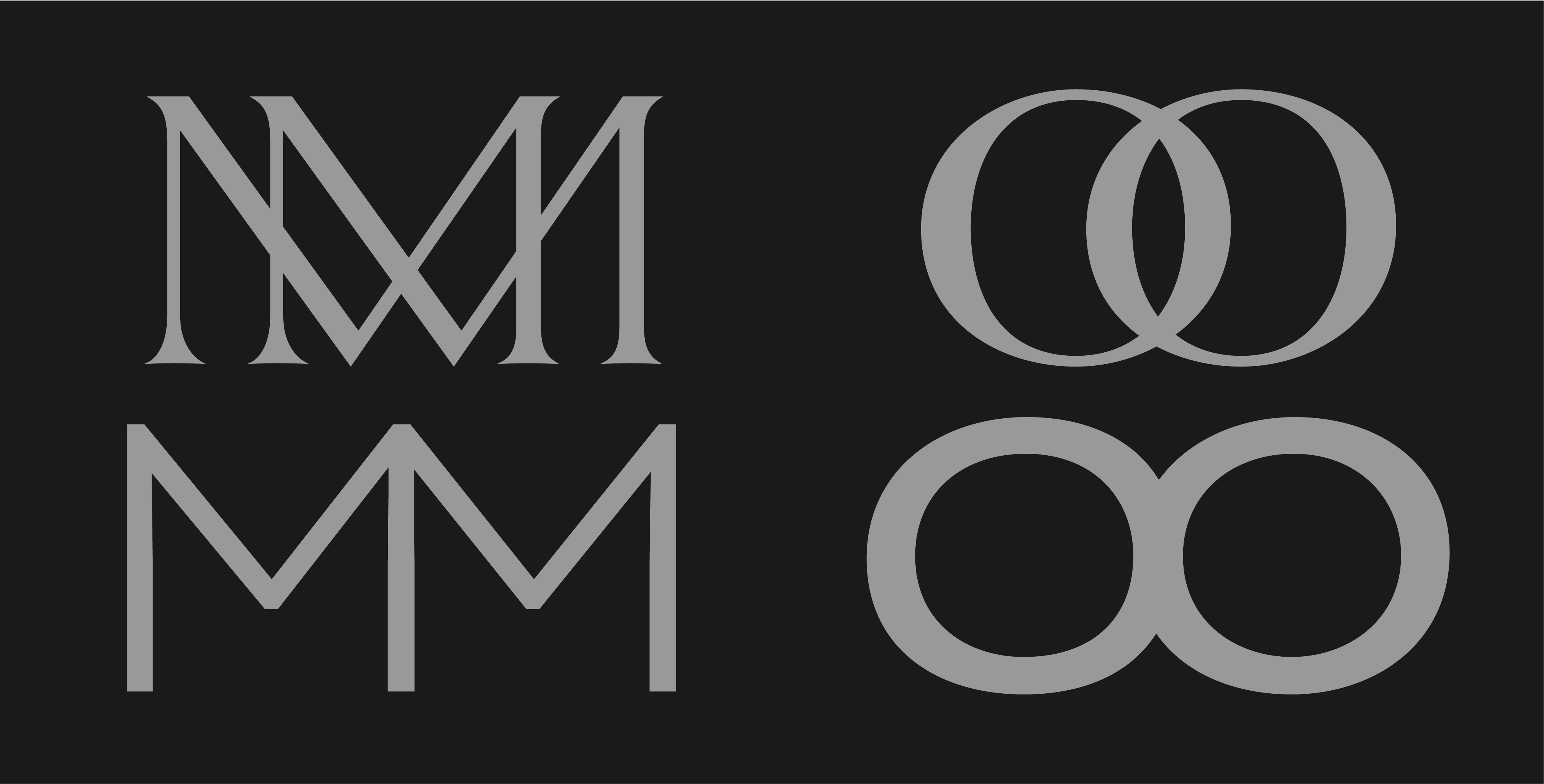
Inclusion of ligatures into the typefaces follows the general storyline of Roman capitals interpretation. Ancient stone cutters very likely used this nifty technique of merging multiple characters to save the line space and create a pleasing copy fit. Taking into account complexity of specific combinations, similar logic that was applied to differentiate between Sans and Serif designs, was used for designing ligatures. Louvre Sans, a more clean and open typeface, called for ligatures of the same nature - less complex, clean connection points and spatious stacking. On the other hand, Louvre Serif allows for overlapping letter combinations due to it’s high contrast.
Credits & details
Type design: Marko Hrastovec
Creative direction: Dream On, Paris
Art Direction: Sandro Dujmenović (Beton)
Photography: Elliott Amblard
