


Design information
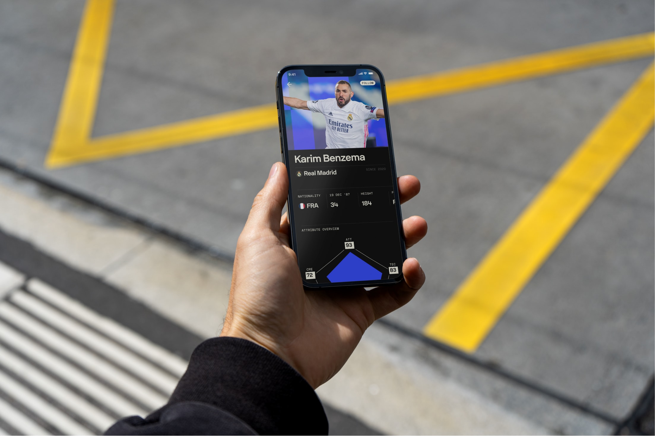
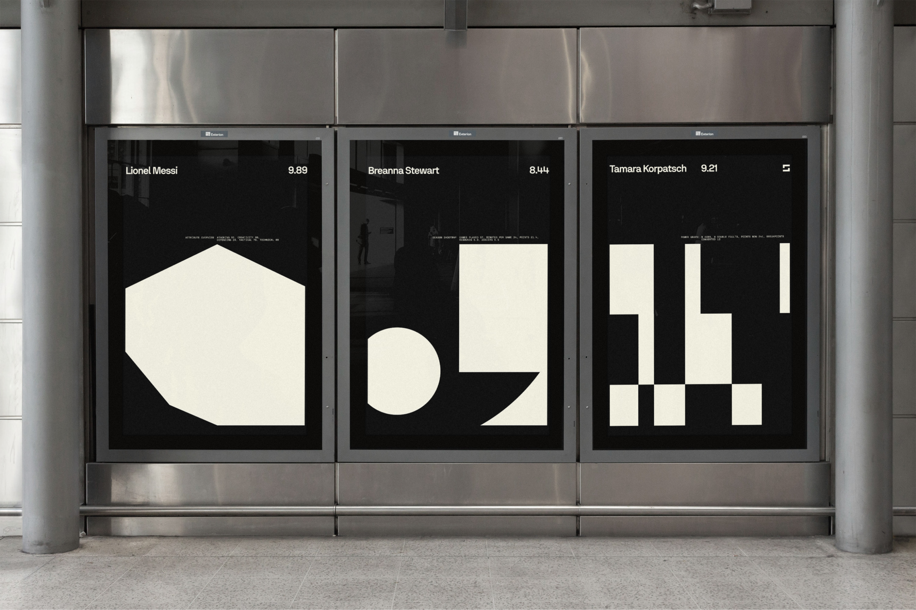
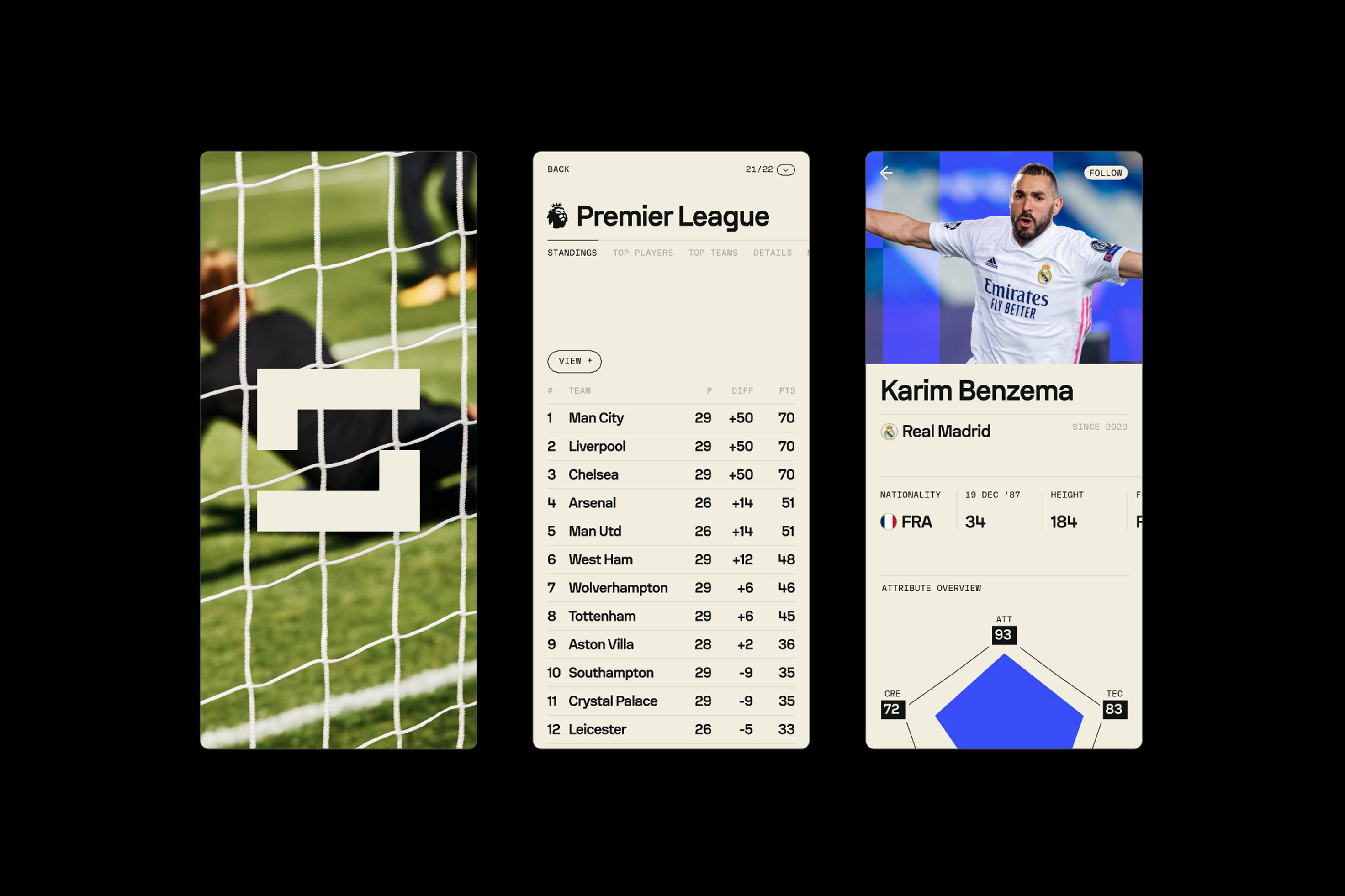
In 2022 we were invited by London's Design Studio and Sofascore teams to partner up on designing and developing a new typeface family custom tailored for rebranding of Sofascore and their unique product range such as Sofascore Player Ratings, Heatmaps, Shotmaps, Attack Momentum and Attribute Overview that set them apart from the rest – and are the key factor resulting in over 23 million monthly active users.

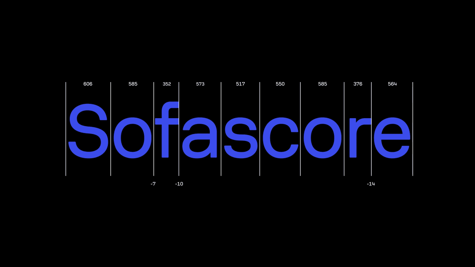
From the get-go, we worked with both technical and visual constraints, making sure to match vertical proportions of previously used Roboto, so that in-house teams could smoothly avoid baseline shifts when replacing fonts in the system. On the other hand, creative direction was provided by Design Studio team, having a clear idea of robust overall character, almost machine-like shape construction and paying special attention to design of numerals, as underlying brand foundation is basically numbers-heavy approach to sports.

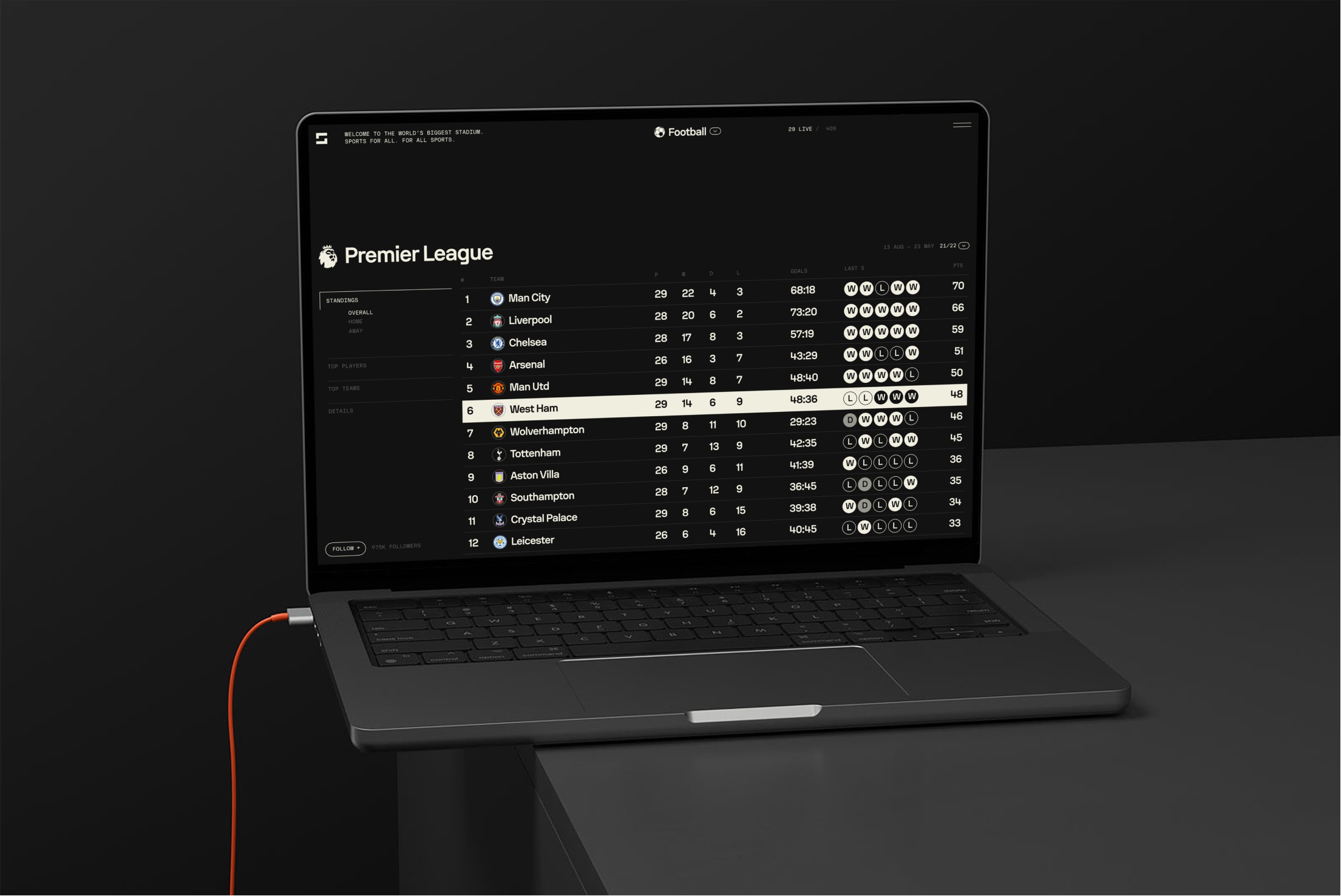
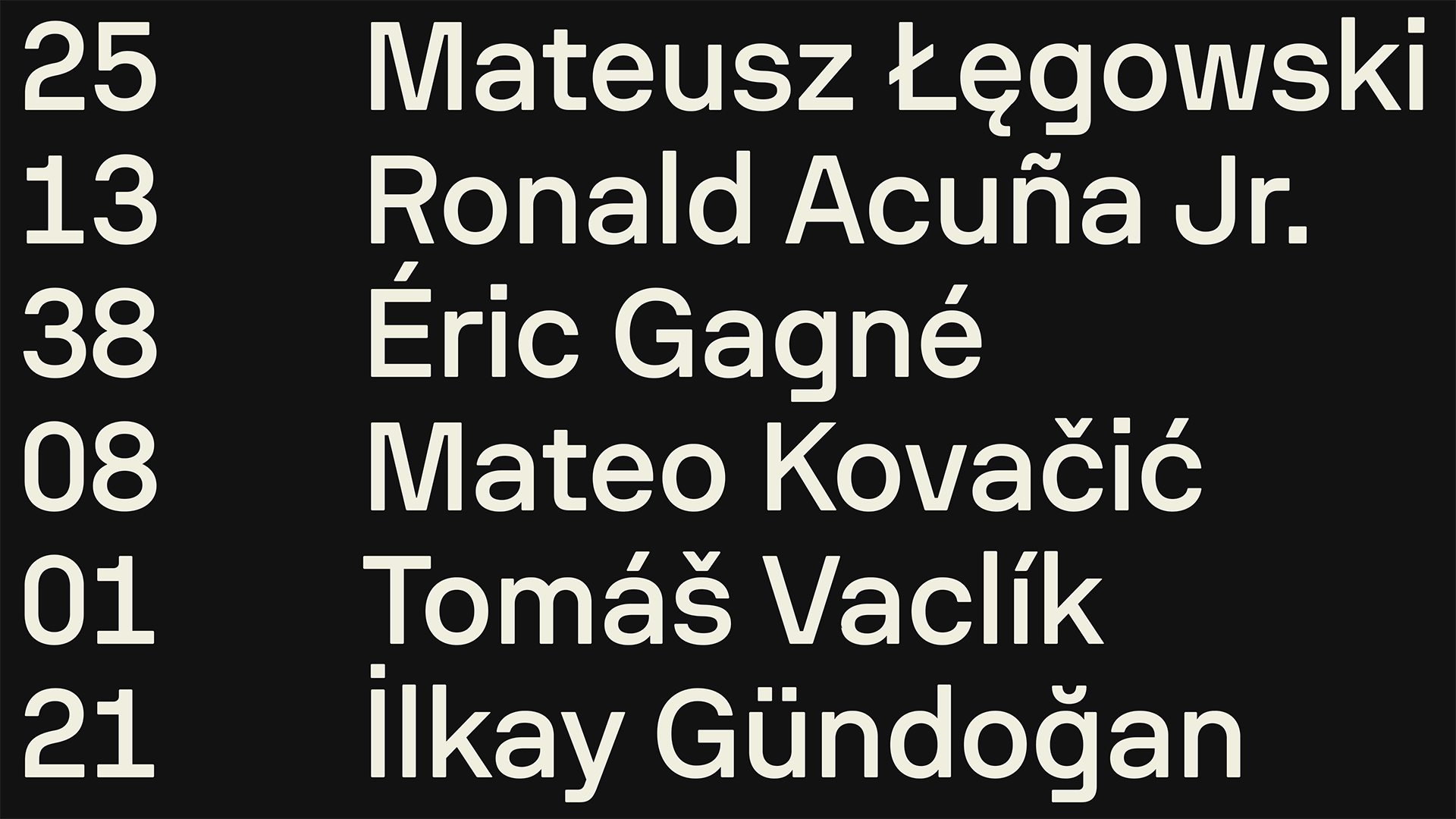
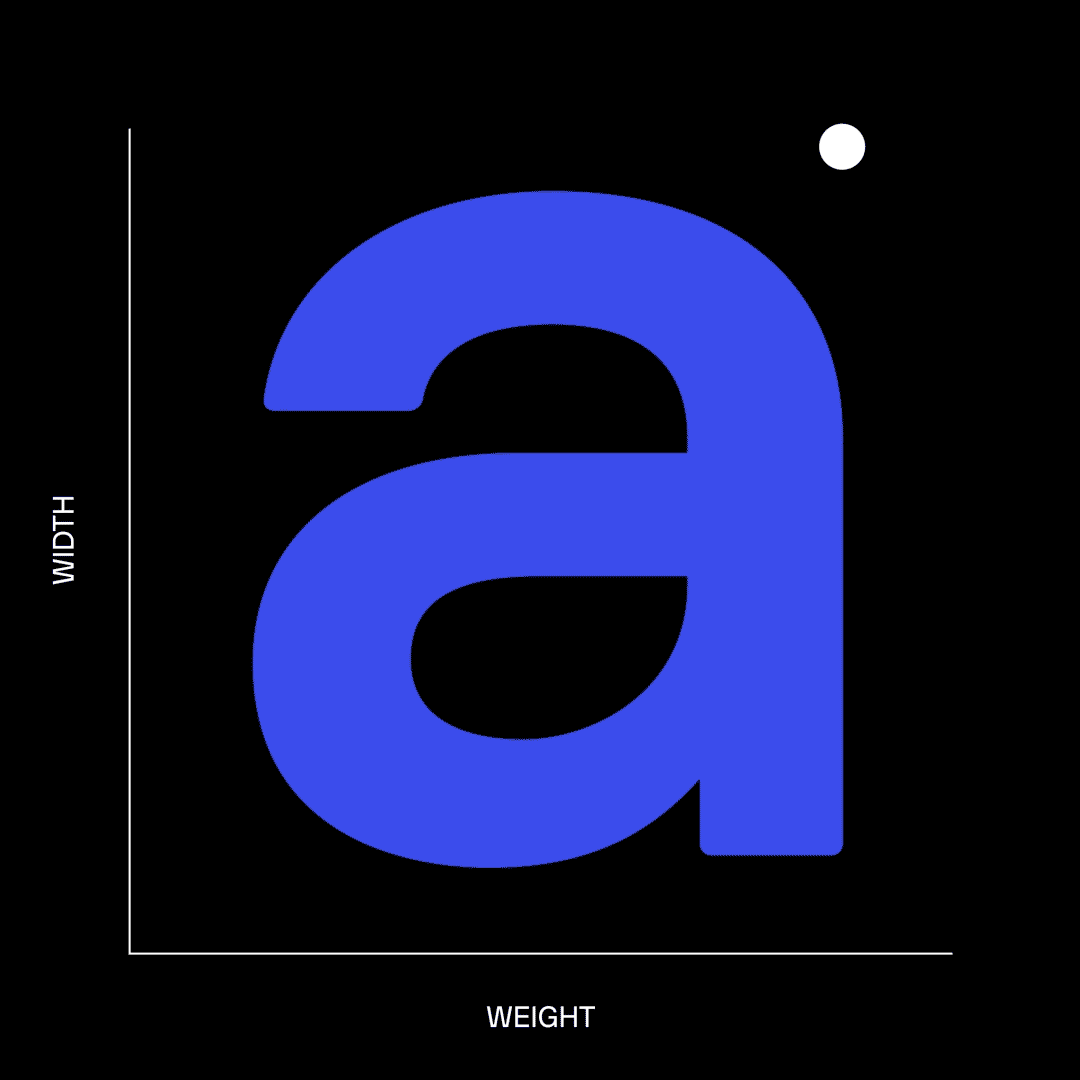
Family of fonts is structured around normal and condensed styles, necessary for seamless type setting of longer player names and team names in often limited containers across Sofascore product range. Three weights - Regular, Medium and Bold add to the typographic spectrum, especially when it comes to branding and producing variety of brand touchpoints. All styles are packed and delivered inside a single variable font format for easier implementation, with exception of Sofascore Mono which is a single style addition to the family.
Along with matching shapes to the rest of the branding elements, we ensured type performs great in small sizes on screen. Therefore, many small details serve both purposes. For instance, flat bridges in diagonal joints are barely visible in small sizes, but open up crucial space to keep the letters legible. On the other hand, such details pop more when set big, adding to the overall machined character.

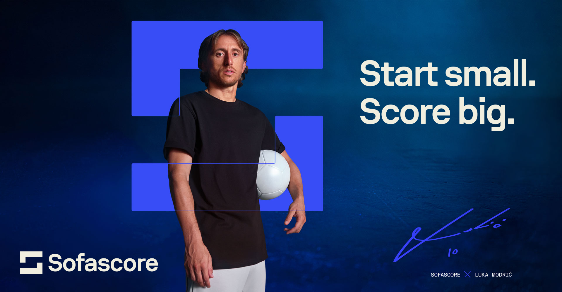
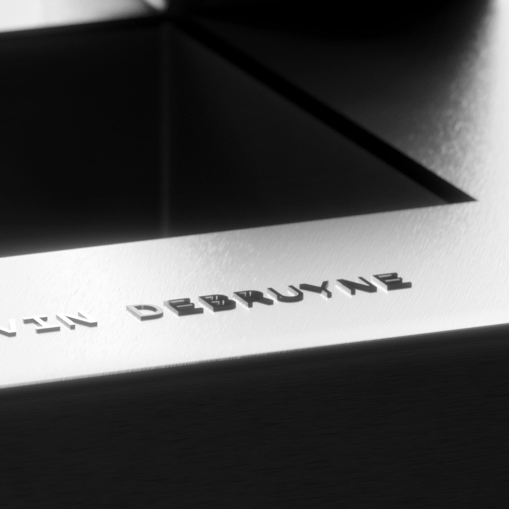
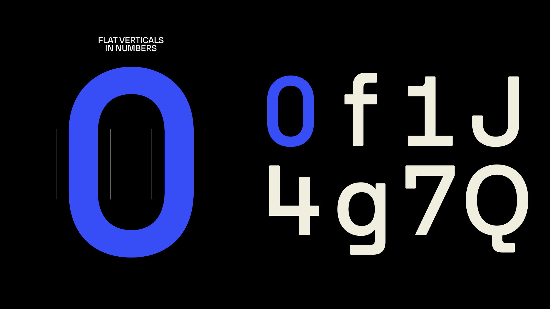
When possible, new Sofascore frame symbol is embedded within letter construction, utilizing geometric brackets with strong horizontal and vertical emphasis. When it comes to numbers, even rounds are flattened to become vertical stems in order to over-exaggerate the effect. Add to the mix a little flat serif or tail here and there, and quickly Sofascore Sans becomes highly recognisable and ownable asset that ties the brand together through word image.
Credits & details
Client: Sofascore
Branding: Design Studio
Type Design: Hot Type (Marko Hrastovec)
Spacing & Kerning: Igino Marini
Branding Motion Design: Order
Type Motion Design: Andrej Todorovski