

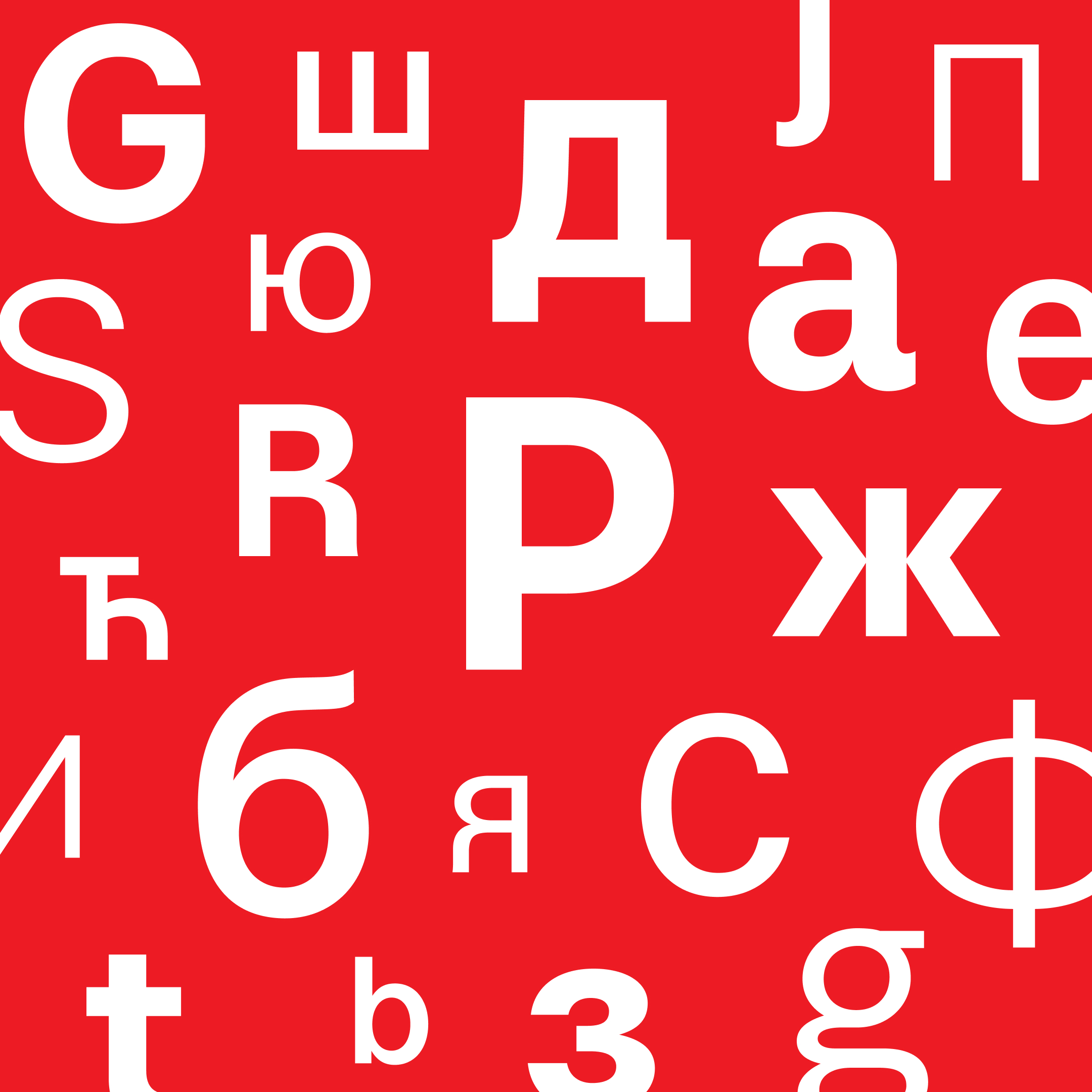
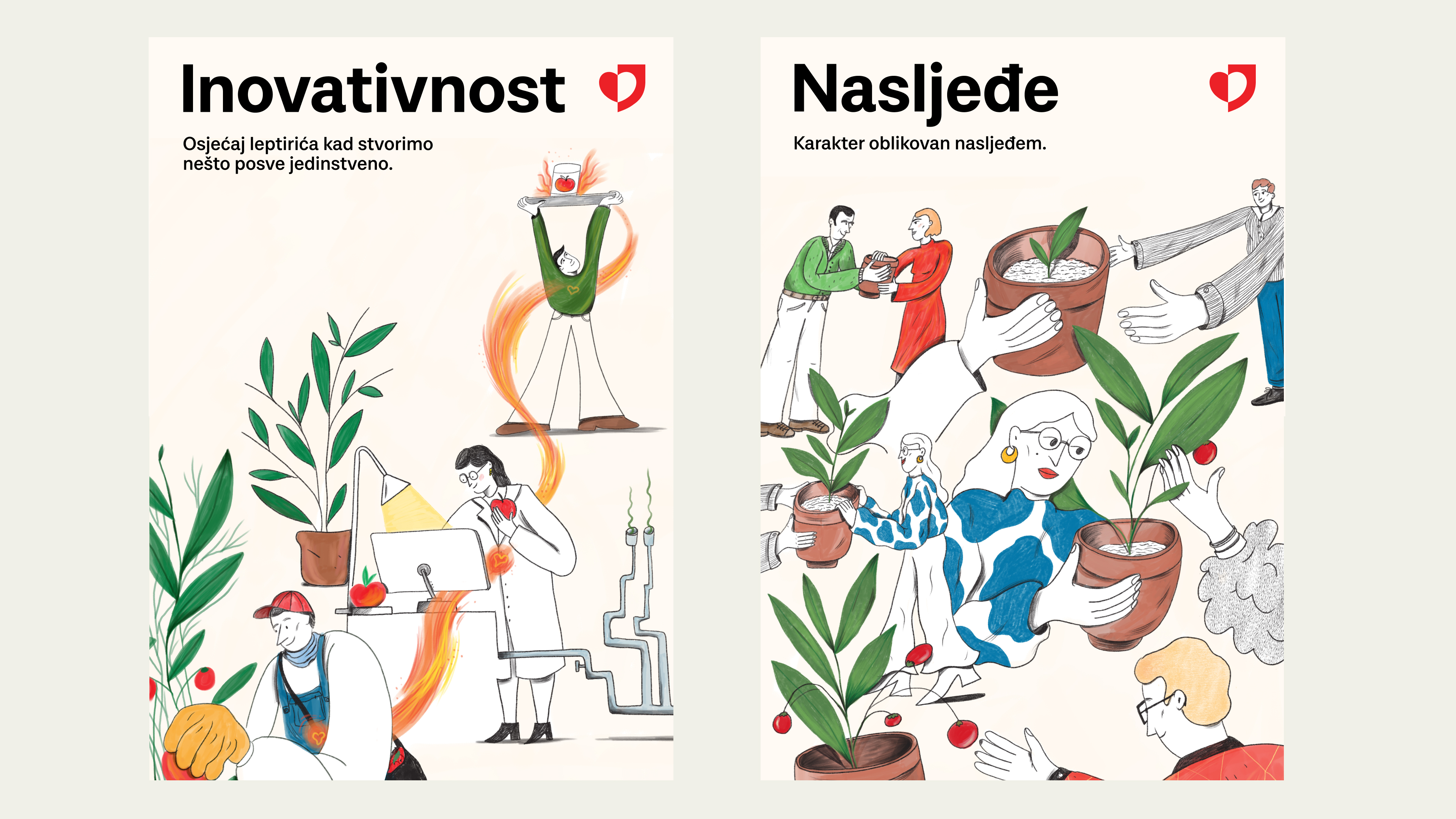


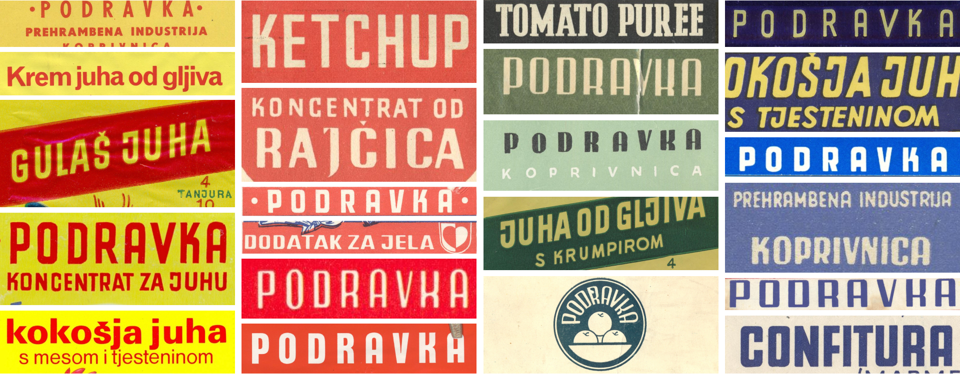
Podravka typography draws inspiration from it's rich visual history and tradition of progressive packaging designs. During the rebranding process, company was kind enough to open doors to their archives, and we embarked on a retrospective journey. As a result, a completely new, easy-to-read typeface "Podravka sans" was designed. Shapes from historical Podravka logos are incorporated into the contours of individual letters, and the negative space of the letter "a" is taken from half of the heart - the most recognizable symbol throughout the history.
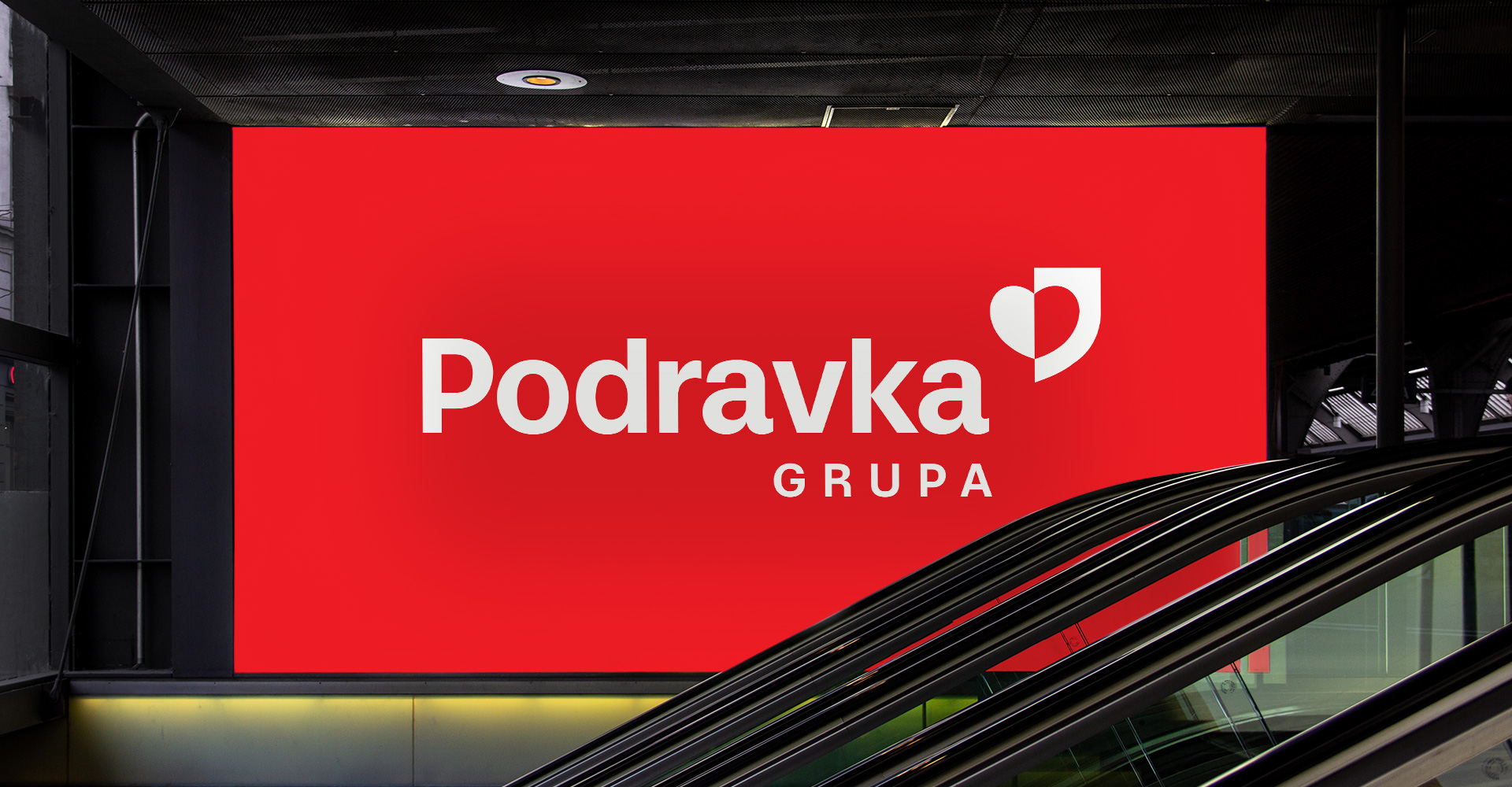
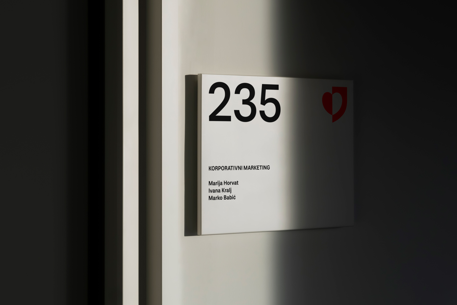
The heart symbol is "released" from the fixed central position on the logo and becomes an independent element. The shape of the heart has been discreetly refined: the sharpness of the tip of the base has been softened, the contour of the heart has been improved and the thickness of the base has been uniformly redrawn. In the redesign of the logo, the core of the identity is preserved, but at the same time new values are communicated and space is opened for contemporary communication towards new markets and consumers.
Credits & details
Type design: Marko Hrastovec
Kerning: Igino Marini
Motion: Studio Size
Agency: Bruketa&Žinić&Grey
Account director: Maša Ivanov
Art Director: Igor Manasteriotti
Creative director: Davor Bruketa
Illustration: Hana Tintor
View full agency credits