Design notes
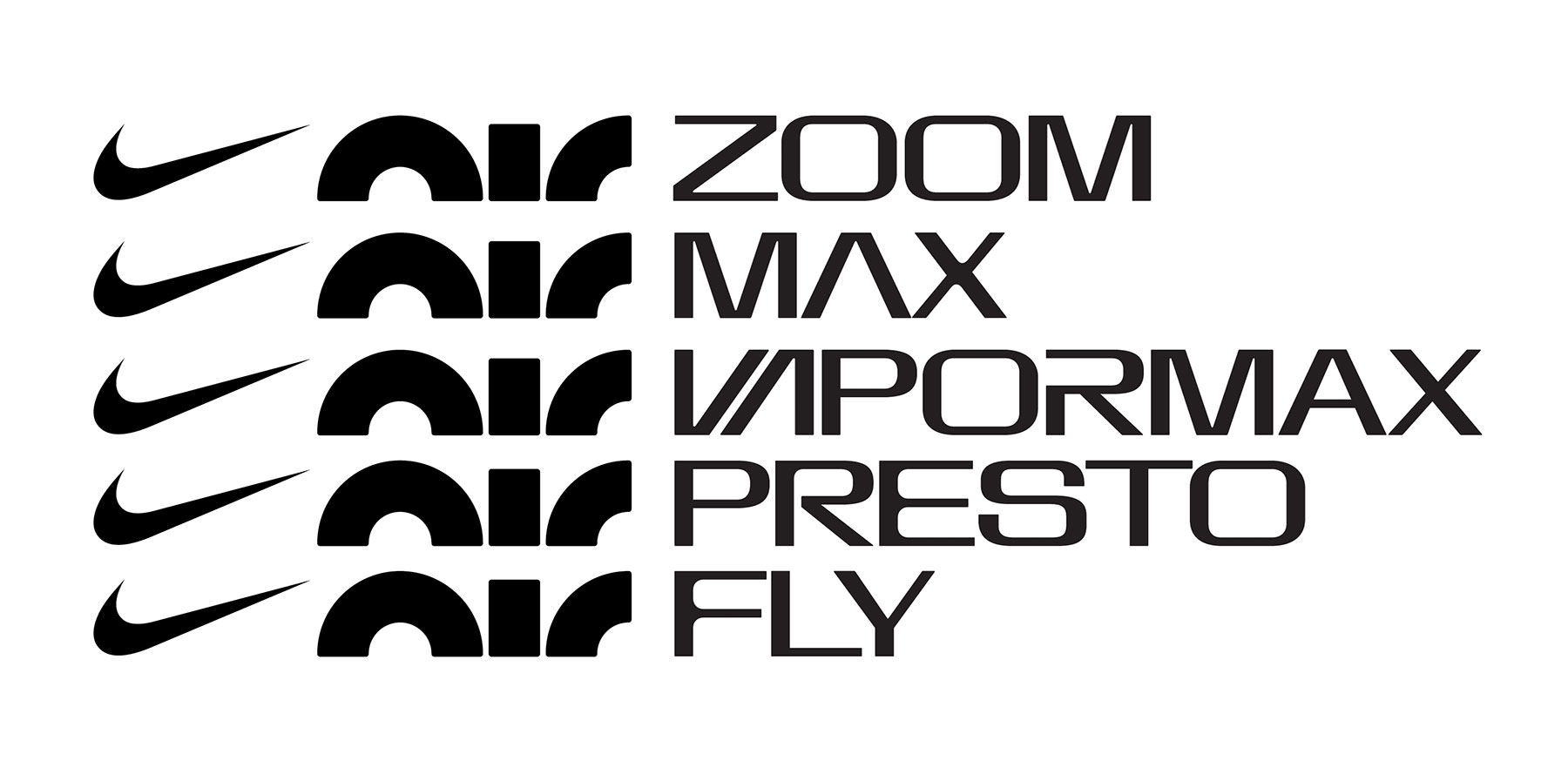
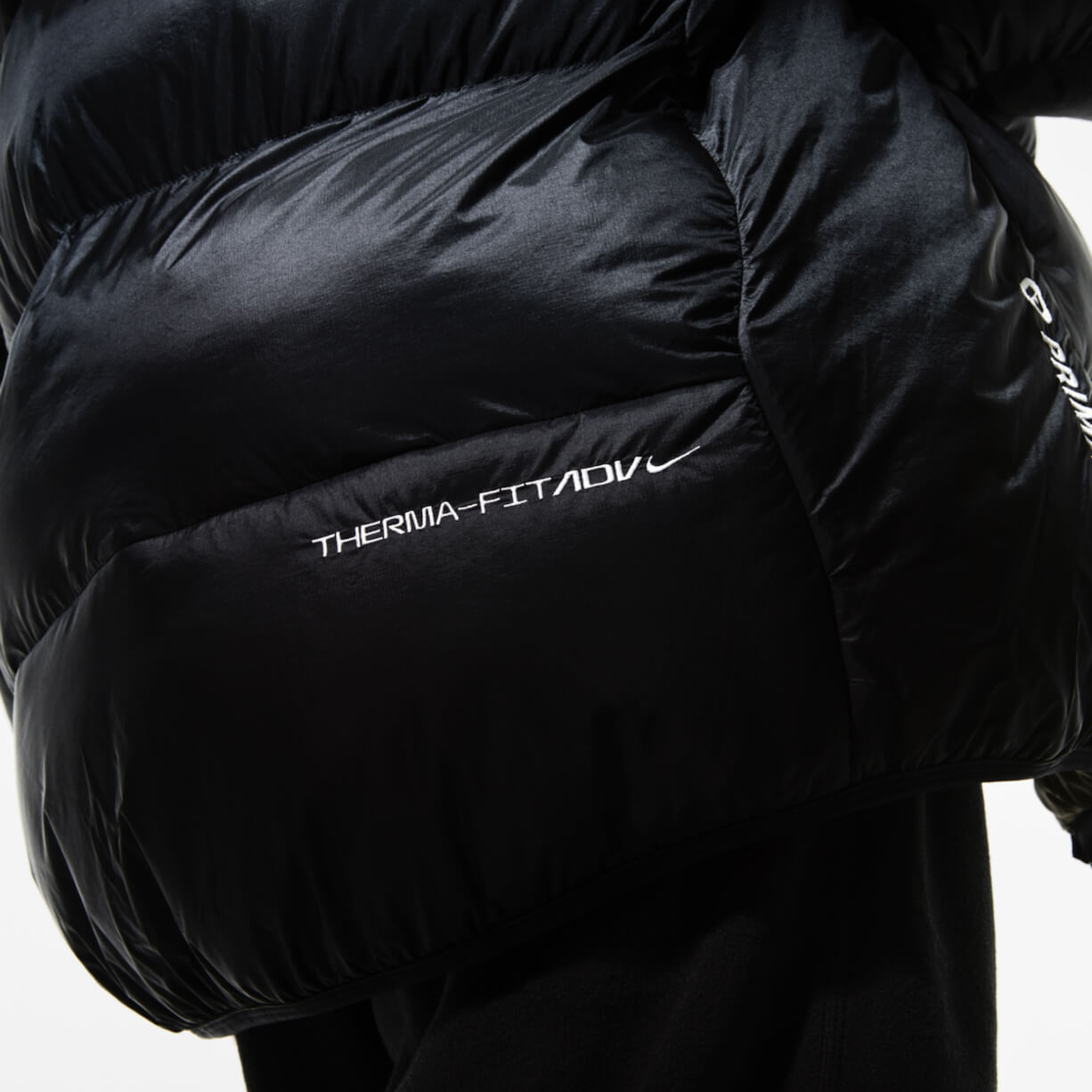
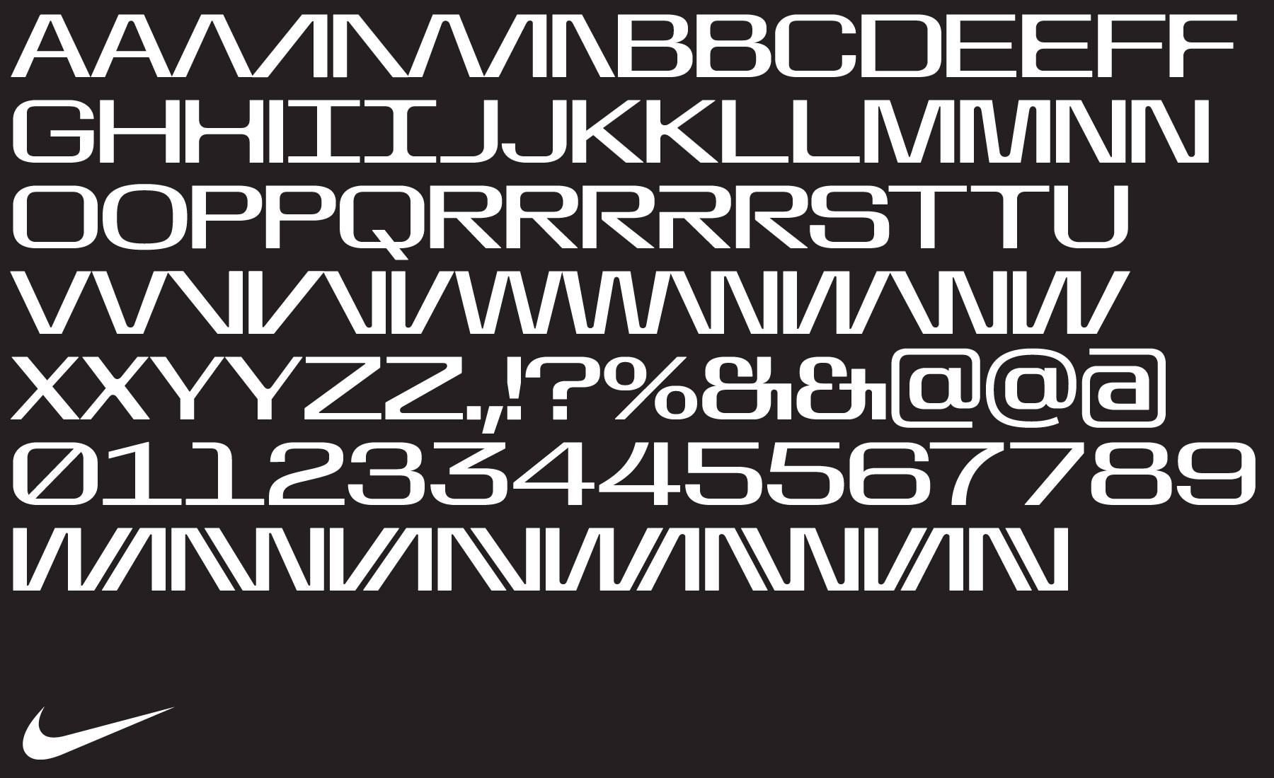
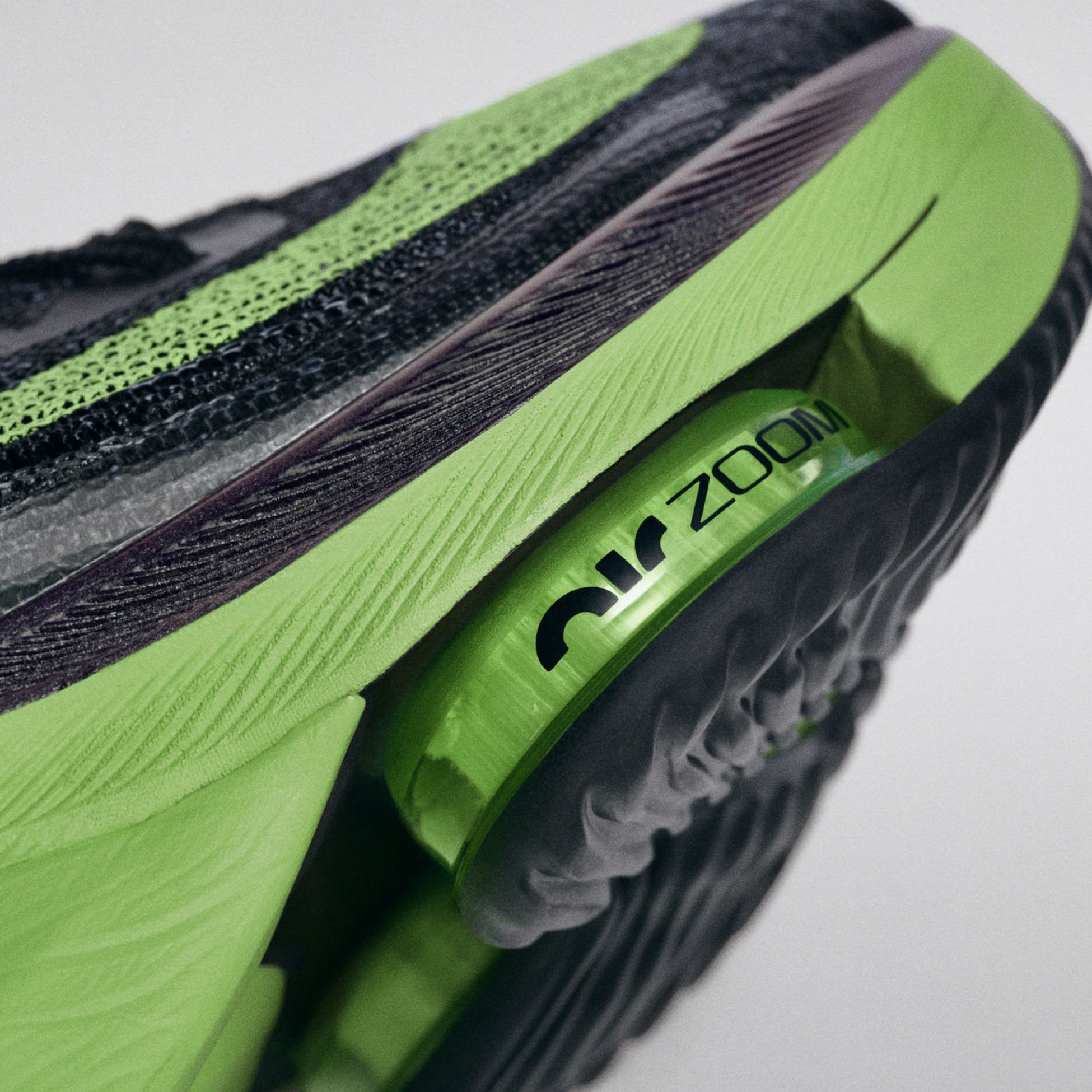
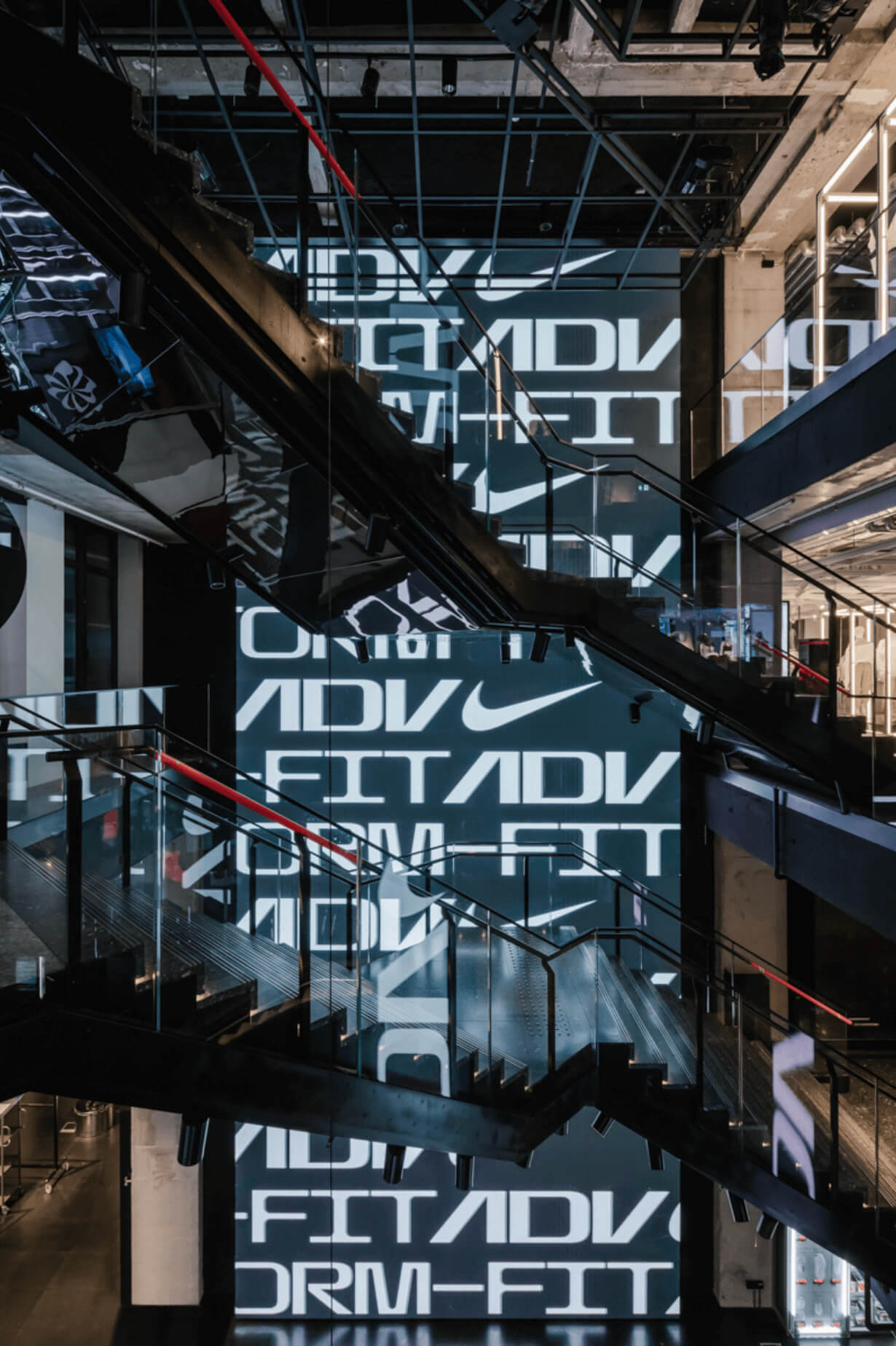
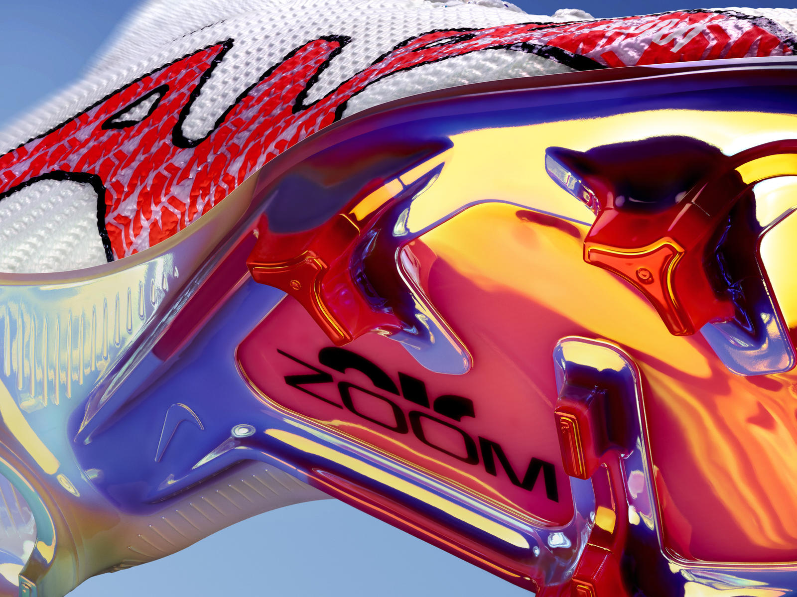
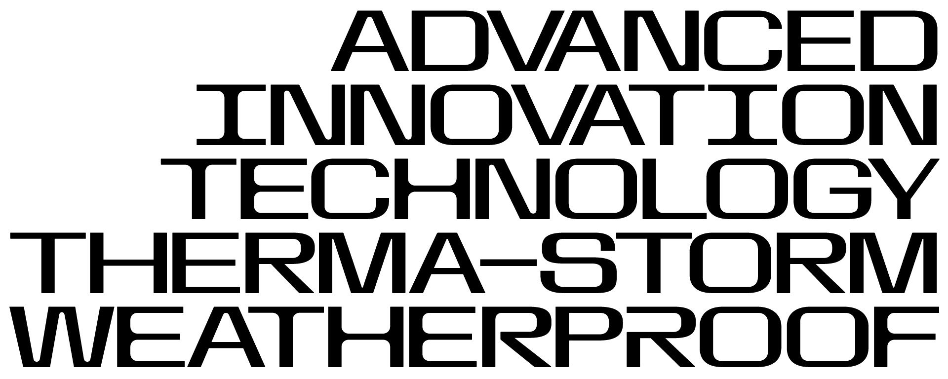
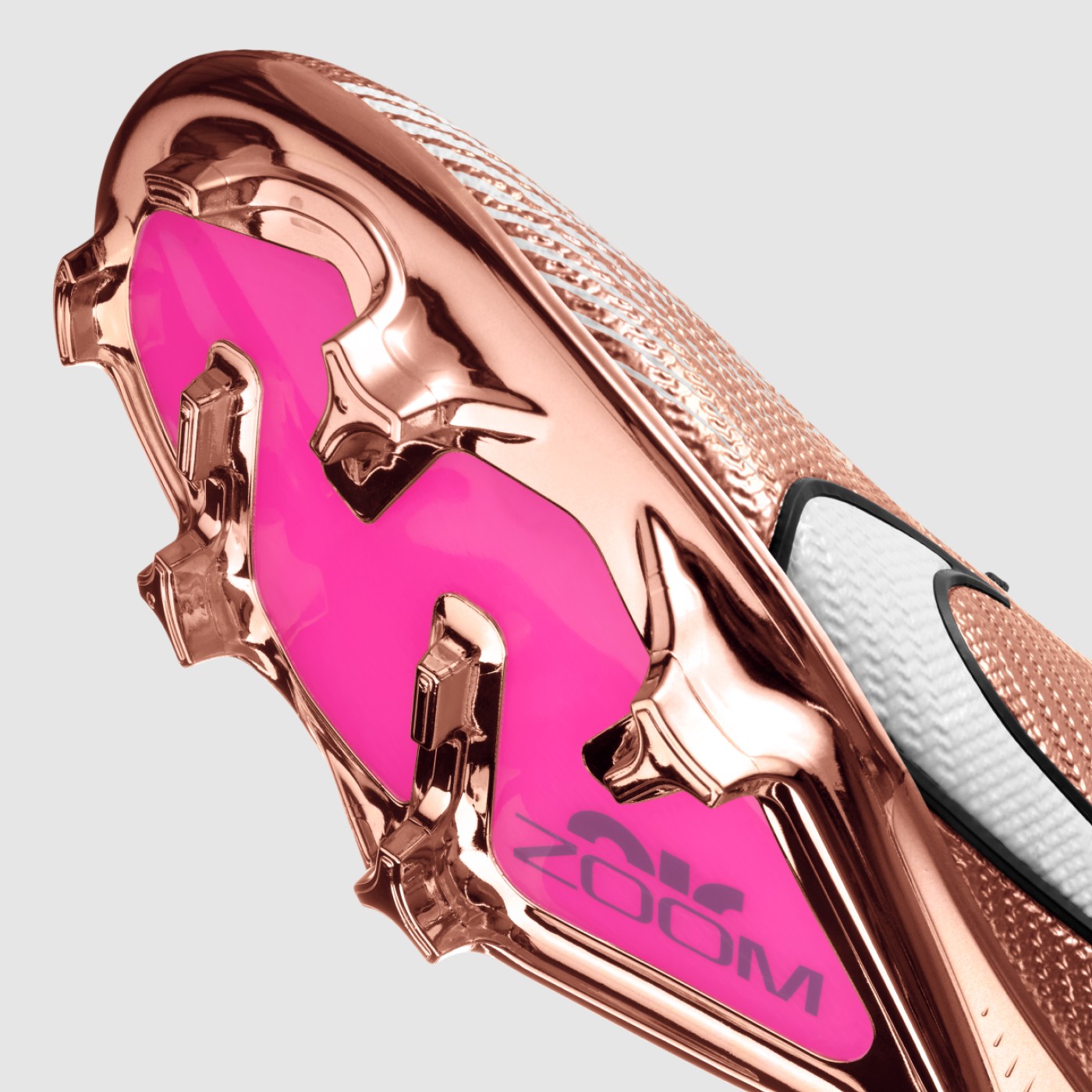
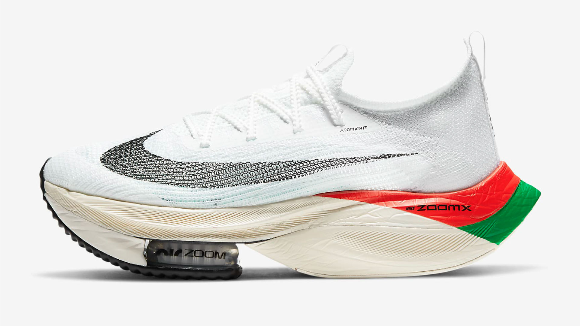
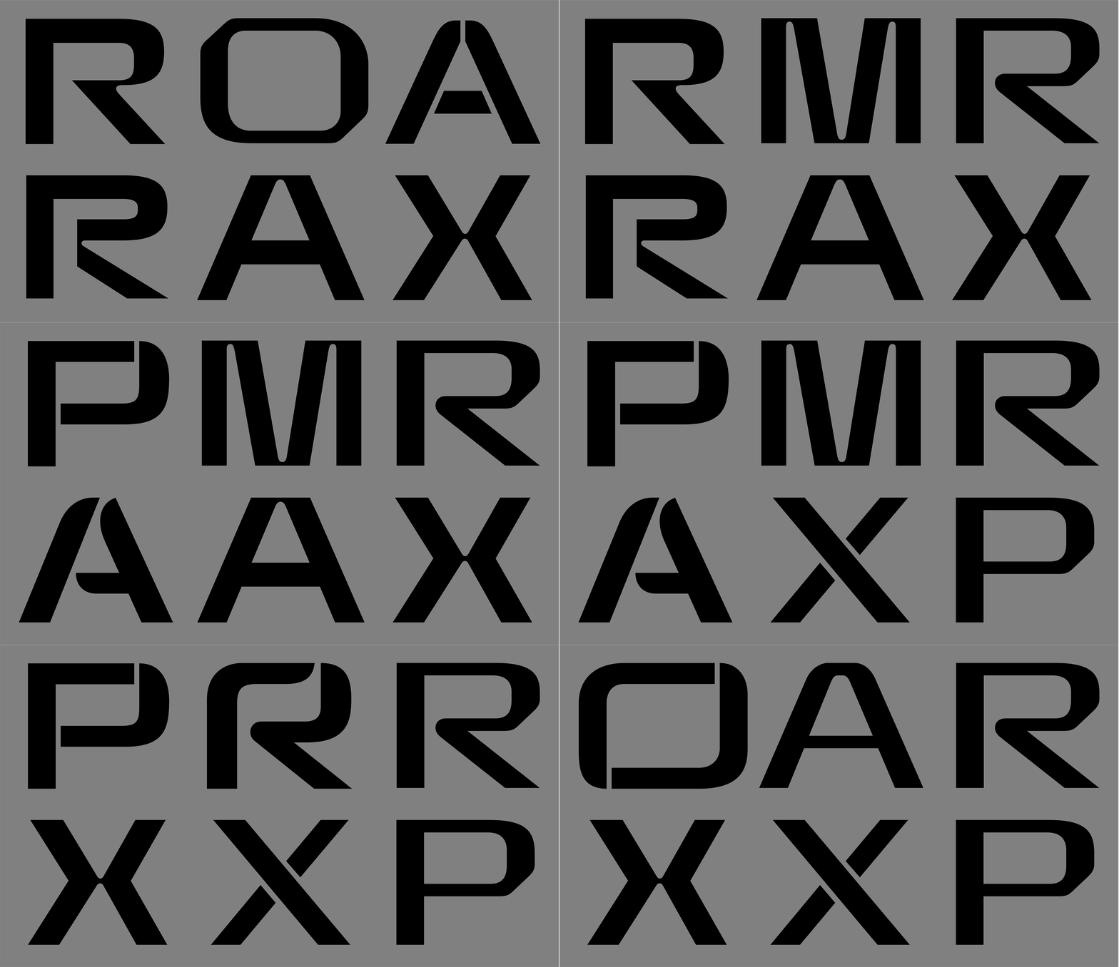
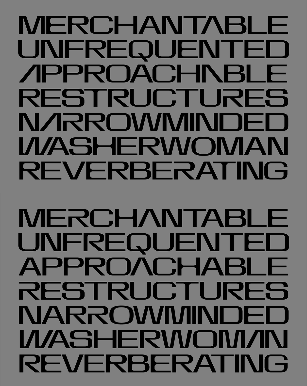
Goal of the project was to design a typeface that matches in character with the new AIR logo, loudly speaks technology and clearly looks forward in time. From the get go it was about wide proportions, tight spacing, rounded corners and machined precision. Early stages allowed for more experimental explorations with given parameters, where few interesting directions emerged.
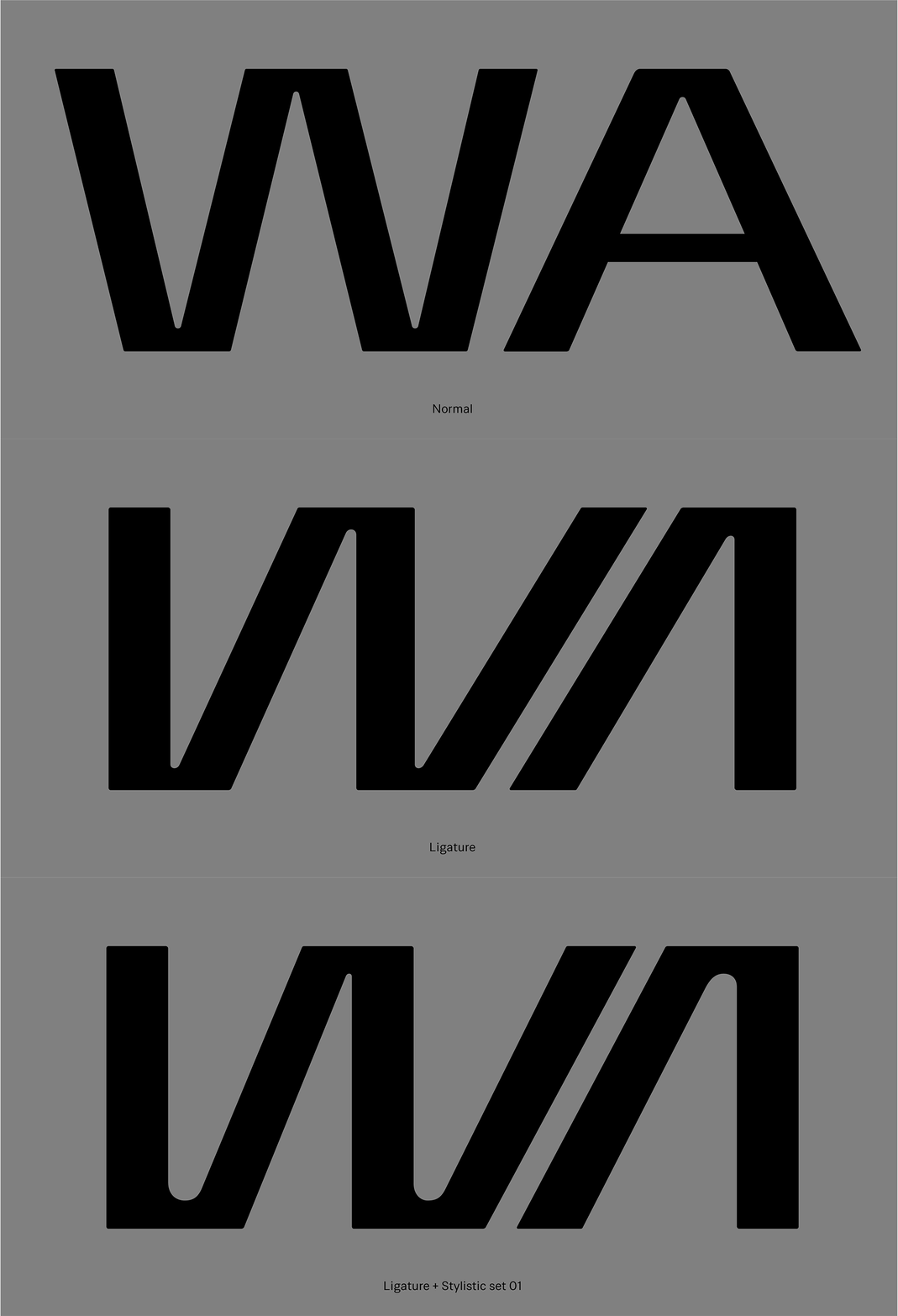
To boost the flexibility of the typeface, together with Nemanja we decided to incorporate ligatures with diagonal letter combinations. Each ligature also got it's alternative stylistic treatment with rounded inner corners, the same way as many other single letters did.

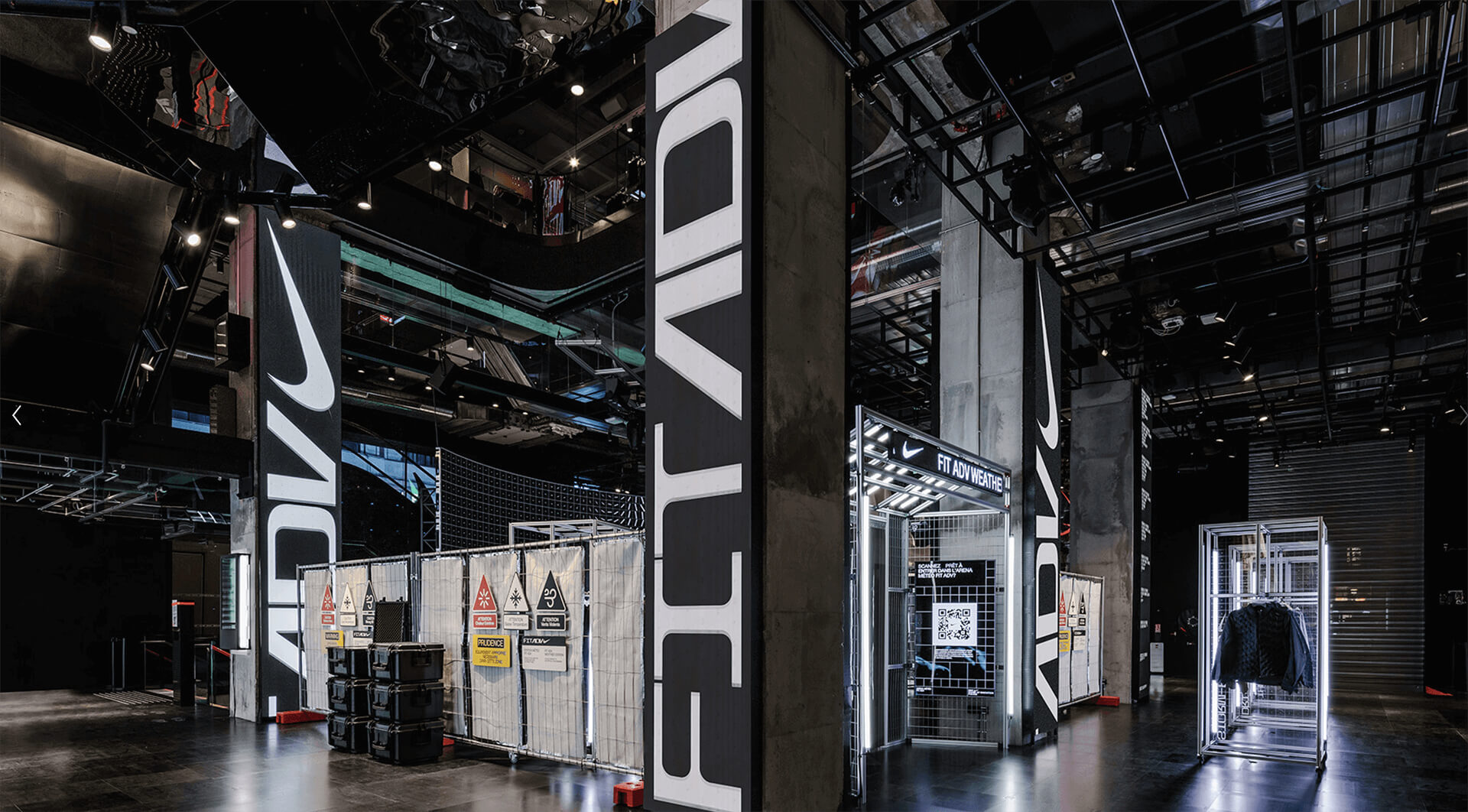
During development phase, typeface was thoroughly tested in various sizes and application methods on a range of material to ensure shapes and corners perform as desired. Those tests informed inside and outside corner radius, as well as how tight spacing can go before strokes blend into each other.
Credits & details
Art direction: Nemanja Jehlicka
Type design: Marko Hrastovec
Images: Nike, Hot Type
