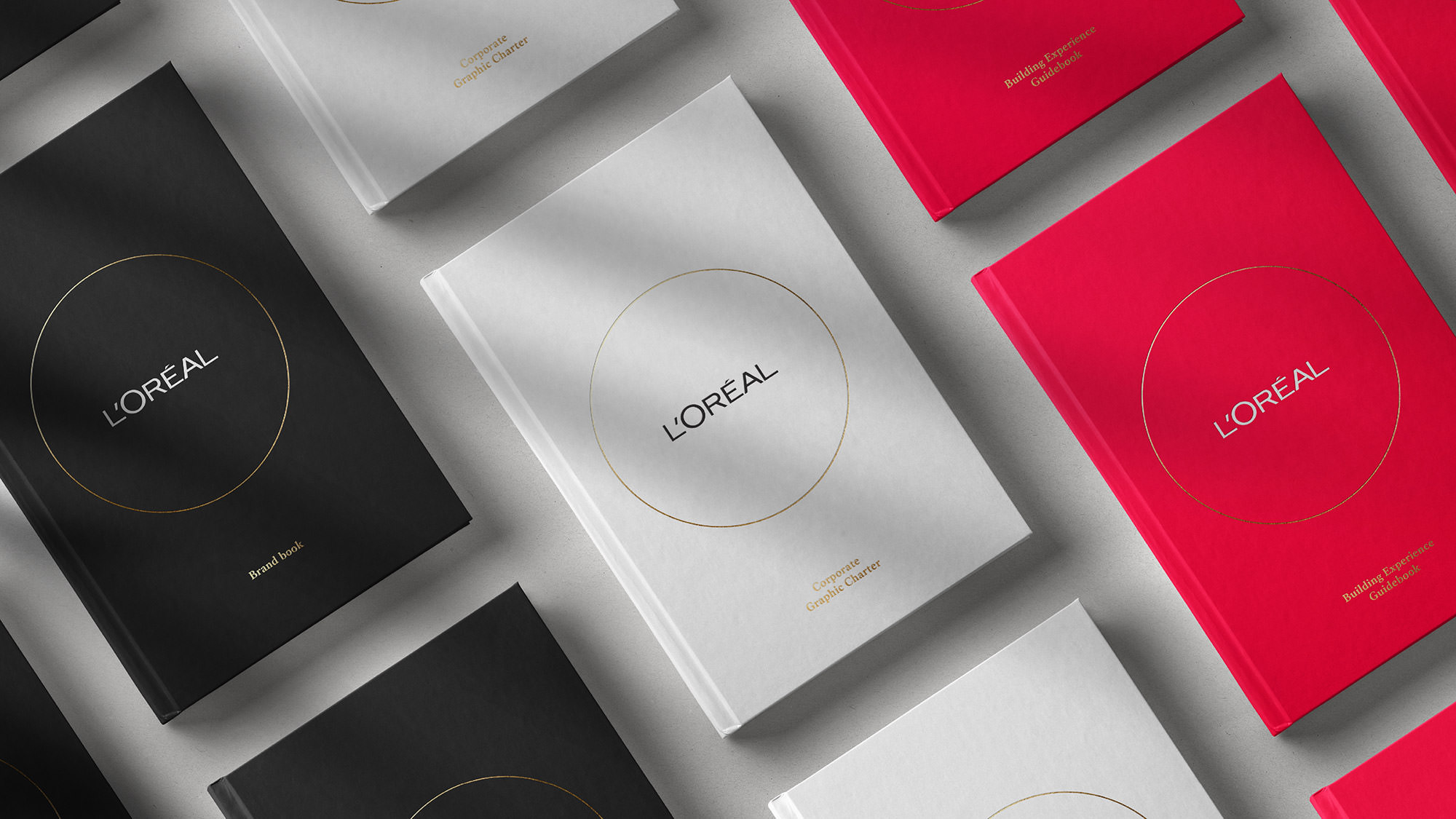
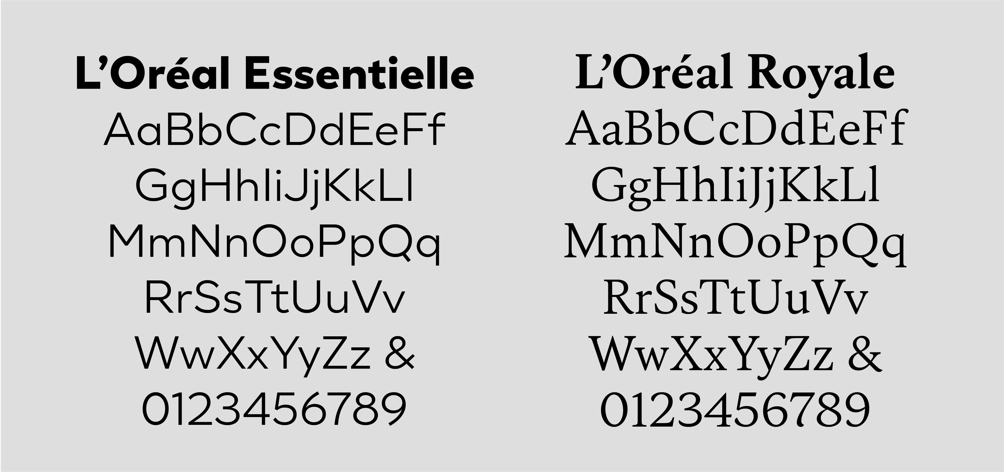
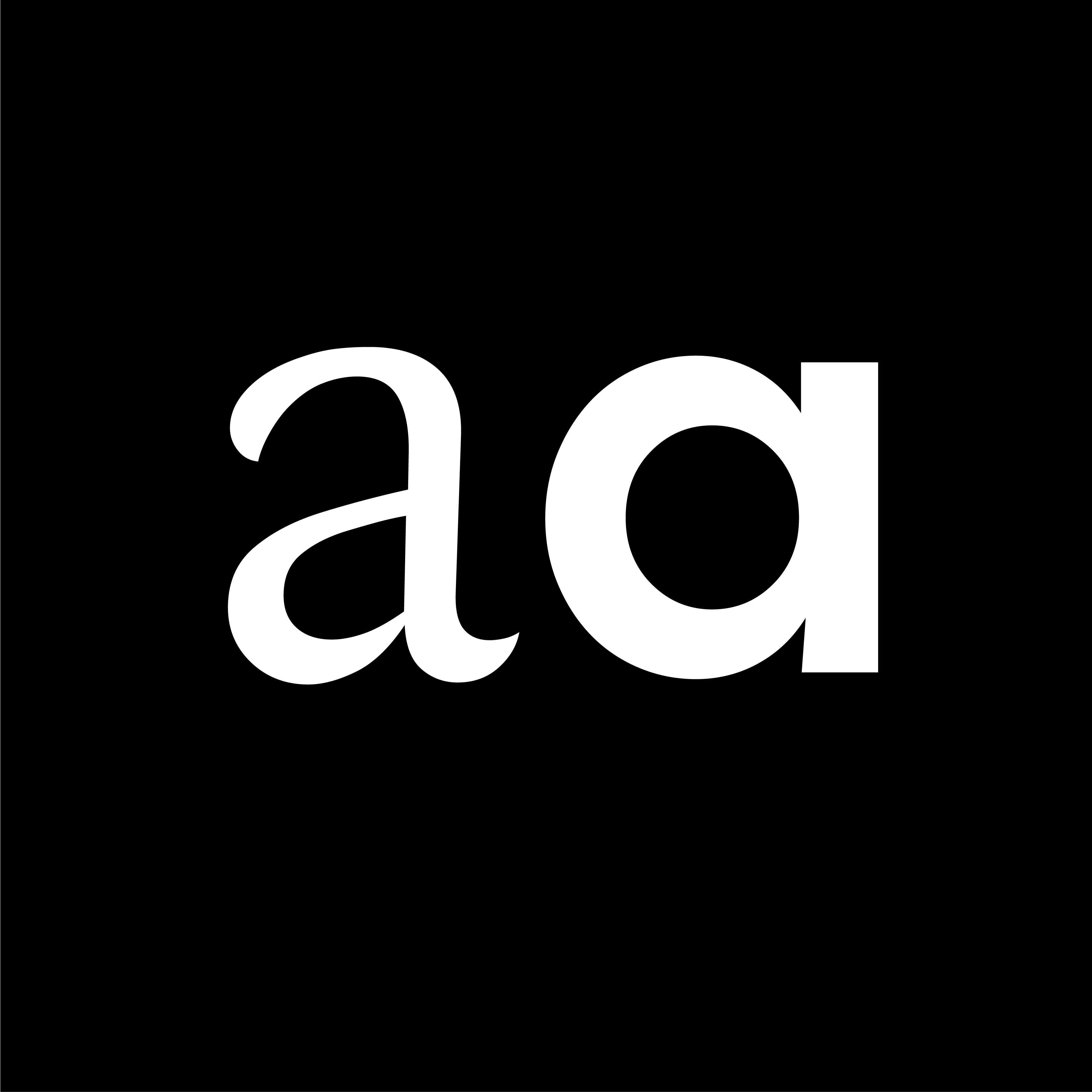
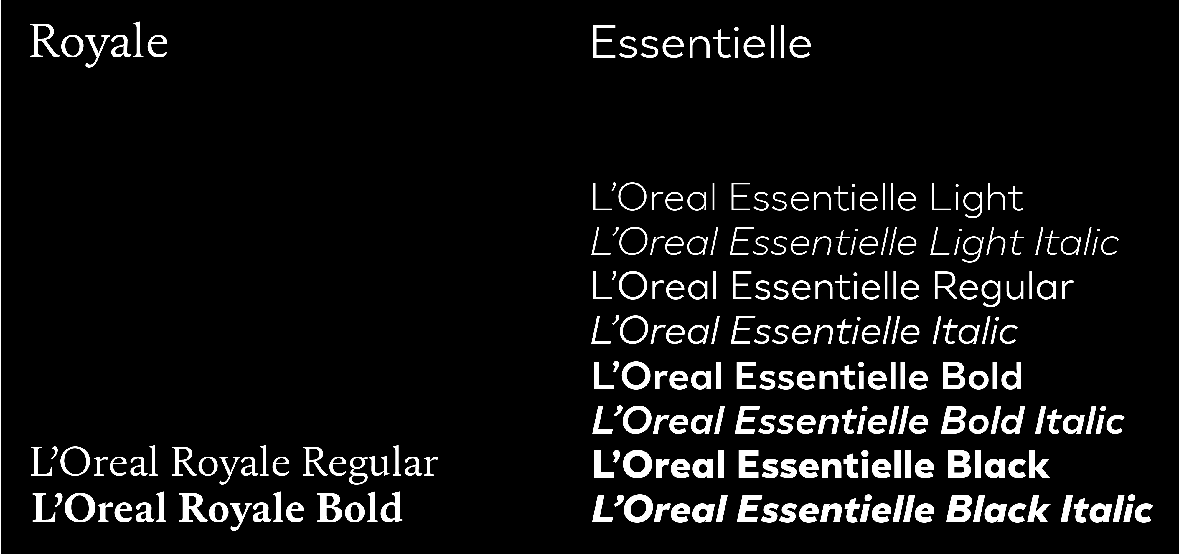
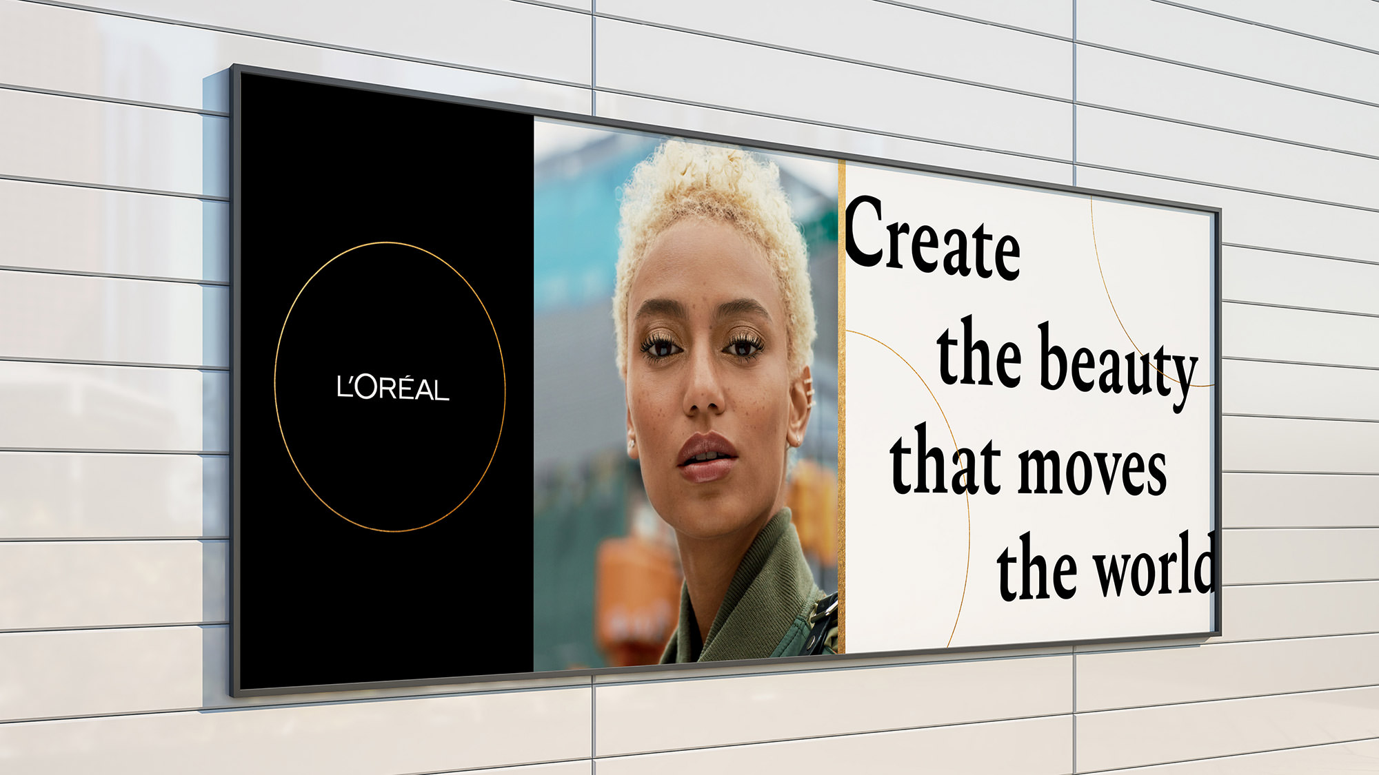
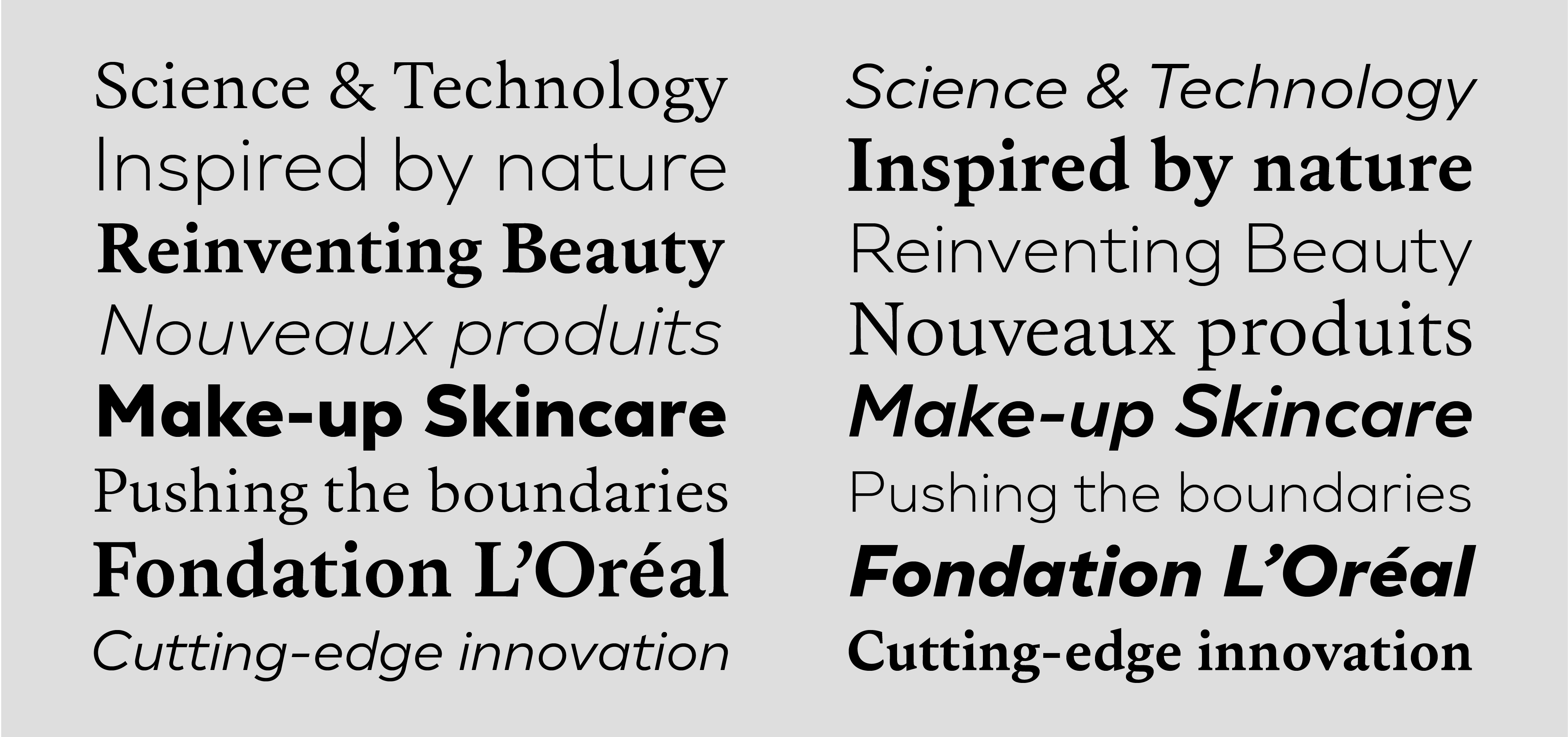
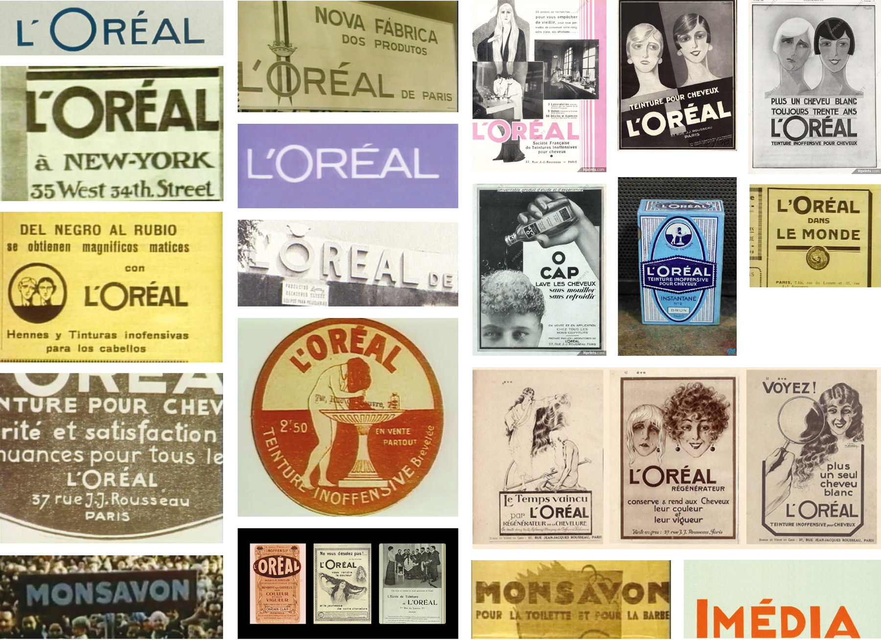
L’Oreal Essentielle
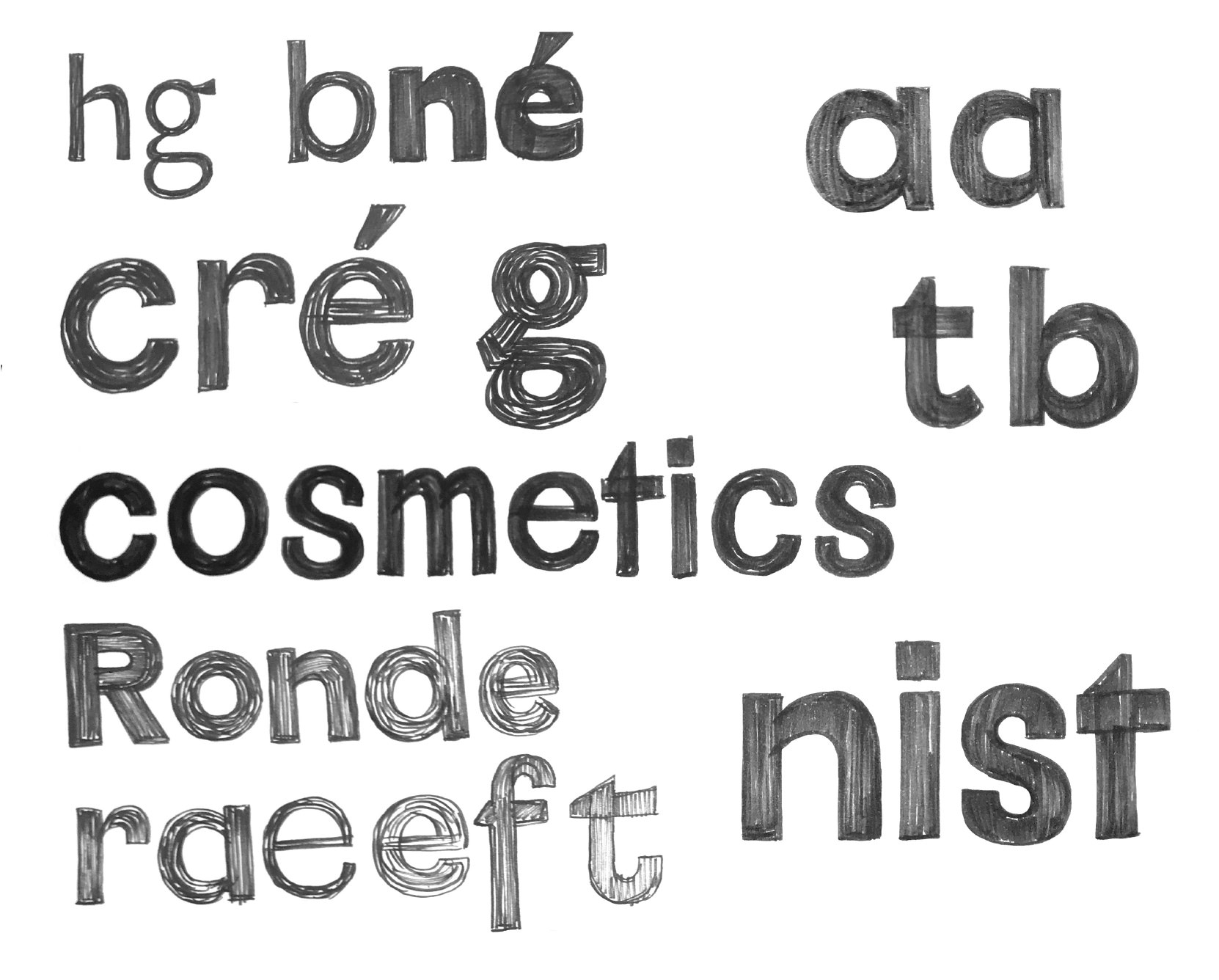
Essentielle is a geometric sans serif in 4 weights - Light, Regular, Bold, Black, with matching italics. Design is based on various brand logotype versions throughout history, as well as geometric typefaces used on their iconic product packaging. To better inform shapes that are being designed, we reached deep into L’Oréal archives, digging through plenty of promotional video material, printed publications, magazine advertisements and packaging boxes. No matter the era when those were designed, there is one clear connecting thread that we noticed: extensive use of geometric sans serif typefaces. Sometimes there would be Art Nouveau flavor to the shapes, other times it's lively, curvy strokes, but the skeleton was always clean geometry. From there we took things to the drawing board and explored in what way can we give turn historic sentiment into timeless sophistication.
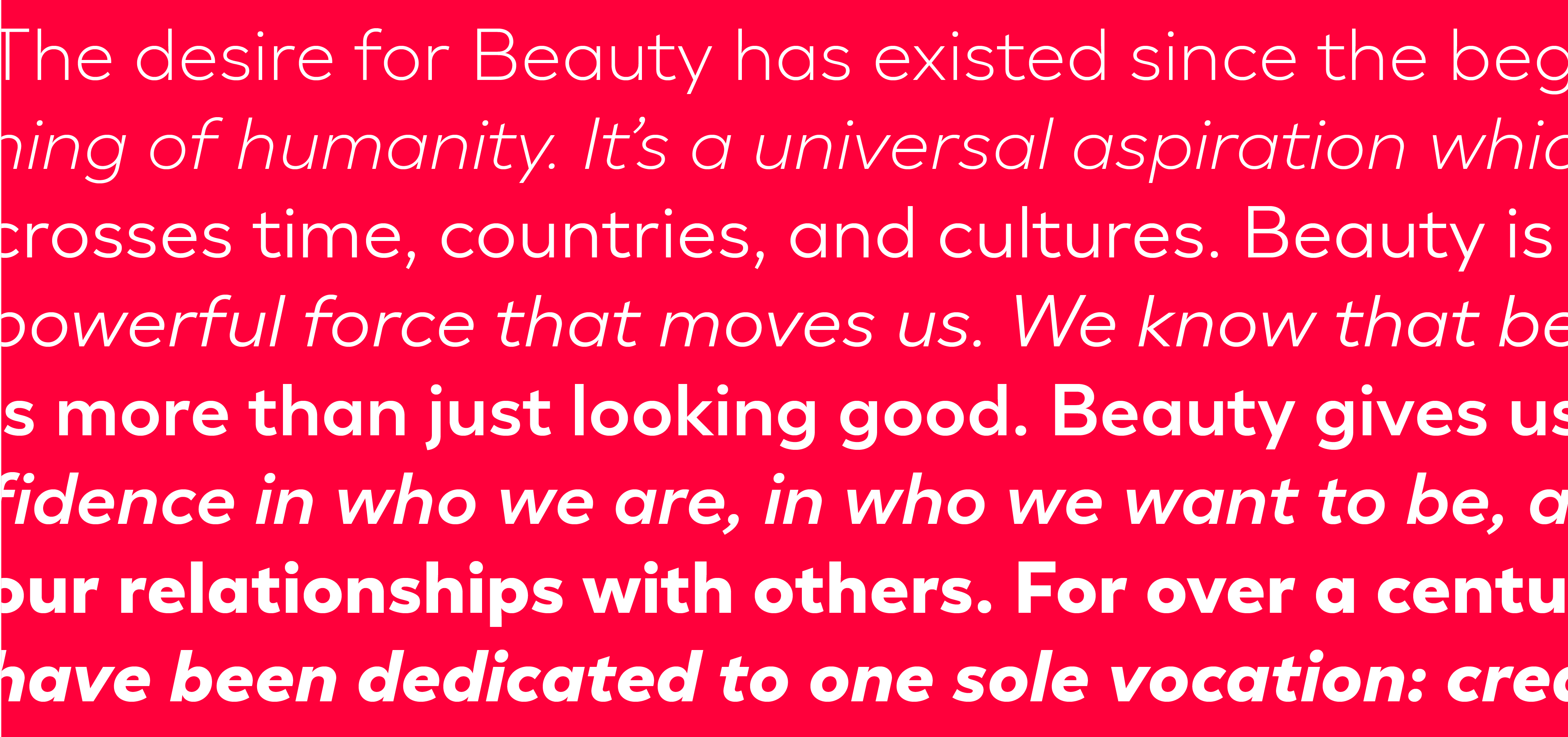
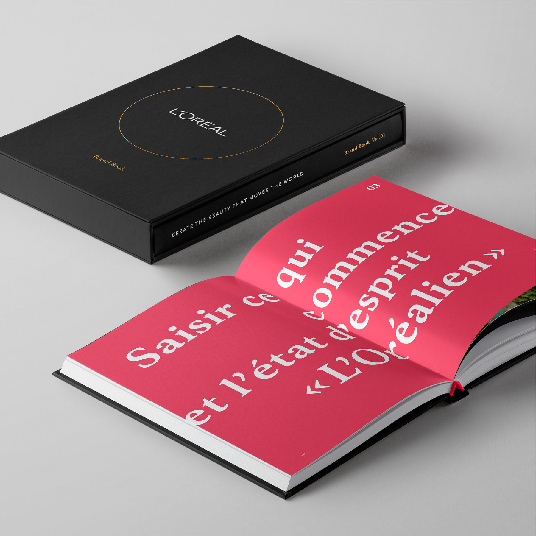
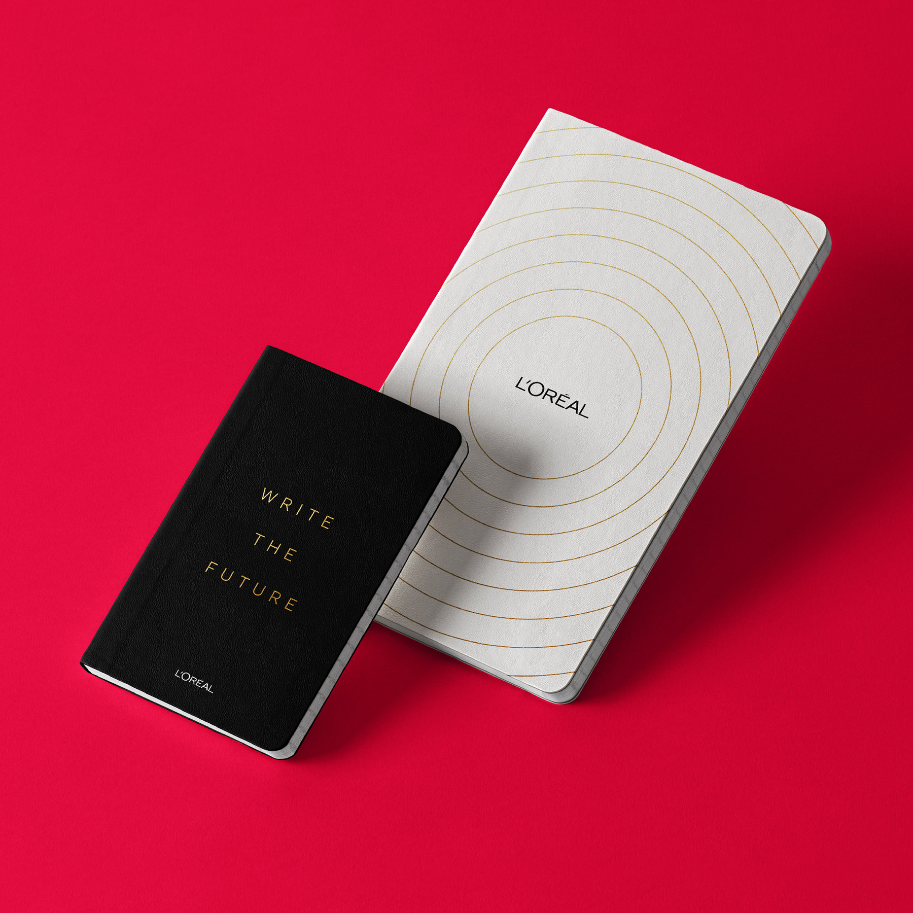
L’Oréal Royale
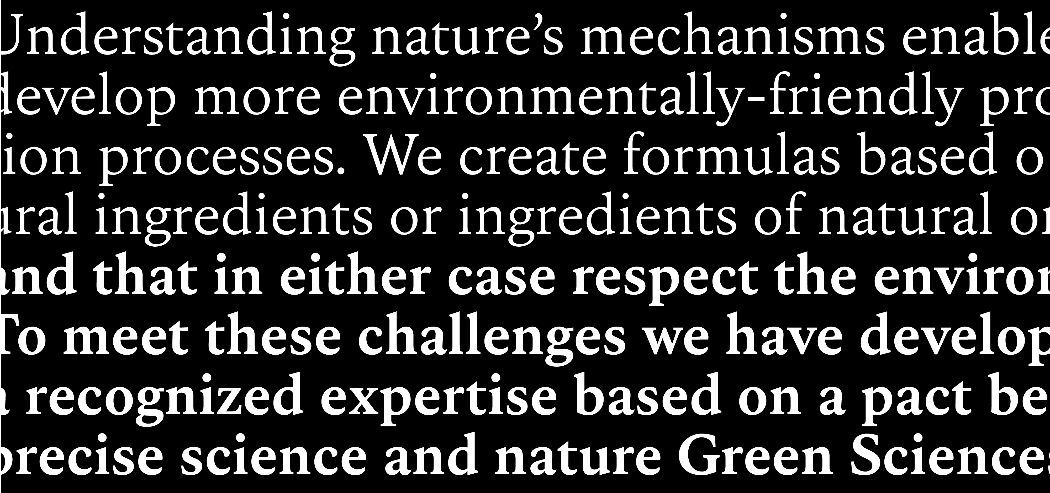
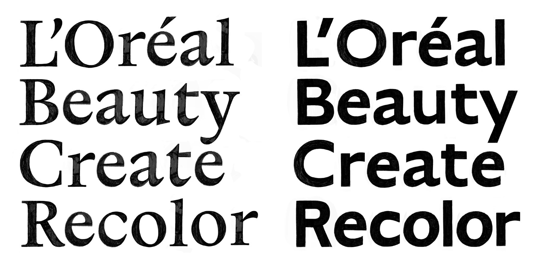
Royale is a serif typeface in two weights - Regular and Bold. Stroke construction model is influenced by the work of Robert Granjon, while it is finished off with soft brush terminations that add warmth and a contemporary sense of beauty. Royale is designed to shine in bigger sizes, but can also handle running text with ease.
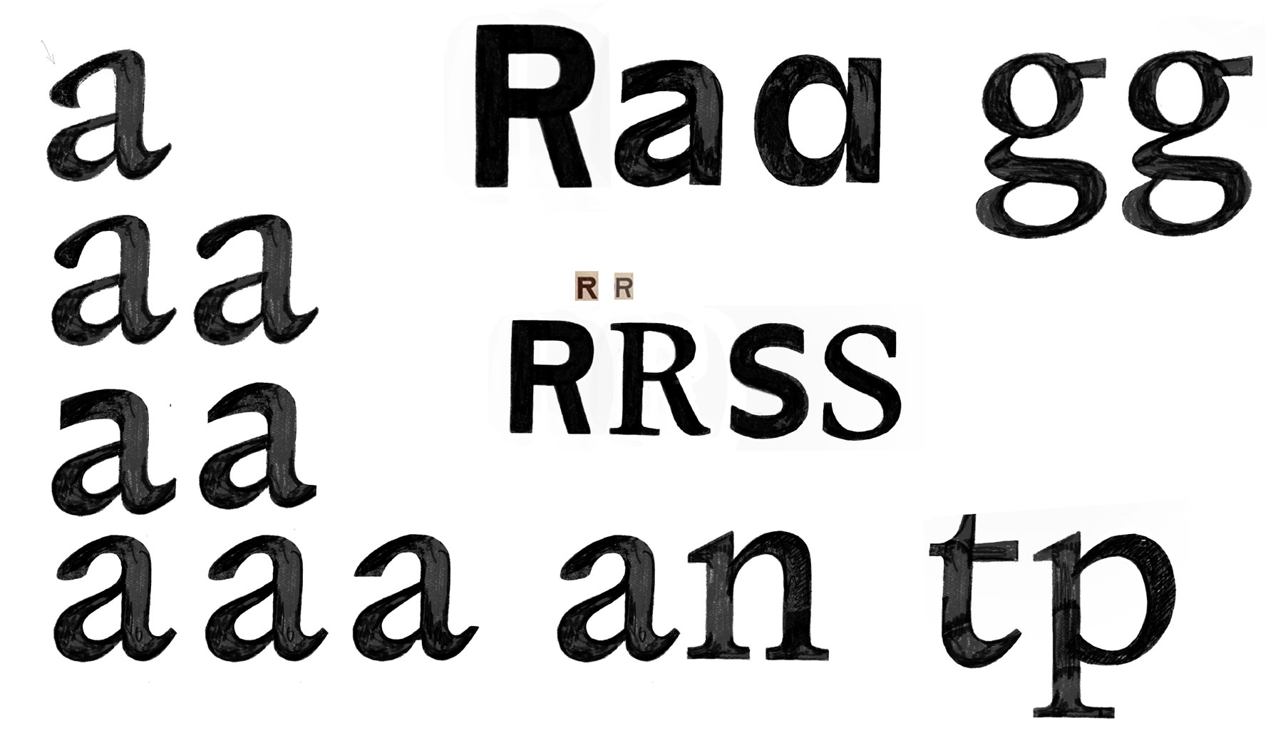
Construction of some crucial shapes like lowercase a,g,e,t,p was in large part inspired by Granjon’s Two-line Pica Roman. In the early design stages we took that construction model and applied all sorts of possible terminations to see how it could speak of sophistication and beauty. Together with the client, we settled on a brush-like, pointy stroke endings that can easily translate into both lowercase and uppercase letters. Brush as a tool is not only limited to painting and calligraphy, but it has it's history in make-up world too. So, it doesn’t come as a surprise that final design resembles exactly that, though in a more subtle and elegant language.
Credits & details
Designed with Elliott Amblard
Creative direction: FutureBrand, Aksel Öz
Mastering: Jean-Baptiste Morizot
Images: FutureBrand, Hot Type