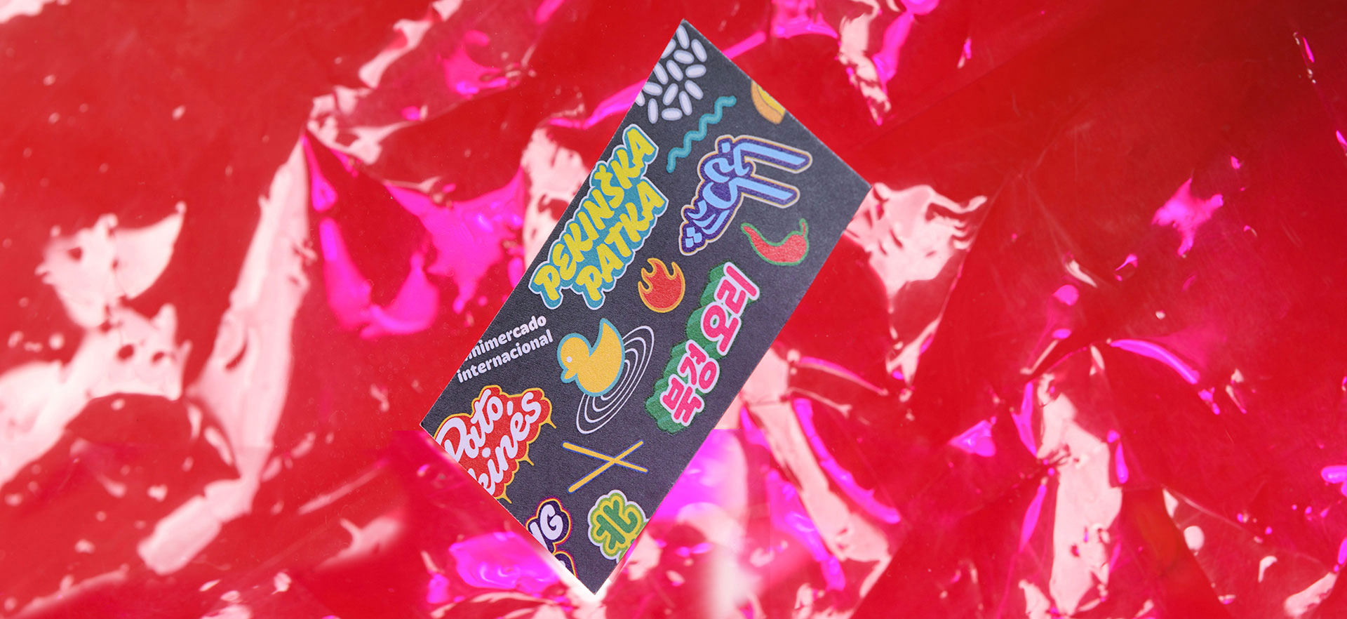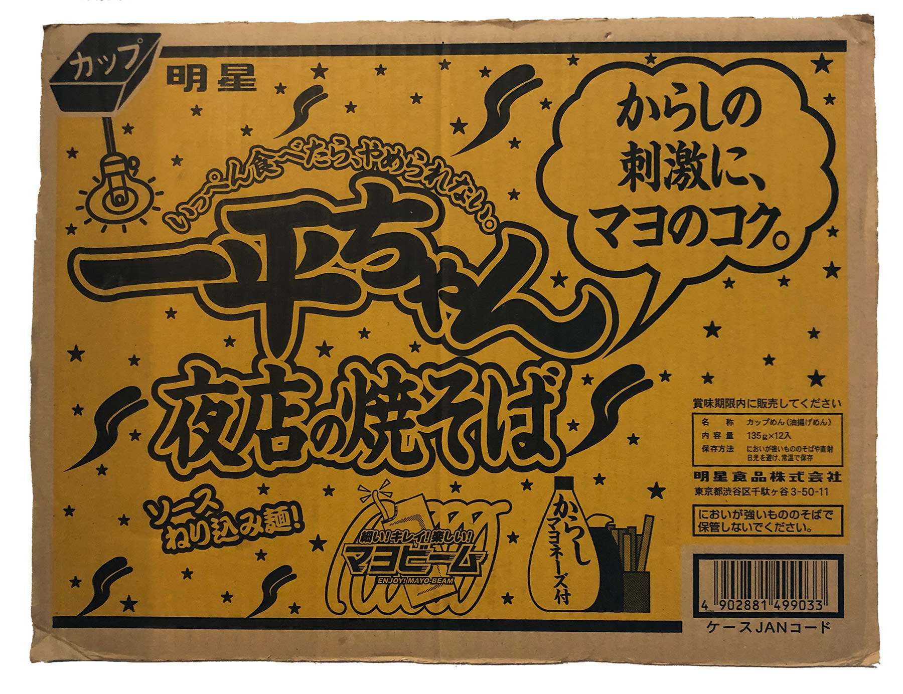
Visual language of both lettering and illustration comes from quirky packaging and transport box designs of Asian, South American, Mexican and African food producers. From there we developed a range of various rounded lettering styles that work well with shadows, stacking outlines and all sorts of effects. Illustrations are representing recognisable products one can get in the store. Visually following the style of lettering pieces, they are placed around them to form a vibrant pattern that evokes comfort and celebrates differences.

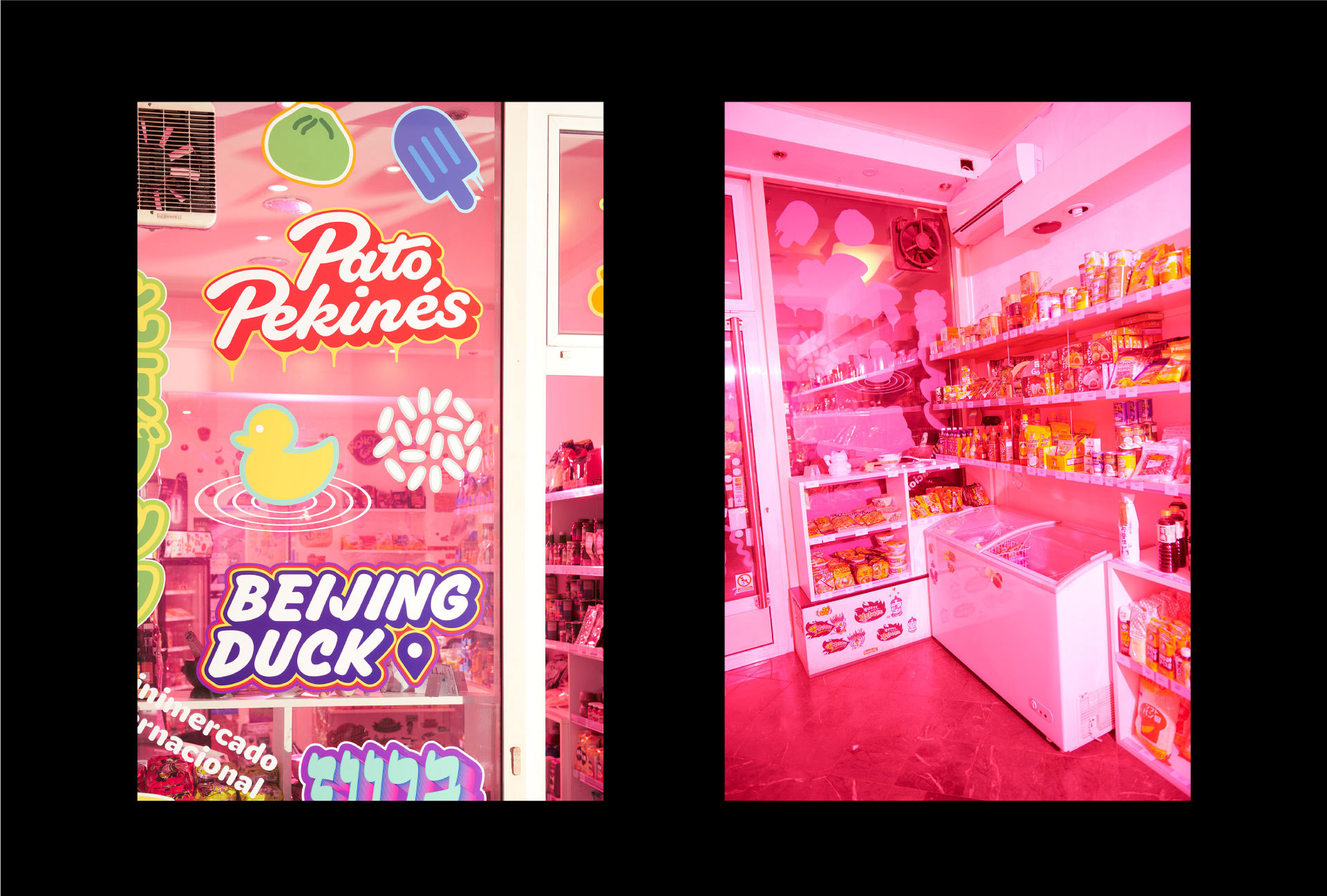
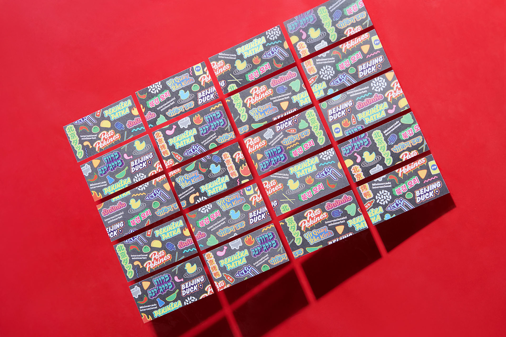
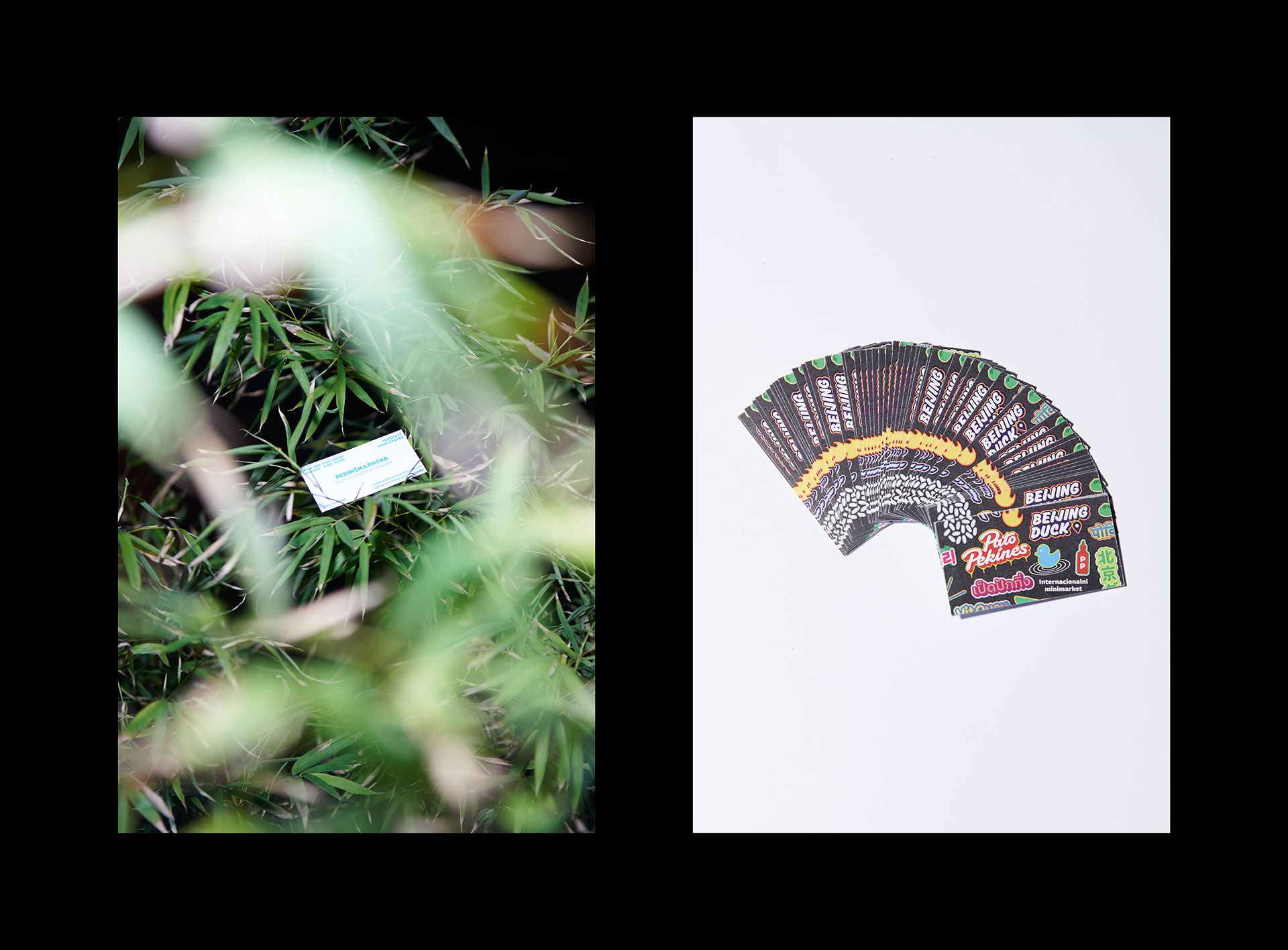
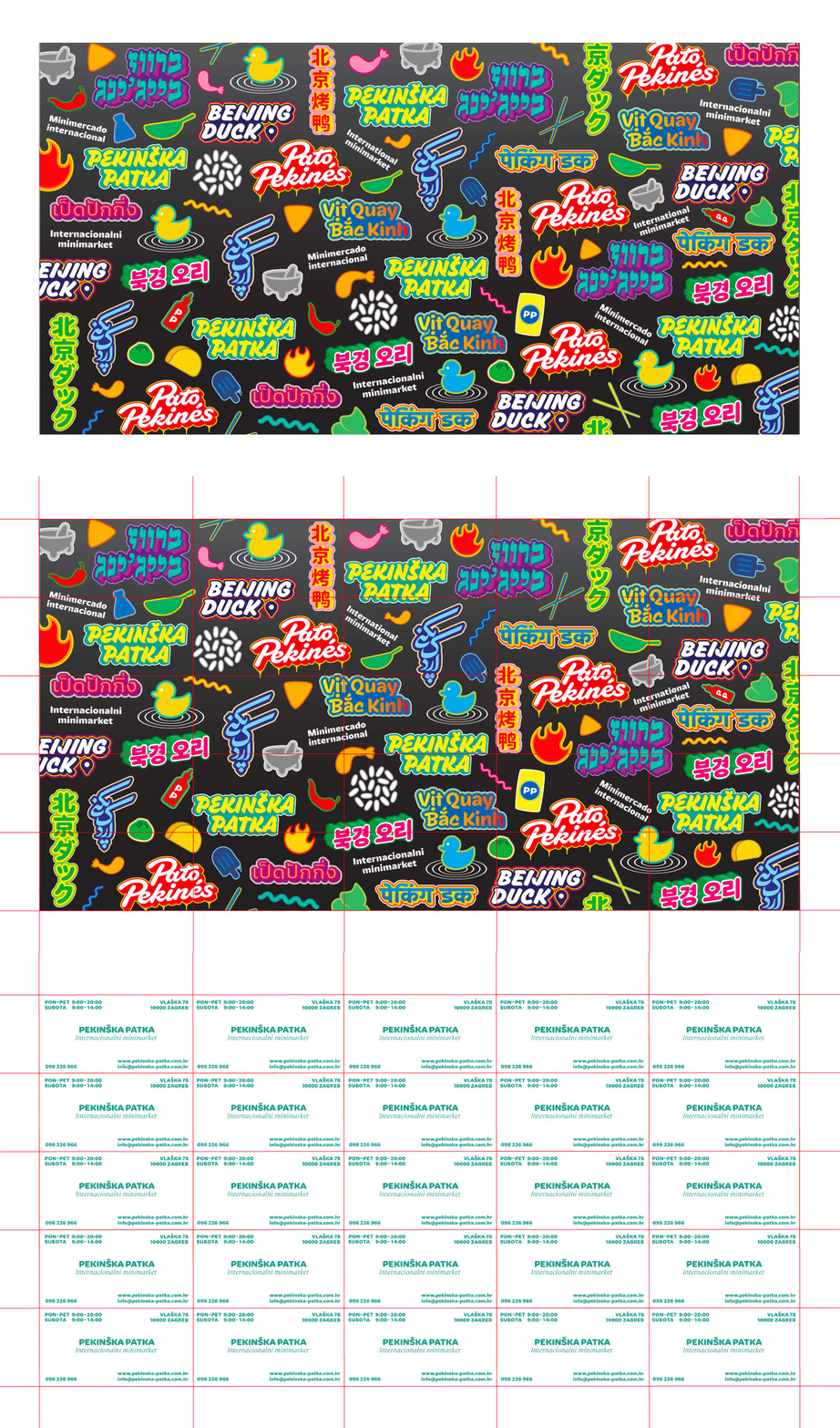
Such pattern is then for example used as the back side of business cards printing sheet - when cards are cut into format, back side of each card has a random, always unique pattern segment. Similar approach is used for other printed applications when possible. Following the same design principle of more is more, shop front windows are considered as a canvas where similar pattern is recreated.
Credits & details
Bahman Eslami (Farsi logotype)
Daniel Grumer(Hebrew logotype)
Tezzo Suzuki (help with Japanese logotype)
Shiva Nallaperumal (help with Devanagari logotype)
PS Z (Photography)
