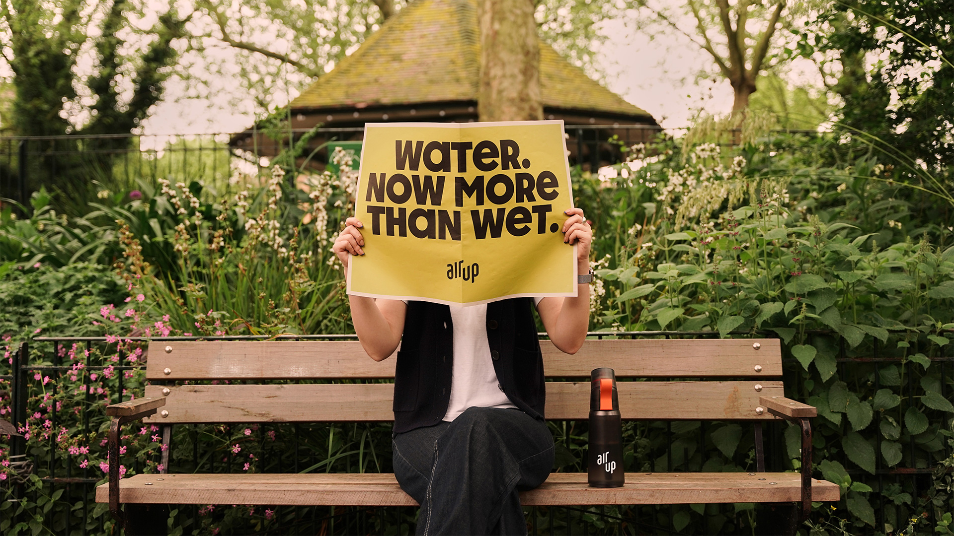
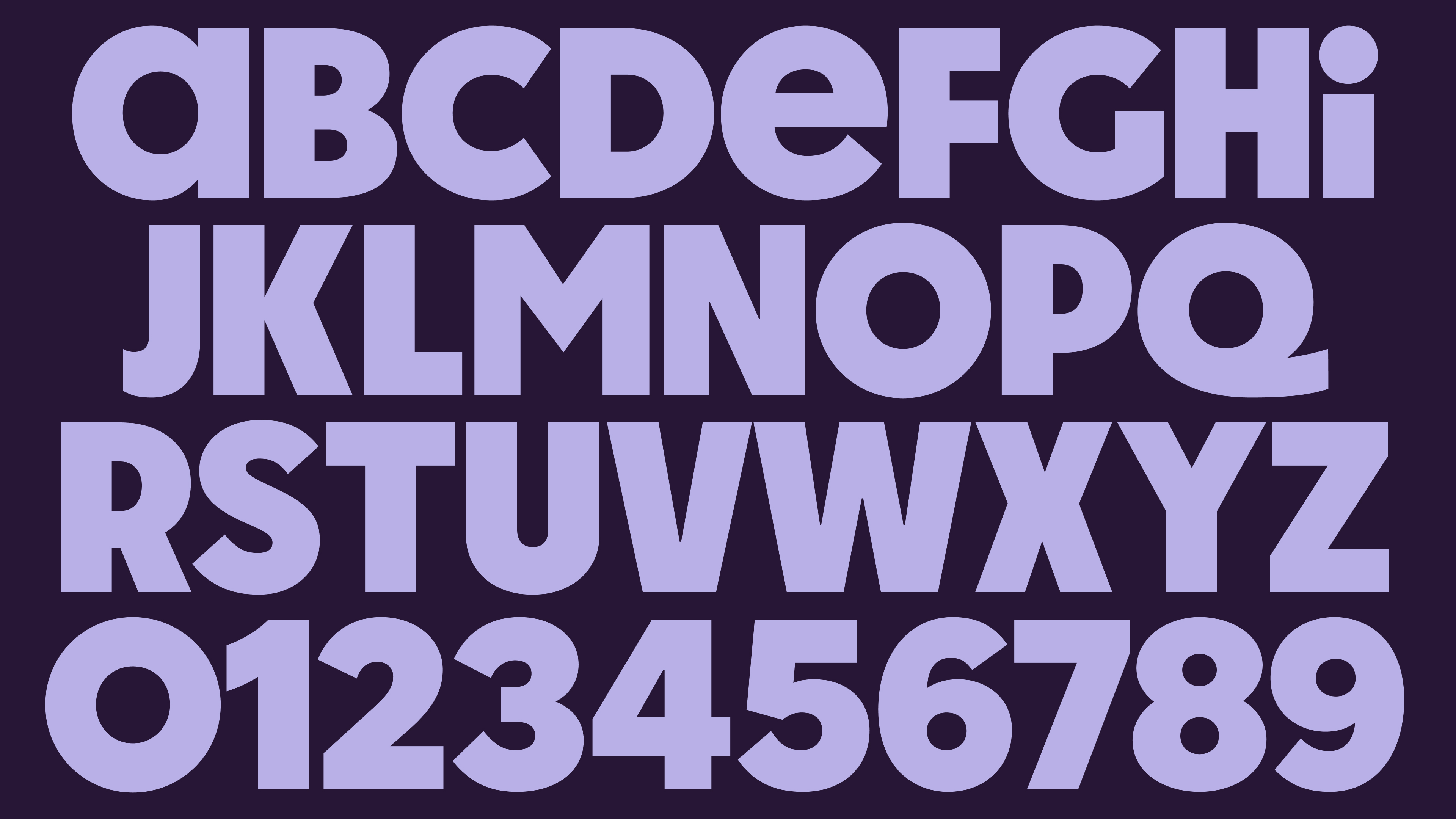
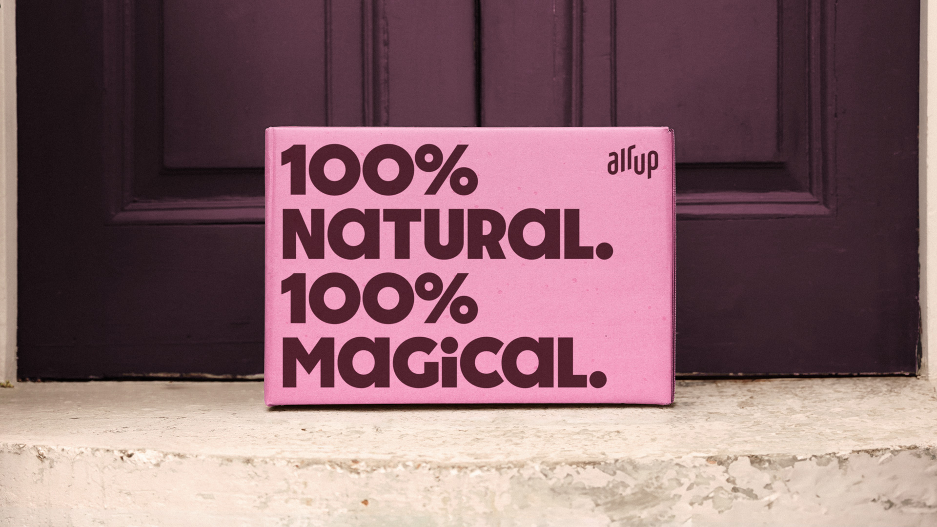
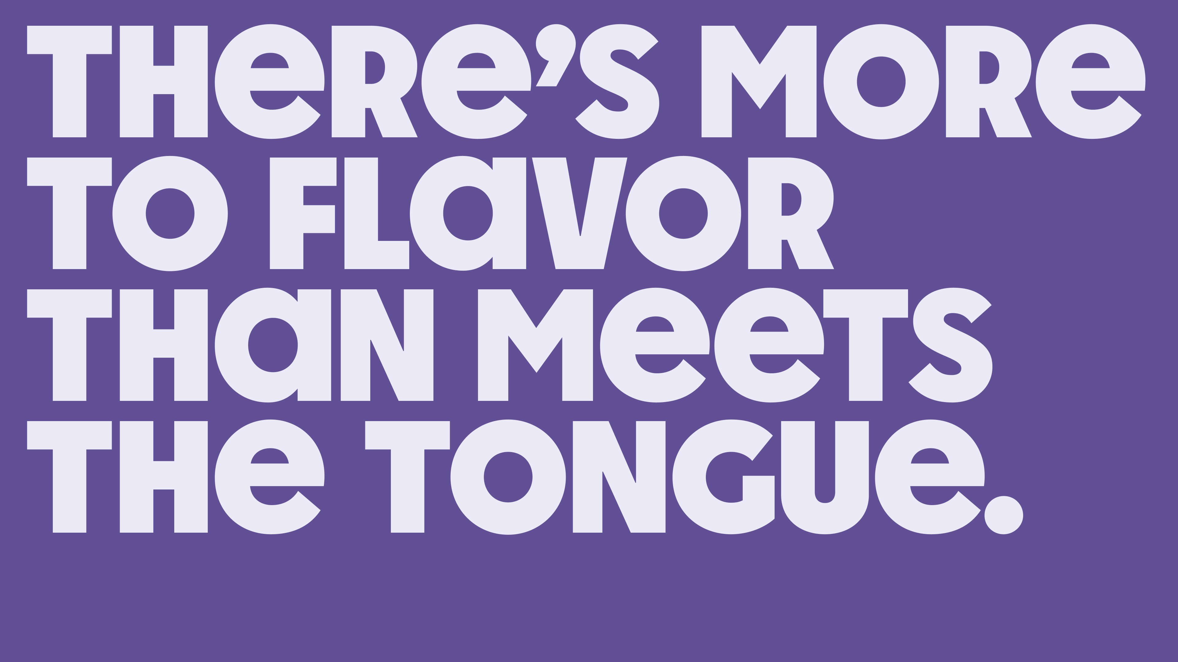
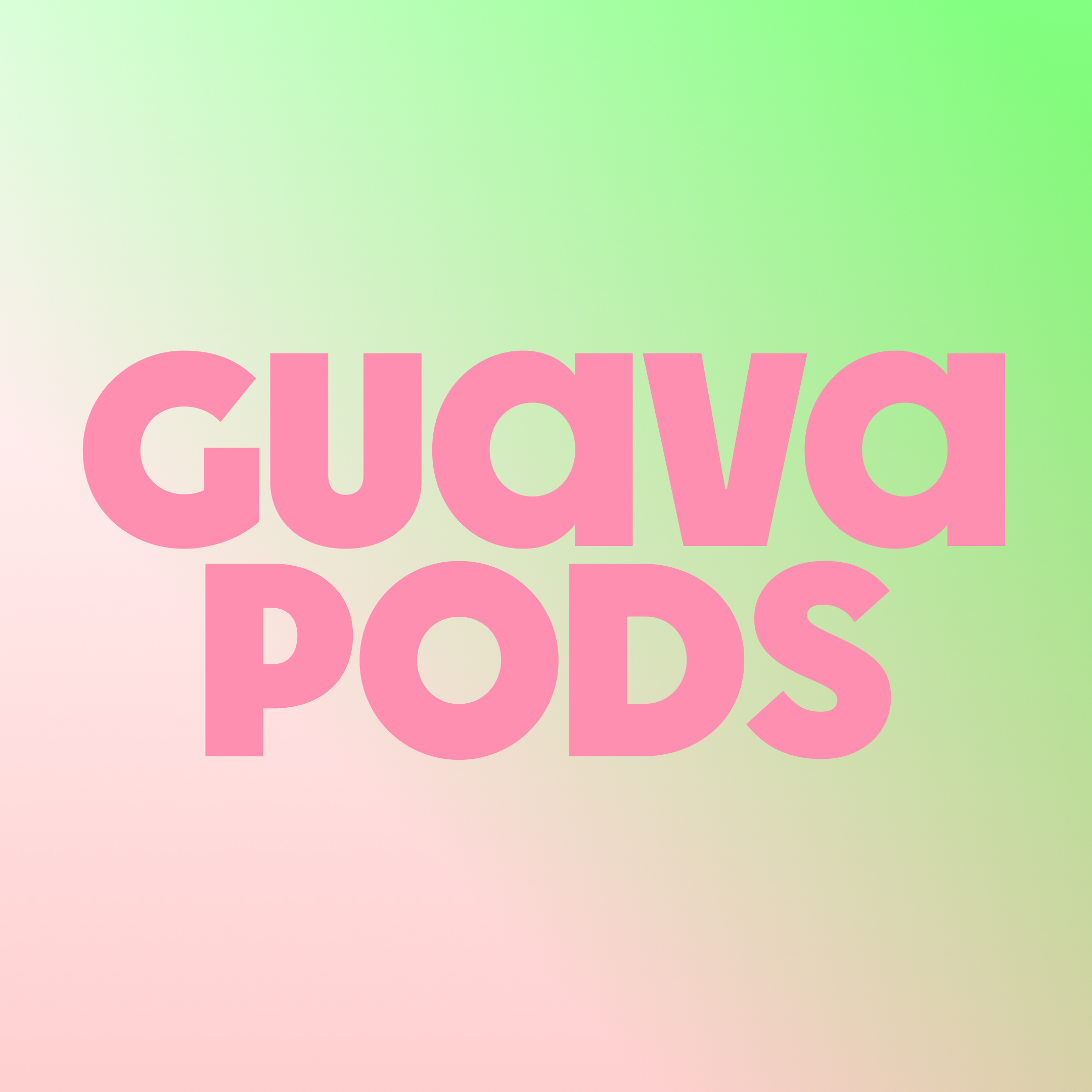
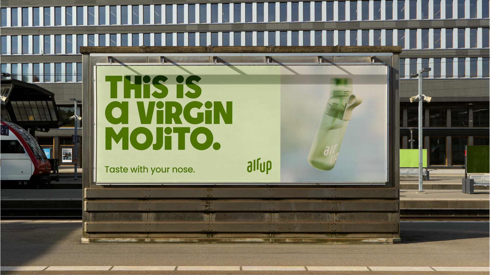
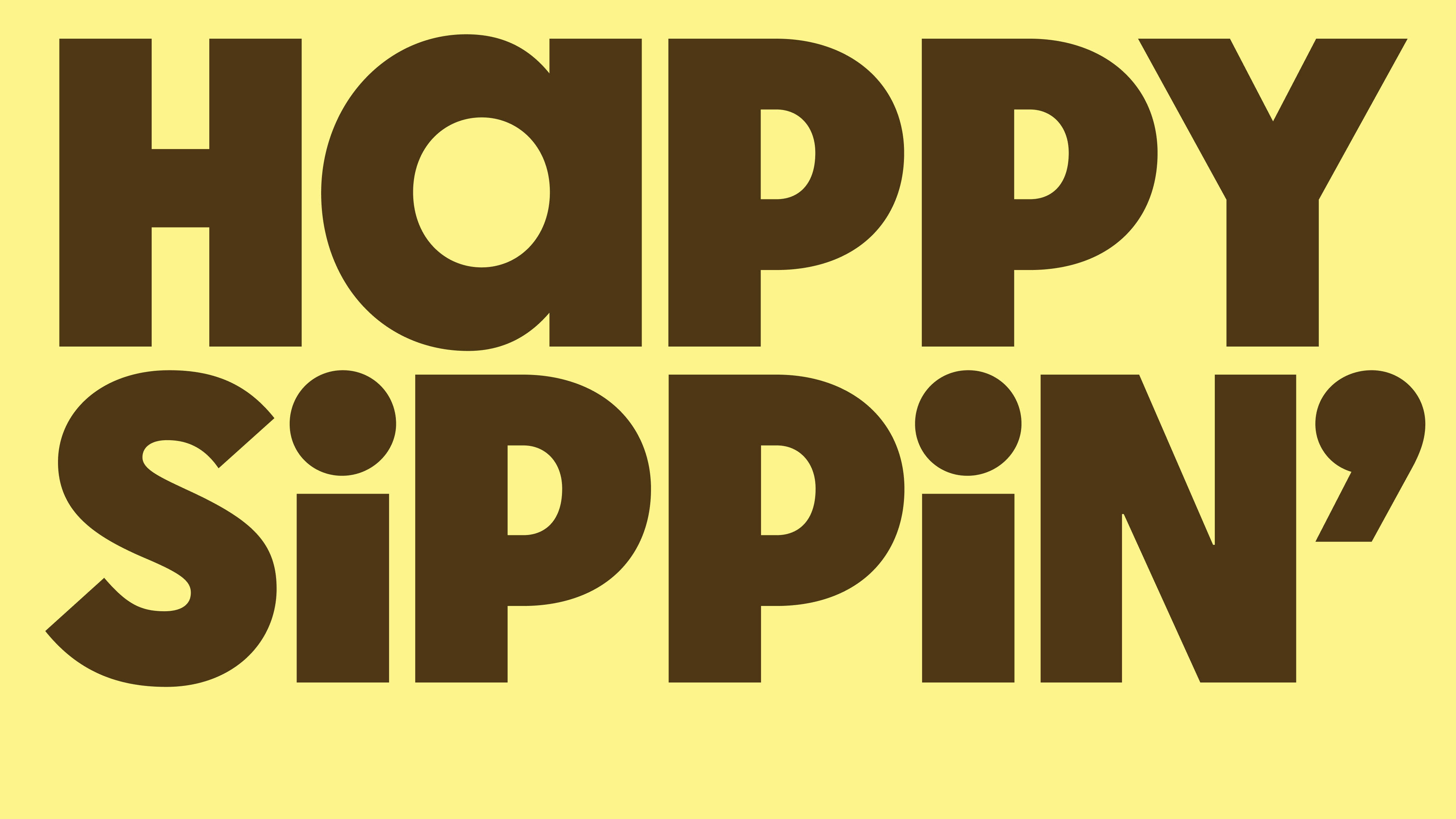
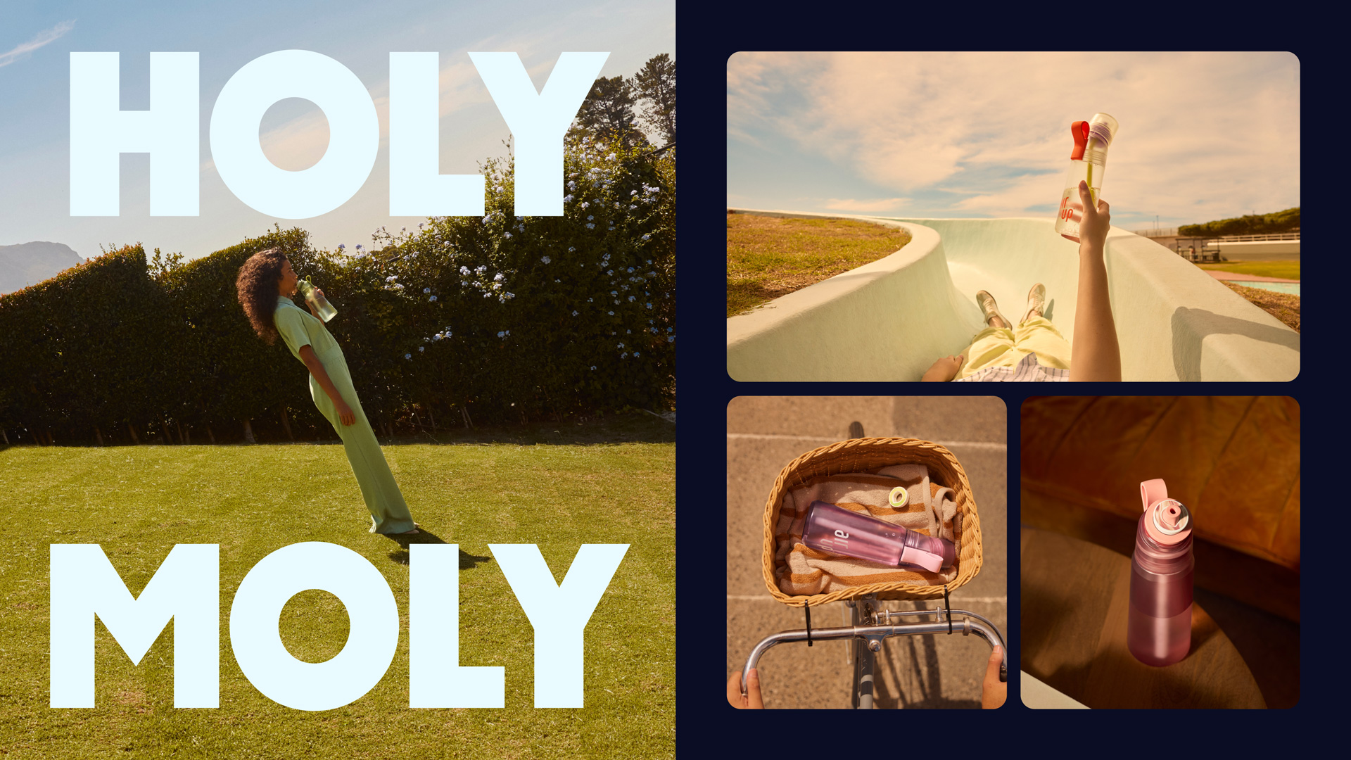
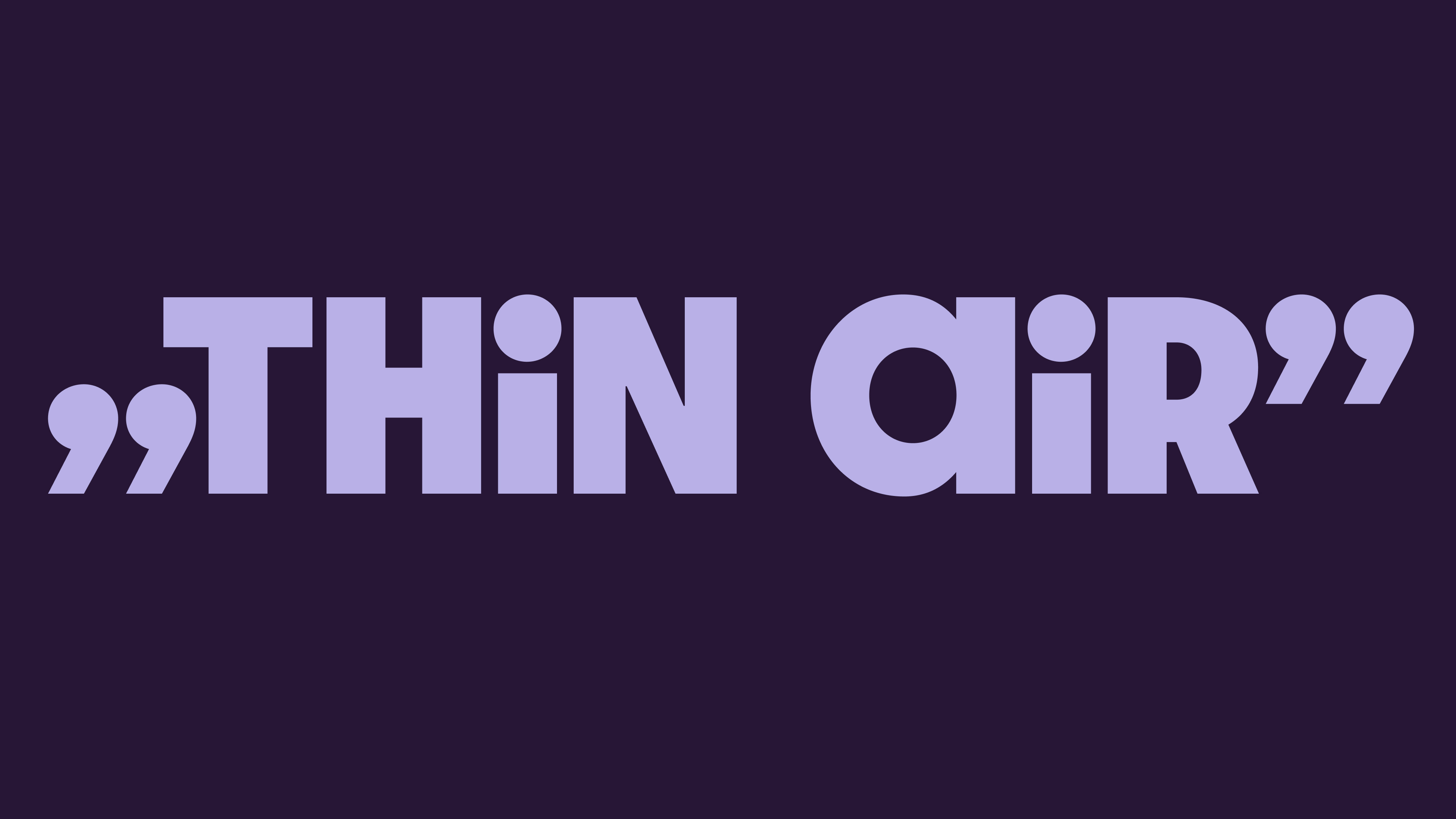
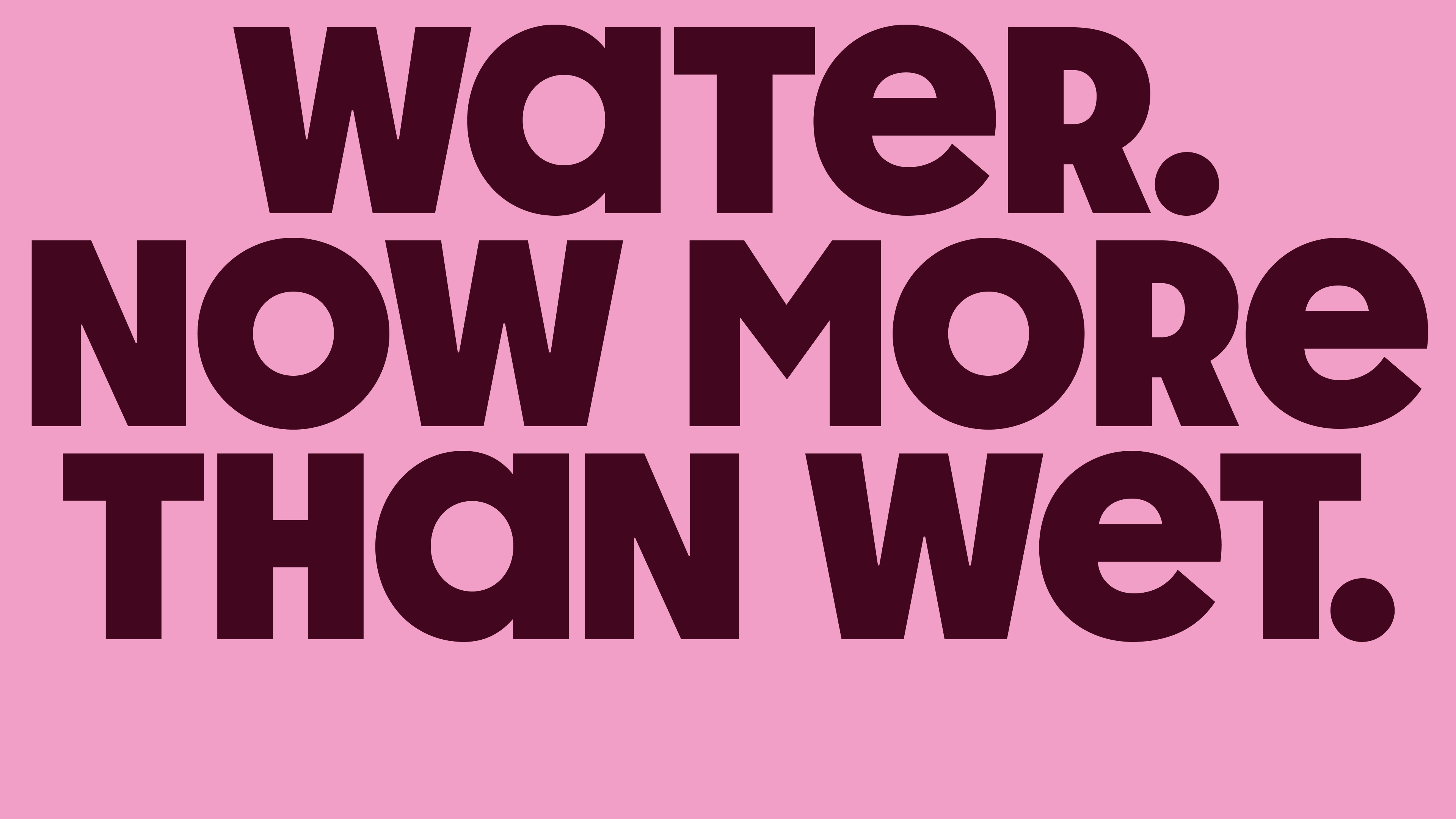
Design of shapes is based on a geometric model, while horizontal proportions follow humanist skeleton, allowing letter widths to create harmonious rhythm. Main style used for branding is Air Up Display, characterized by lowercase shape appearance for vowels. This feature brings in warmth and approachability that sets the tone for entire brand communication.
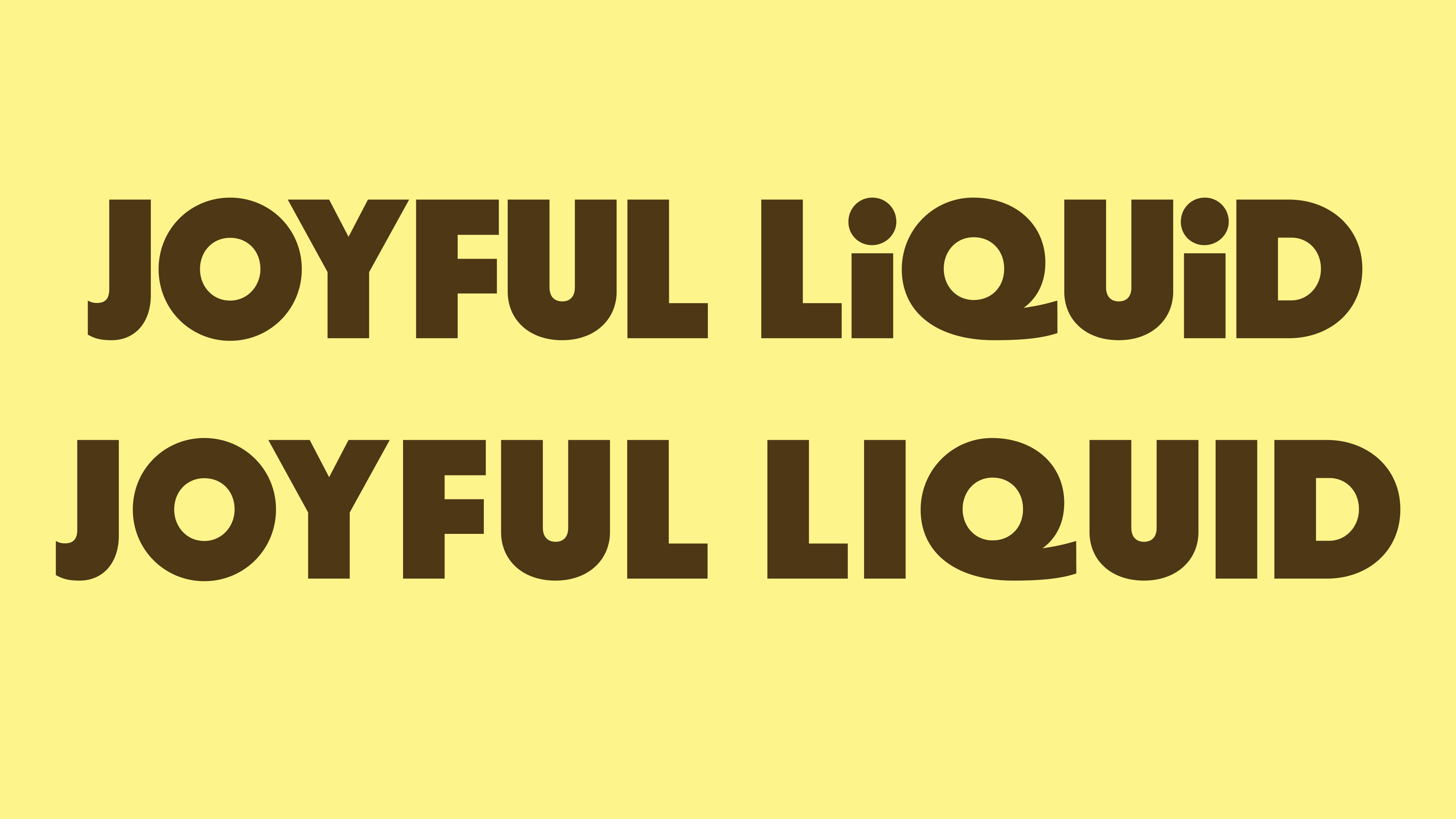
On the other hand, Air Up Bold is the mature member of the family, with grown up full uppercase set and looser spacing to accomodate smaller size application it aims at. As both styles share proportions, it still resonates as the signature Air Up aesthetic even without the joyful features.
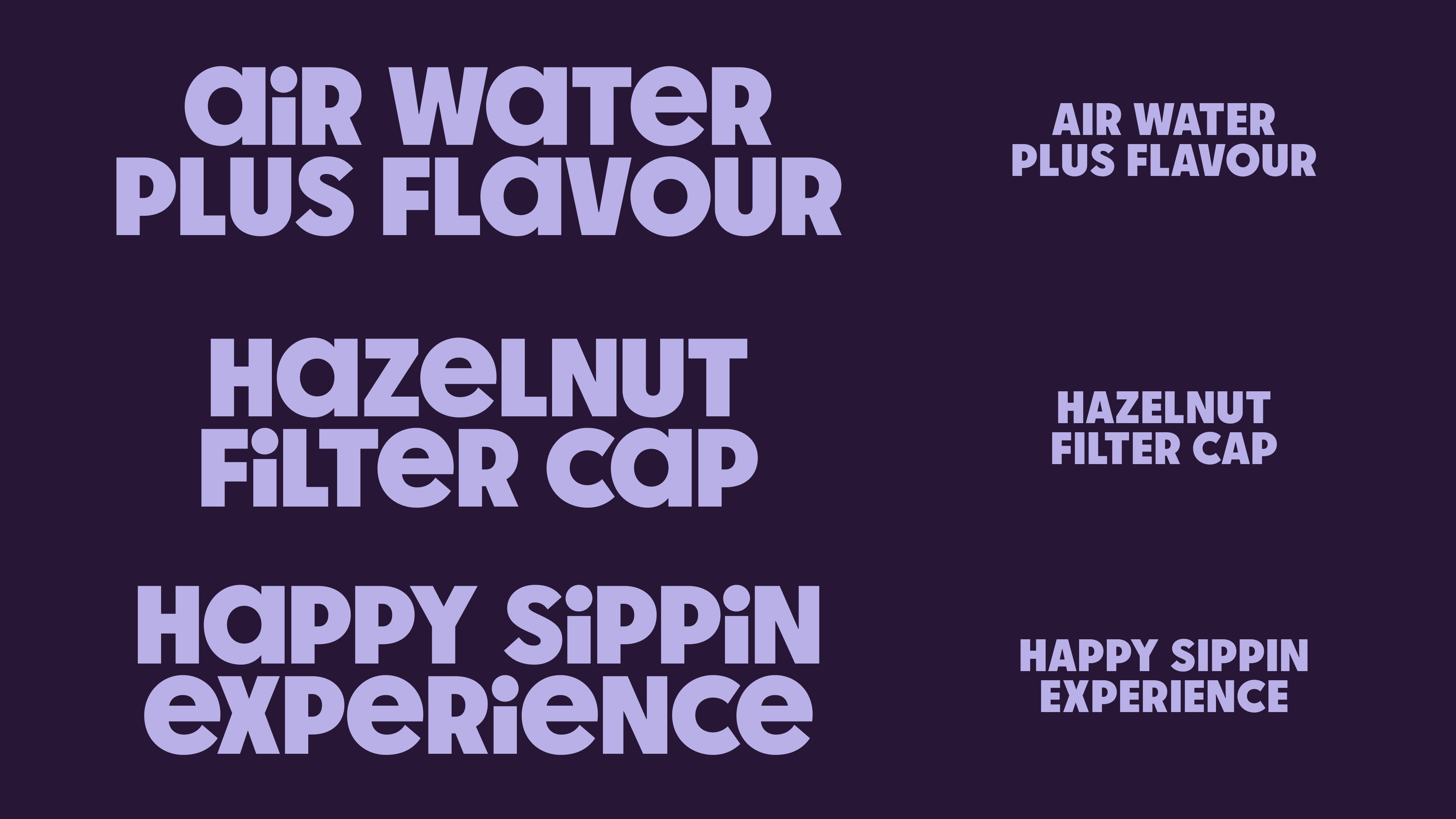
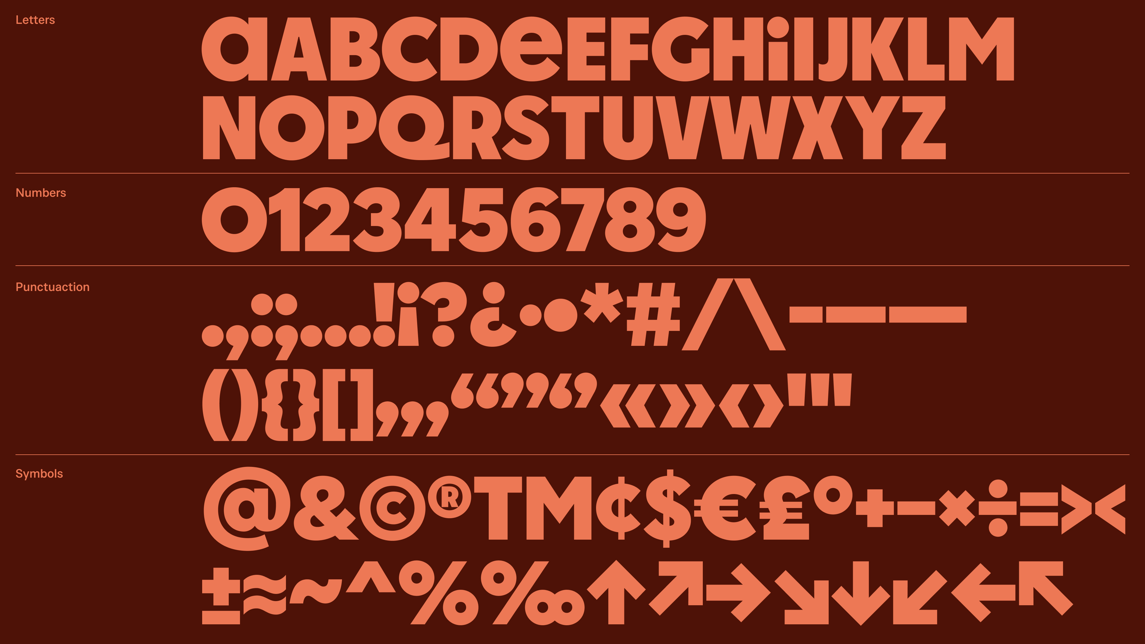
Character set covers numbers, punctuation and symbols, all designed to seamlessly blend with the bubbly geometry of the letters.

Credits & details
air up (client)
Nima Akbari, Brand Creative Director
Toma Perret, Head of Global Brand Strategy
Mother Design (branding)
Harry Edmonds, Creative Director
Issey Conway, Design Director
Ethan Hodson, Designer
Iain Acton, Motion Director
Hot Type (type design)
Marko Hrastovec, Type Designer
