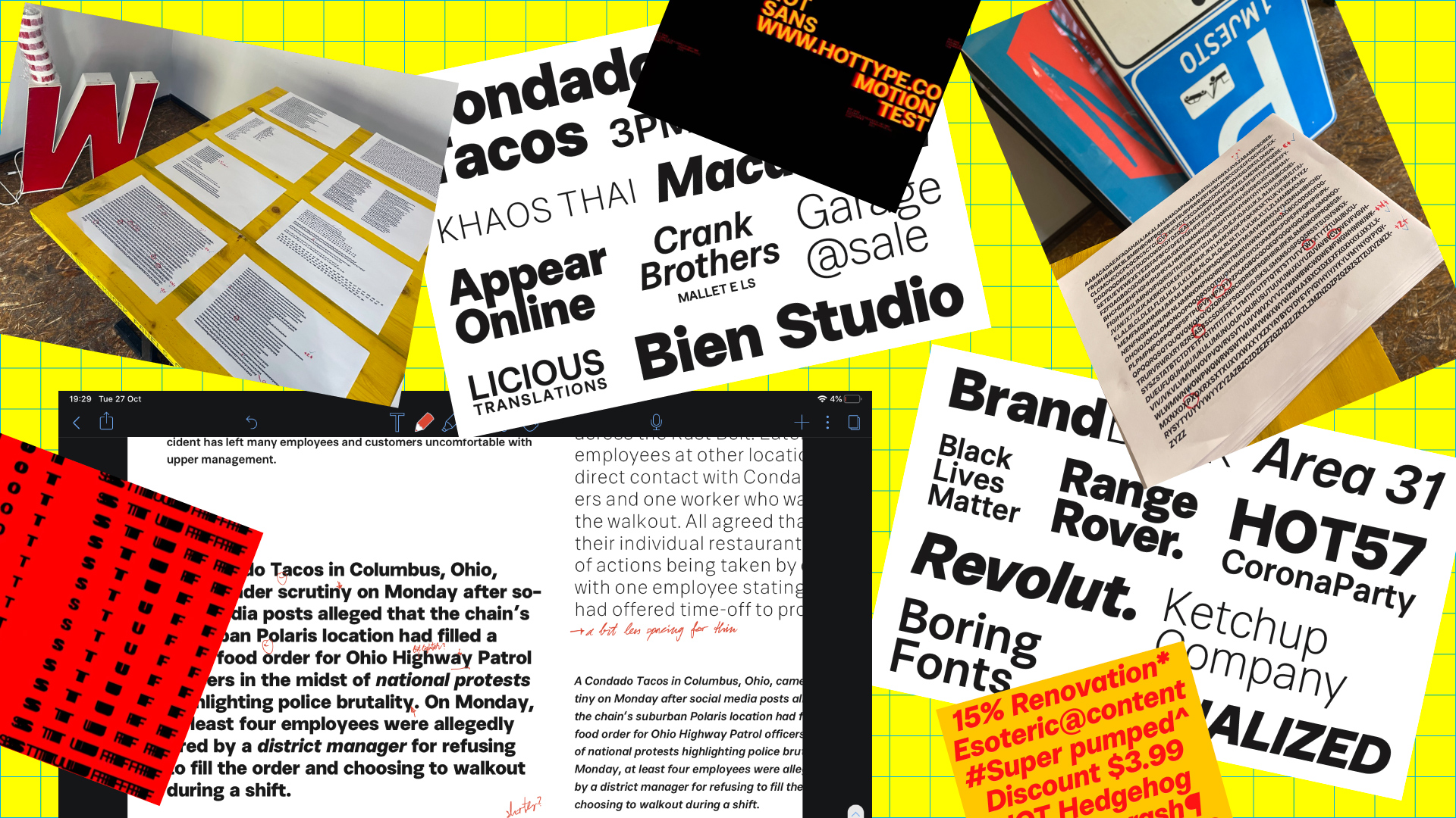
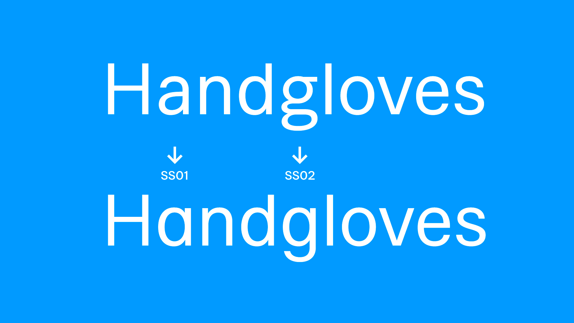
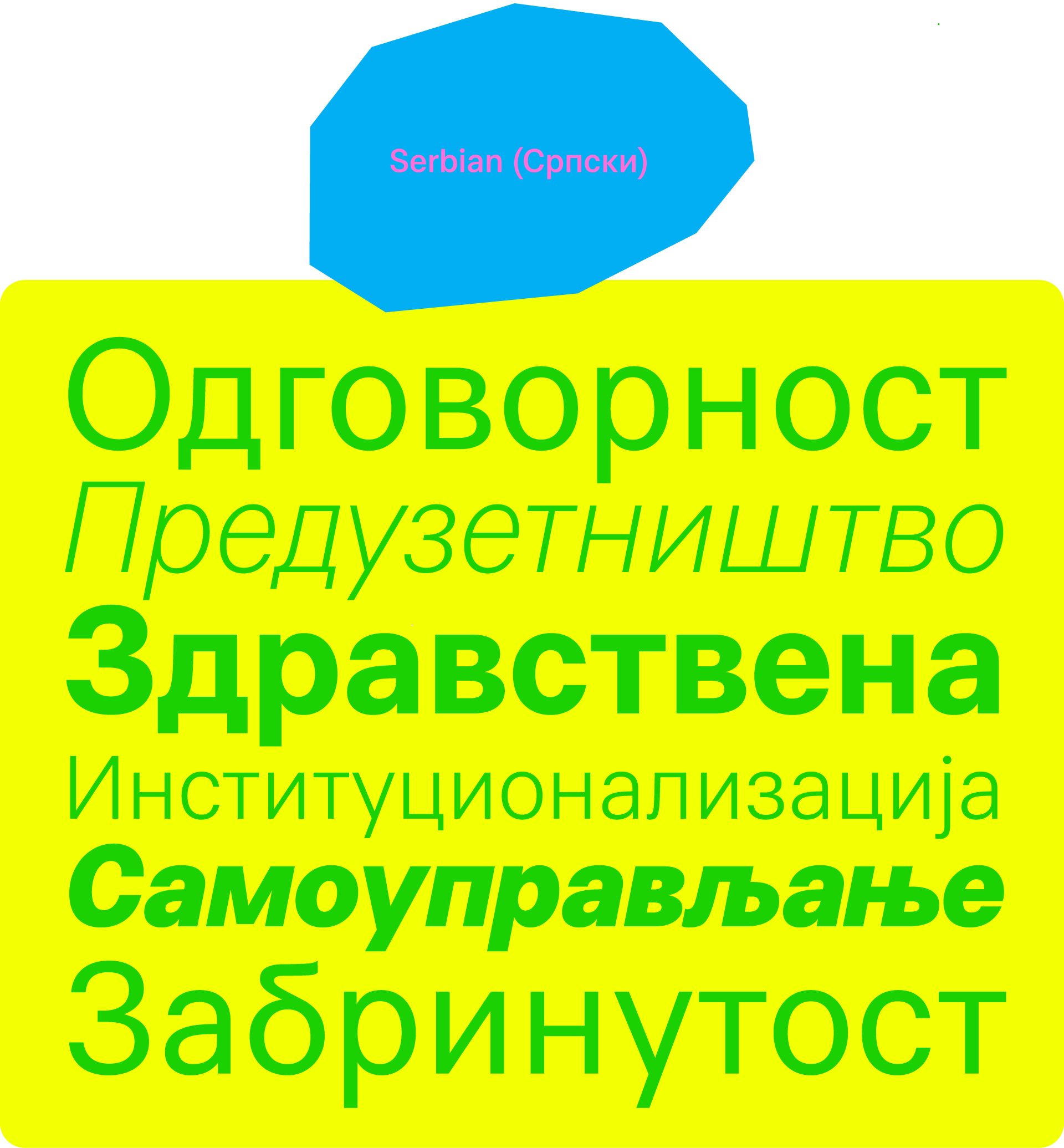
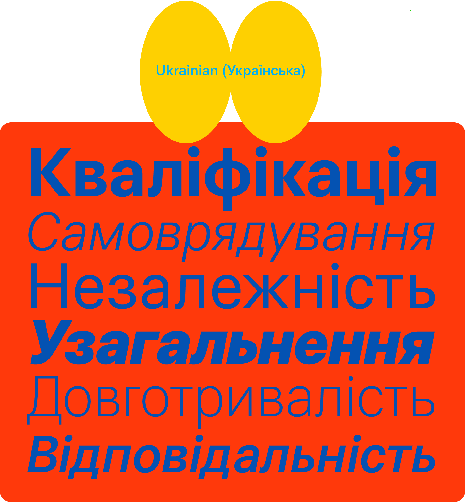
Hot Sans is a typeface family that handles straightforward communication with ease. It is rational by choice, loosened up just enough with couple humanist touches. It balances between geometric sans and grotesque shapes, a blend of flavours that two genres bring to the fore: the warmth of a grotesque, as well as the robustness of geometric shapes.
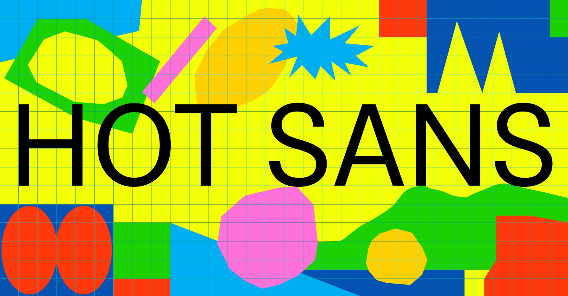
Hot Sans
12 Styles
€70.00 Single style
/ €840.00 Complete
FONTS
Concept
LOADING
HotSansVF:n1
HotSansVF Thin
HotSansVF Thin
HotSansVF Thin
HotSansVF Thin
HotSansVF Thin
HotSansVF Thin
HotSansVF Thin
HotSansVF Thin
HotSansVF Thin
HotSansVF Thin
HotSansVF Thin
HotSansVF Thin
Buy Hot Sans
Packages
Hot Sans complete family
50% OFF
€840.00
€420.00
Add to Cart
Added
Hot Sans CYR complete family
50% OFF
€1,080.00
€540.00
Add to Cart
Added
Single styles
Hot Sans Thin
€70.00
Add to Cart
Added
Hot Sans Thin Italic
€70.00
Add to Cart
Added
Hot Sans Light
€70.00
Add to Cart
Added
Hot Sans Light Italic
€70.00
Add to Cart
Added
Hot Sans Regular
€70.00
Add to Cart
Added
Hot Sans Italic
€70.00
Add to Cart
Added
Hot Sans Medium
€70.00
Add to Cart
Added
Hot Sans Medium Italic
€70.00
Add to Cart
Added
Hot Sans Bold
€70.00
Add to Cart
Added
Hot Sans Bold Italic
€70.00
Add to Cart
Added
Hot Sans Black
€70.00
Add to Cart
Added
Hot Sans Black Italic
€70.00
Add to Cart
Added
Hot Sans CYR Thin
€90.00
Add to Cart
Added
Hot Sans CYR Thin Italic
€90.00
Add to Cart
Added
Hot Sans CYR Light
€90.00
Add to Cart
Added
Hot Sans CYR Light Italic
€90.00
Add to Cart
Added
Hot Sans CYR Regular
€90.00
Add to Cart
Added
Hot Sans CYR Italic
€90.00
Add to Cart
Added
Hot Sans CYR Medium
€90.00
Add to Cart
Added
Hot Sans CYR Medium Italic
€90.00
Add to Cart
Added
Hot Sans CYR Bold
€90.00
Add to Cart
Added
Hot Sans CYR Bold Italic
€90.00
Add to Cart
Added
Hot Sans CYR Black
€90.00
Add to Cart
Added
Hot Sans CYR Black Italic
€90.00
Add to Cart
Added
Cijena ne uključuje PDV.
Prices shown without VAT.