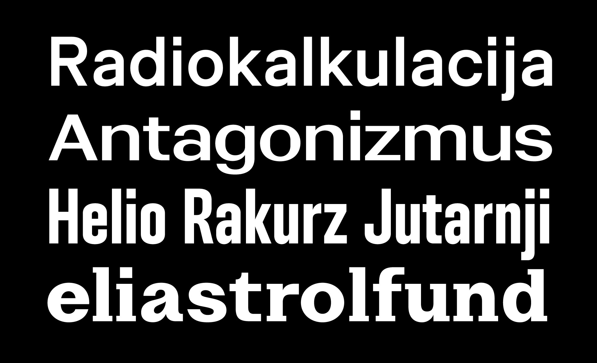
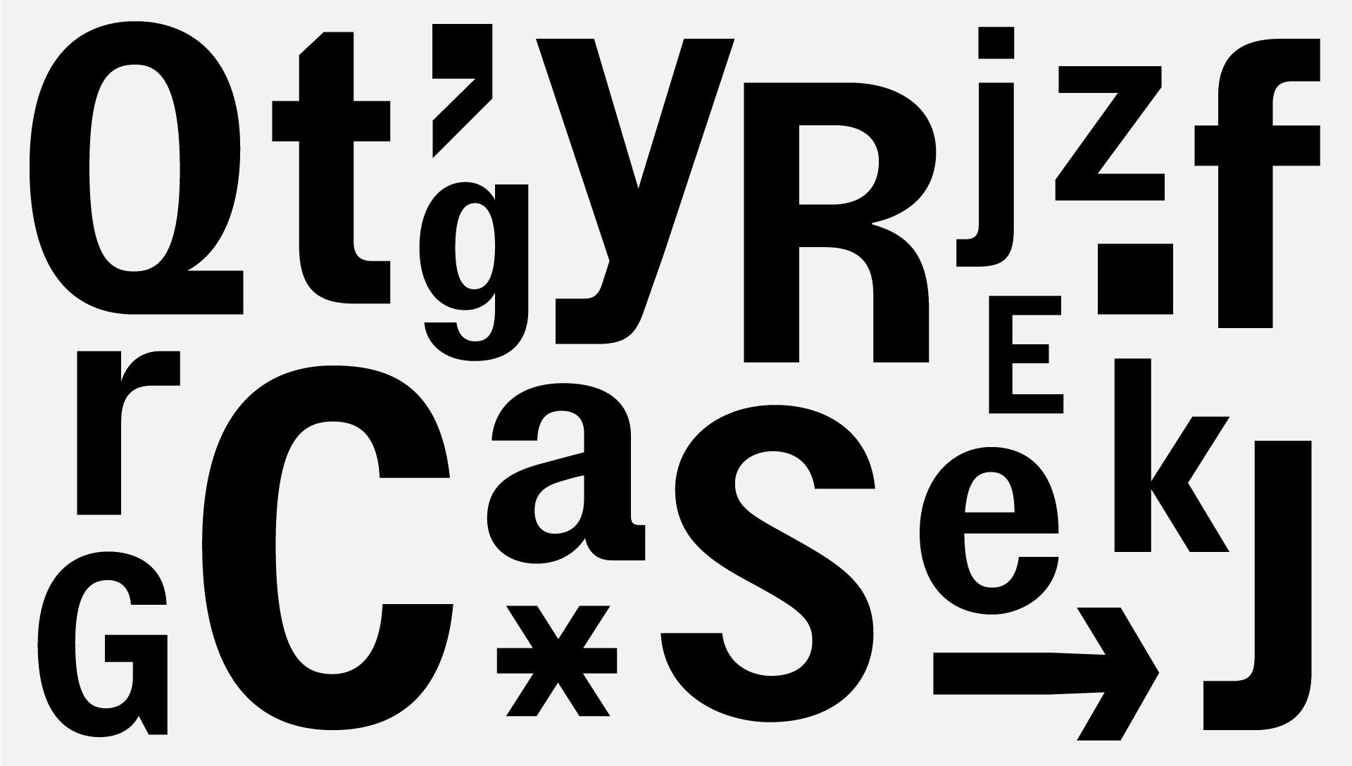
Stroy Mono is a monospaced family relative of Stroy Grotesk. It's precise termination cuts, machined curves and uniform spacing bring out heavy raw looks. Stroy Mono will get you covered from tiny captions to striking headlines with same ease of existence. Style range spans from Thin to Black, complimented by corresponding Italics.
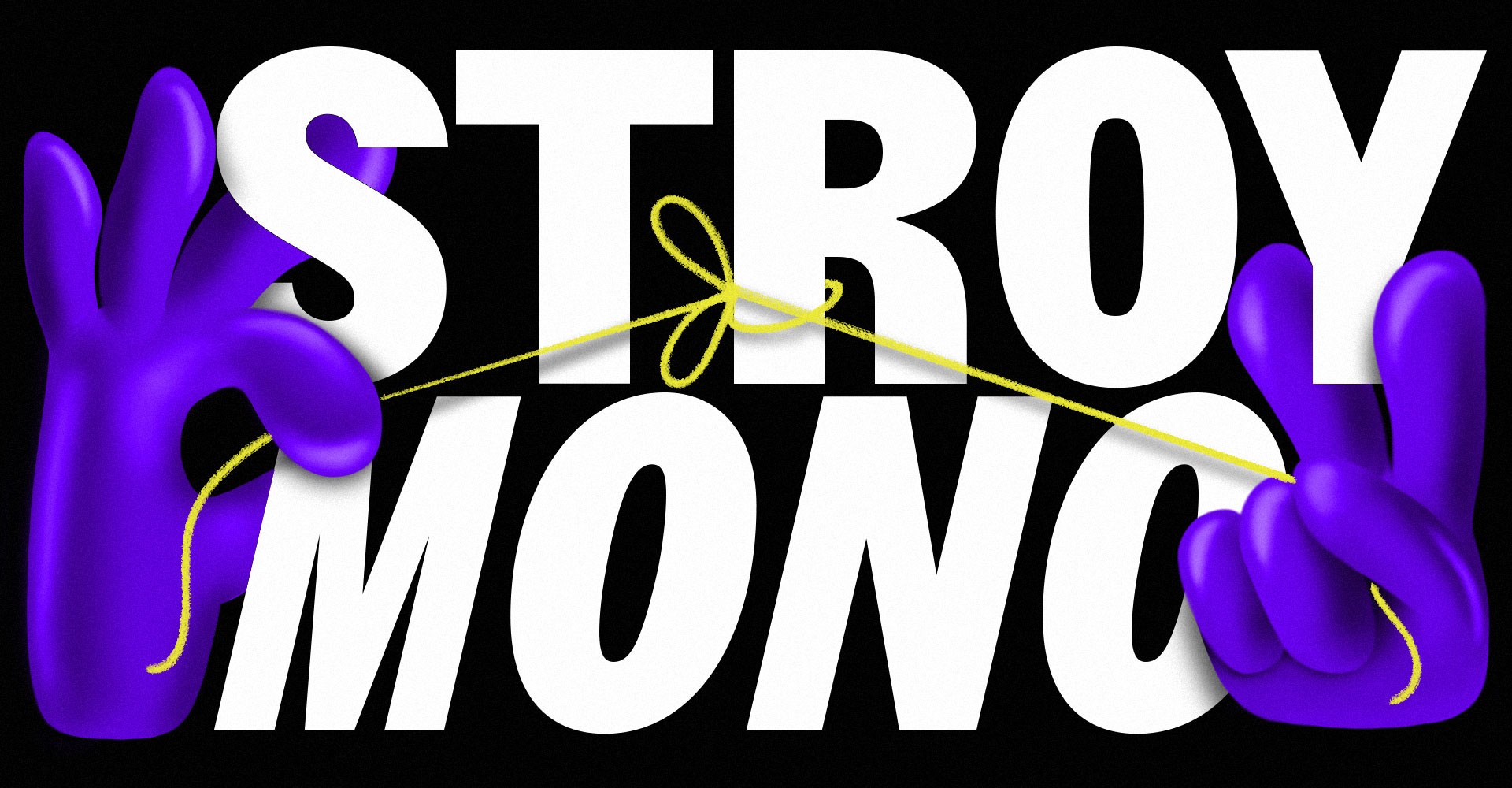
Stroy Mono
12 Styles
€70.00 Single style
/ €840.00 Complete
FONTS
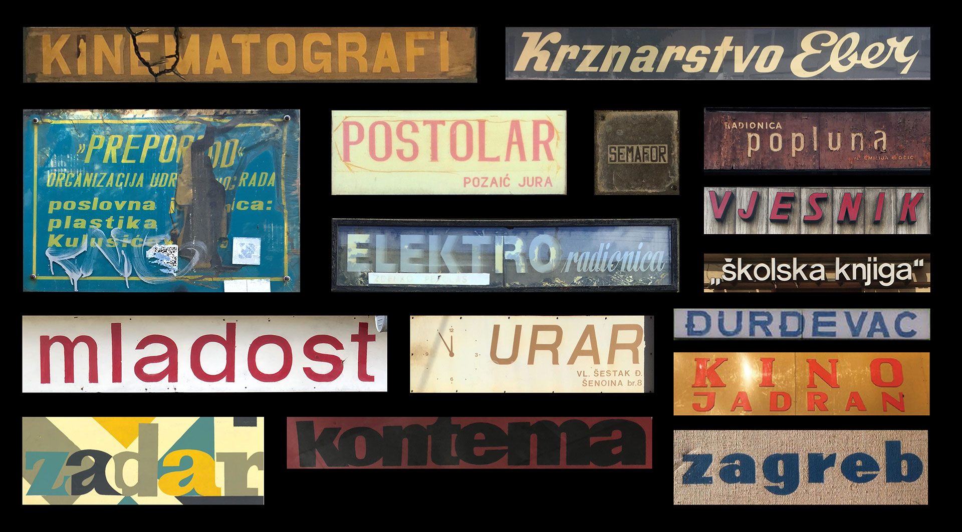
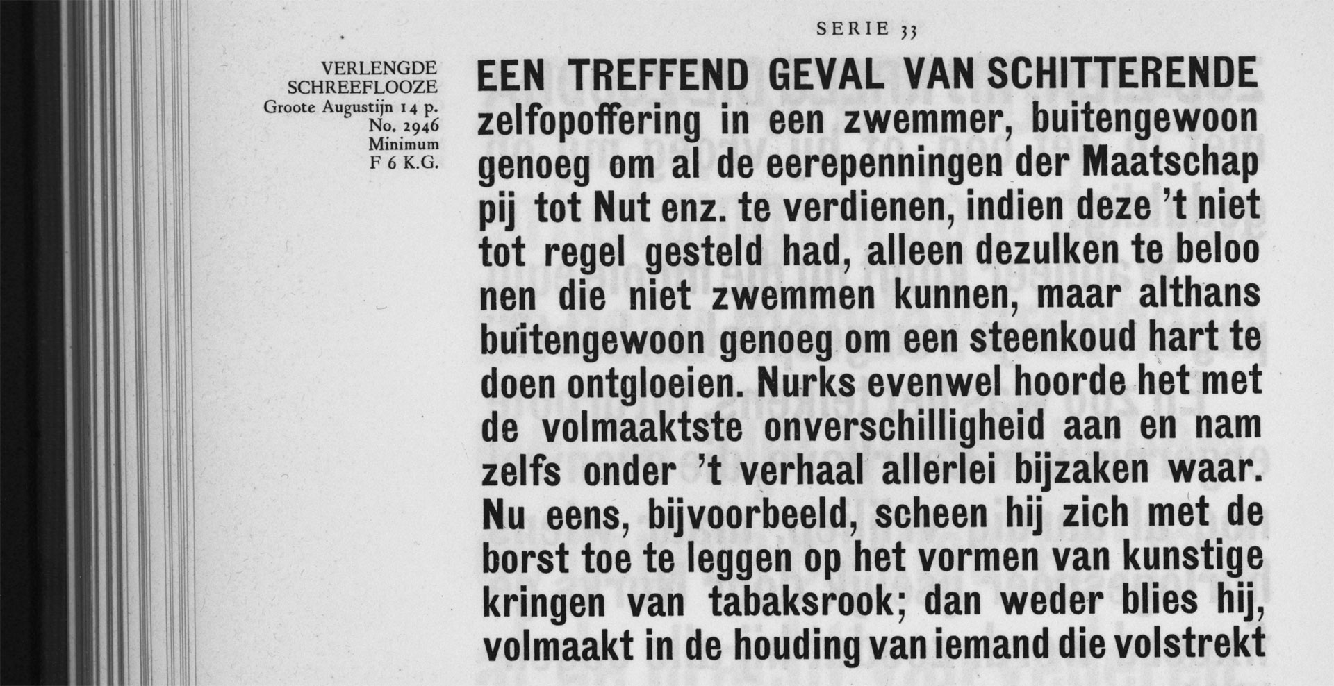
Concept
LOADING
Stroy Mono Thin
Stroy Mono Thin Italic
Stroy Mono Light
Stroy Mono Light Italic
Stroy Mono Regular
Stroy Mono Regular Italic
Stroy Mono Medium
Stroy Mono Medium Italic
Stroy Mono Bold
Stroy Mono Bold Italic
Stroy Mono Black
Stroy Mono Black Italic
Buy Stroy Mono
Packages
Stroy Mono complete family
30% OFF
€840.00
€588.00
Add to Cart
Added
Single styles
Stroy Mono Thin
€70.00
Add to Cart
Added
Stroy Mono Thin Italic
€70.00
Add to Cart
Added
Stroy Mono Light
€70.00
Add to Cart
Added
Stroy Mono Light Italic
€70.00
Add to Cart
Added
Stroy Mono Regular
€70.00
Add to Cart
Added
Stroy Mono Regular Italic
€70.00
Add to Cart
Added
Stroy Mono Medium
€70.00
Add to Cart
Added
Stroy Mono Medium Italic
€70.00
Add to Cart
Added
Stroy Mono Bold
€70.00
Add to Cart
Added
Stroy Mono Bold Italic
€70.00
Add to Cart
Added
Stroy Mono Black
€70.00
Add to Cart
Added
Stroy Mono Black Italic
€70.00
Add to Cart
Added
Cijena ne uključuje PDV.
Prices shown without VAT.