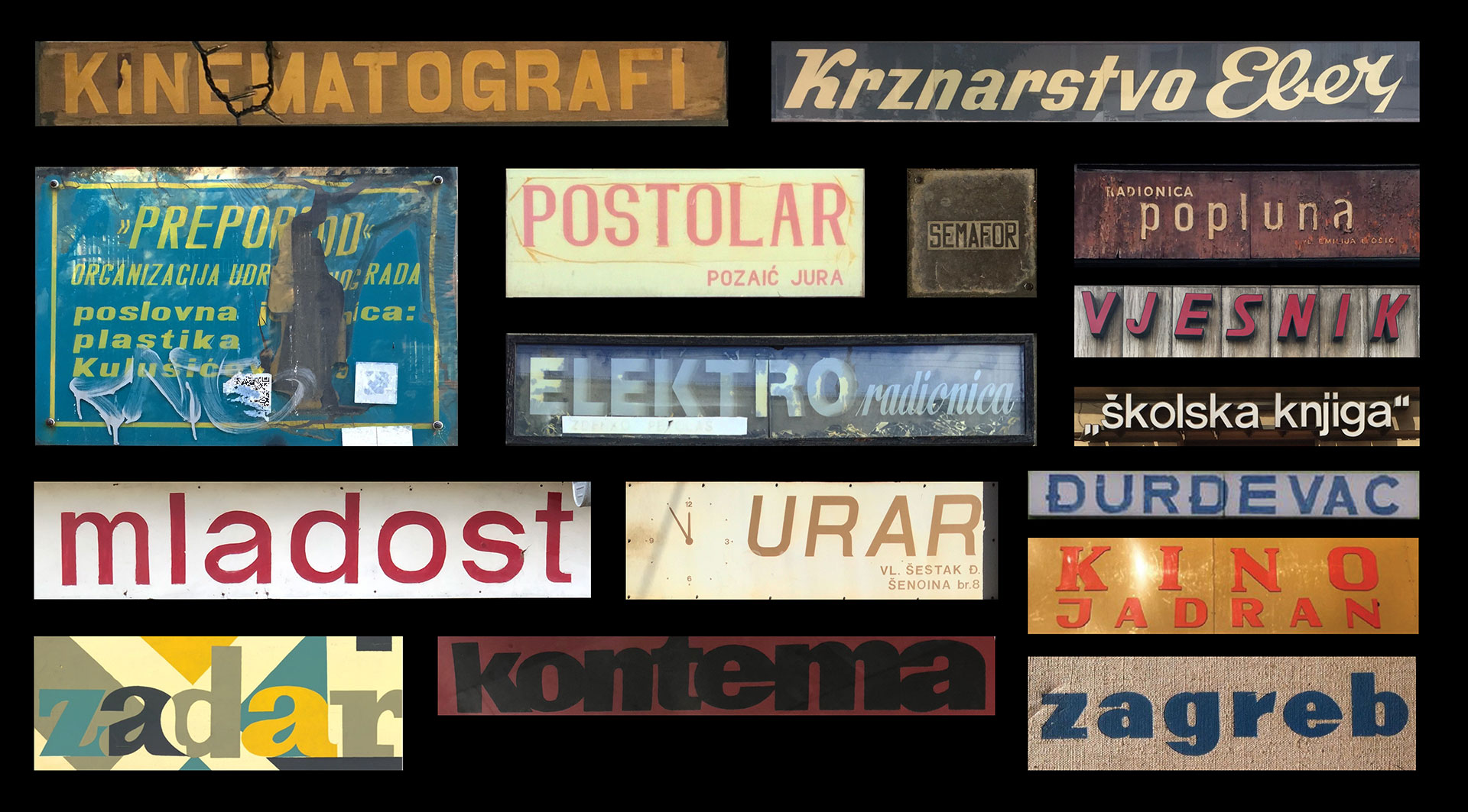
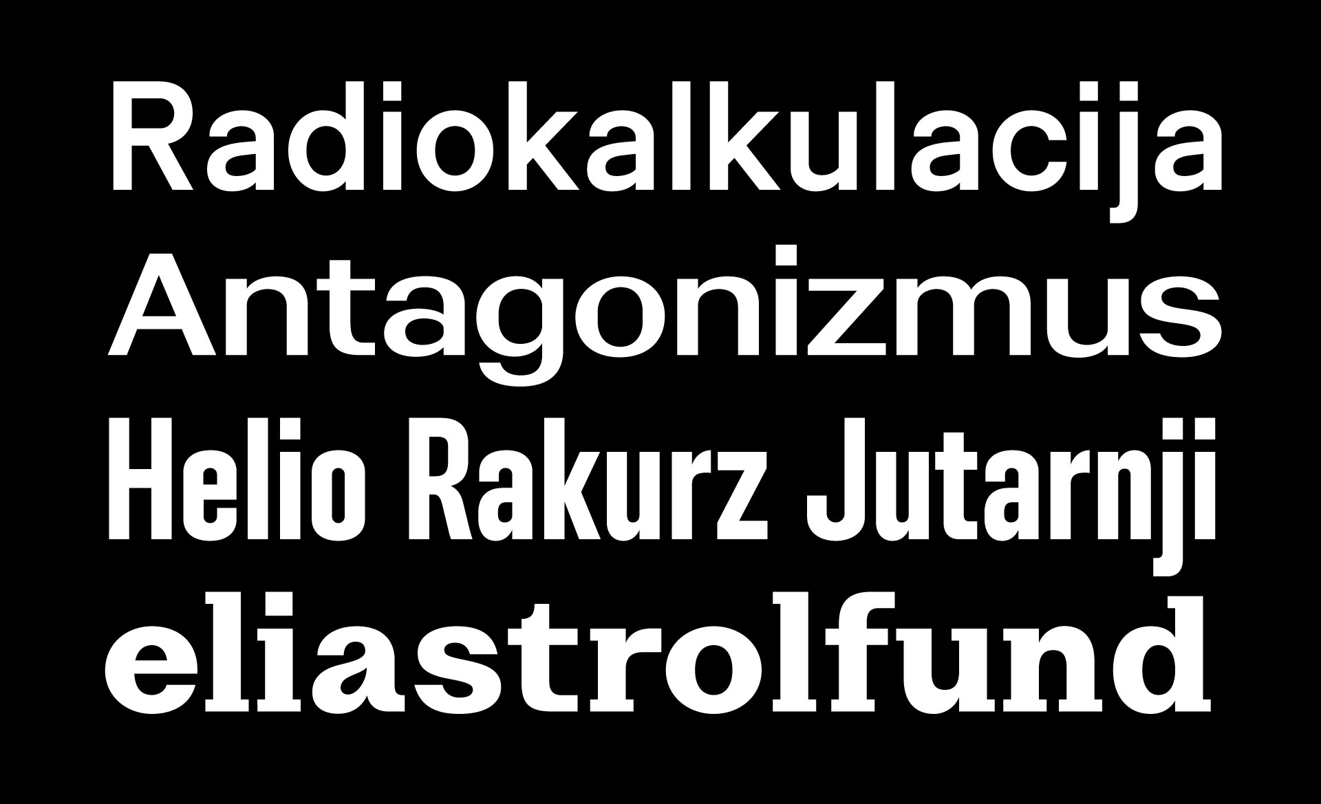
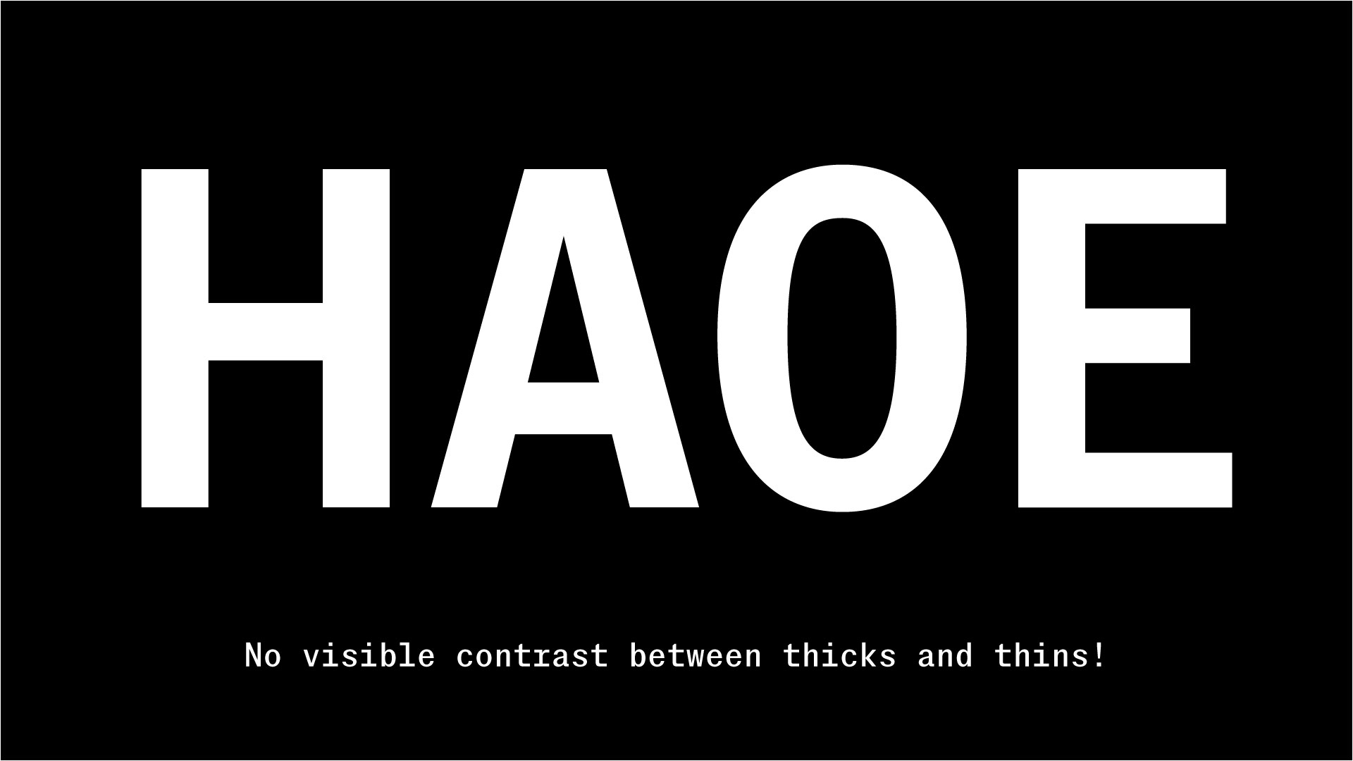
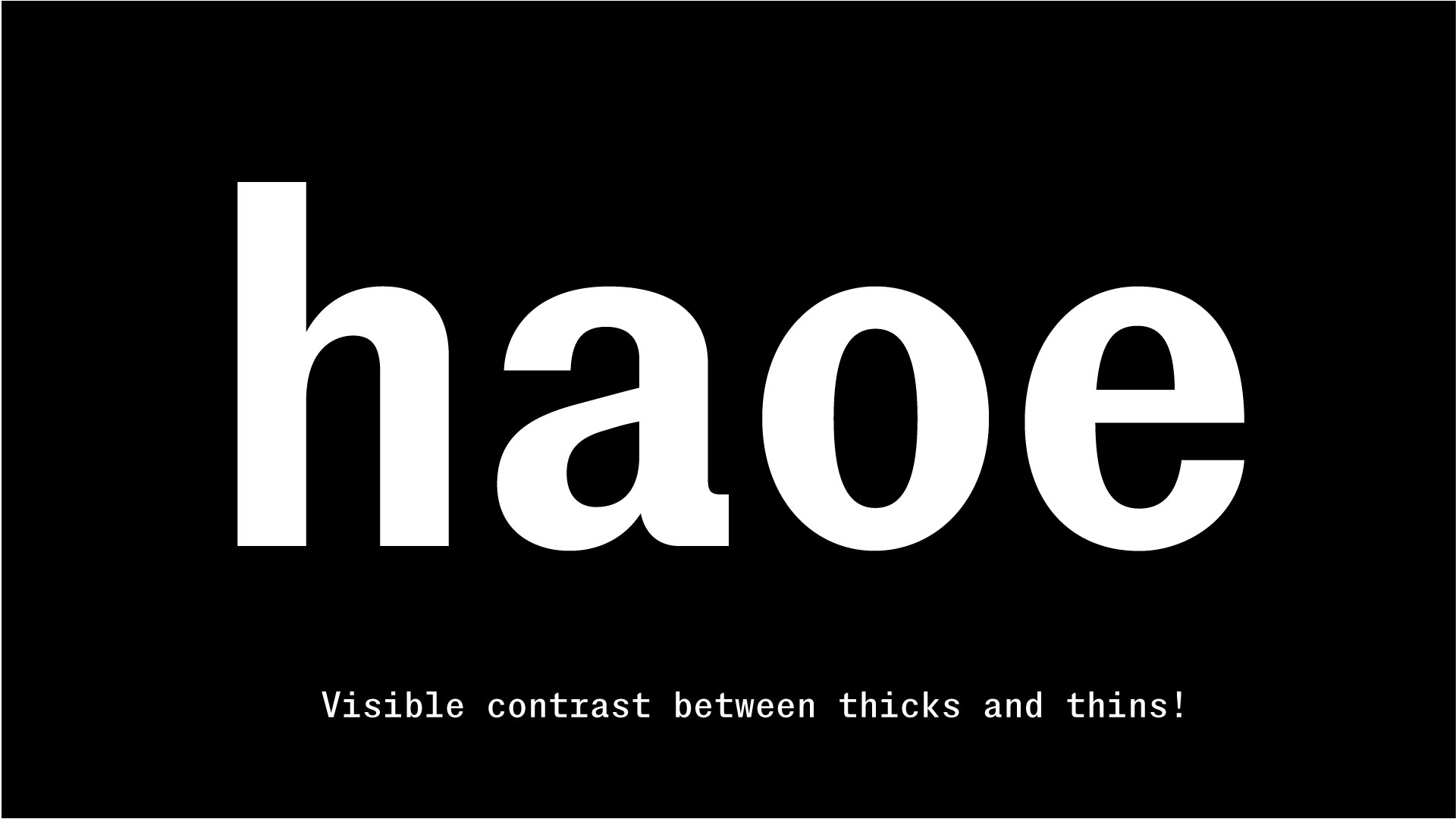
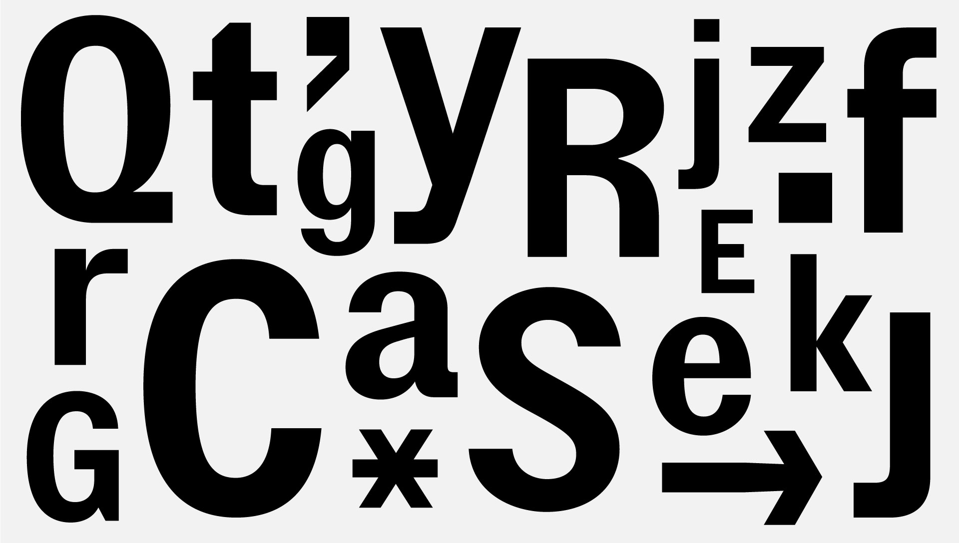
Contemporary interpretation of nostalgia, a grotesque Sans Serif type family, best described through the interplay of contrasting terms—raw and warm. Its overall unrefined feeling is juxtaposed with soft, almost calligraphic upstrokes that connect stems. Stroy Grotesk is a great performer, no matter the size—the bigger it gets, the more of its character will pop out.
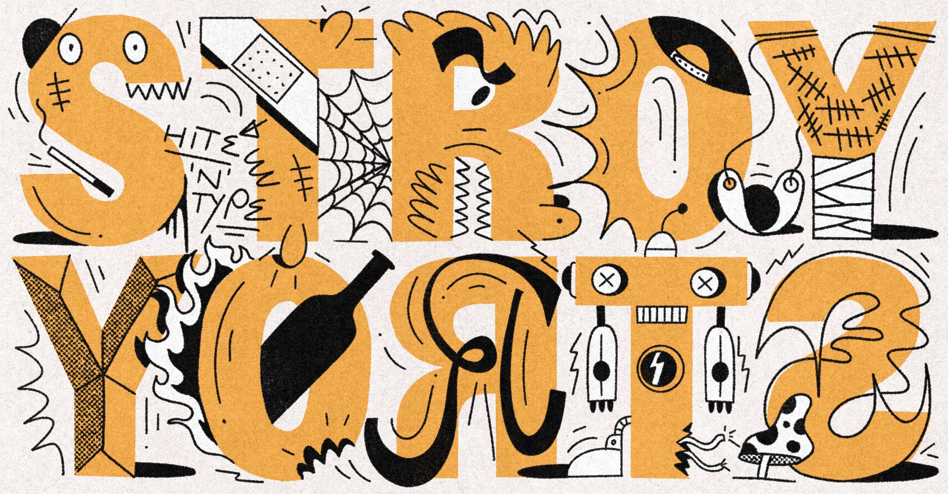
Stroy Grotesk
12 Styles
€70.00 Single style
/ €840.00 Complete
FONTS
Concept
LOADING
Stroy Grotesk Thin
Stroy Grotesk Thin Italic
Stroy Grotesk Light
Stroy Grotesk Light Italic
Stroy Grotesk Regular
Stroy Grotesk Regular Italic
Stroy Grotesk Medium
Stroy Grotesk Medium Italic
Stroy Grotesk Bold
Stroy Grotesk Bold Italic
Stroy Grotesk Black
Stroy Grotesk Black Italic
Buy Stroy Grotesk
Packages
Stroy Grotesk complete family
30% OFF
€840.00
€588.00
Add to Cart
Added
Single styles
Stroy Grotesk Thin
€70.00
Add to Cart
Added
Stroy Grotesk Thin Italic
€70.00
Add to Cart
Added
Stroy Grotesk Light
€70.00
Add to Cart
Added
Stroy Grotesk Light Italic
€70.00
Add to Cart
Added
Stroy Grotesk Regular
€70.00
Add to Cart
Added
Stroy Grotesk Regular Italic
€70.00
Add to Cart
Added
Stroy Grotesk Medium
€70.00
Add to Cart
Added
Stroy Grotesk Medium Italic
€70.00
Add to Cart
Added
Stroy Grotesk Bold
€70.00
Add to Cart
Added
Stroy Grotesk Bold Italic
€70.00
Add to Cart
Added
Stroy Grotesk Black
€70.00
Add to Cart
Added
Stroy Grotesk Black Italic
€70.00
Add to Cart
Added
Cijena ne uključuje PDV.
Prices shown without VAT.