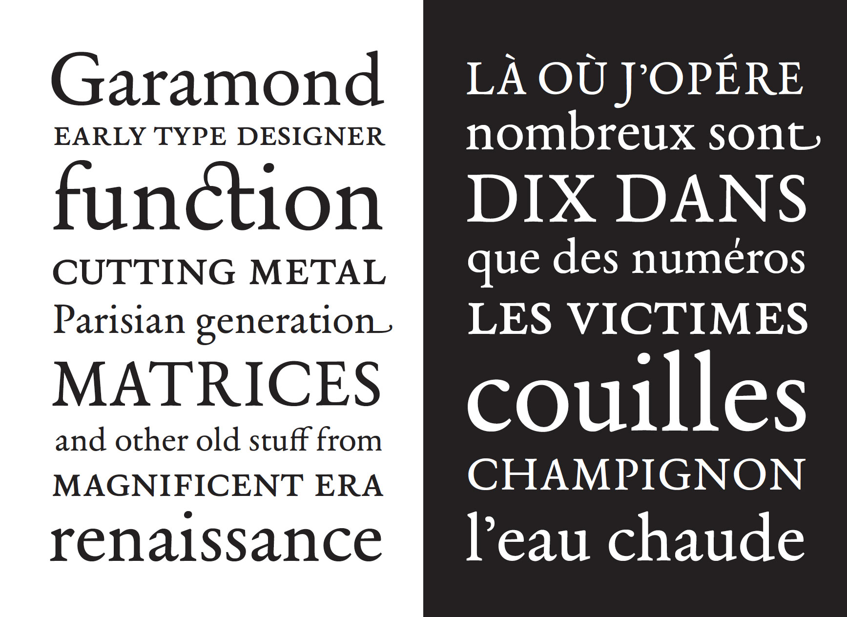
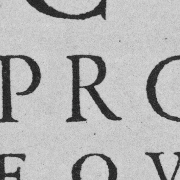
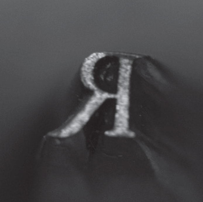
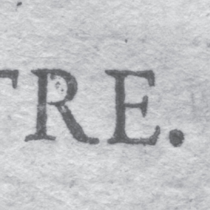
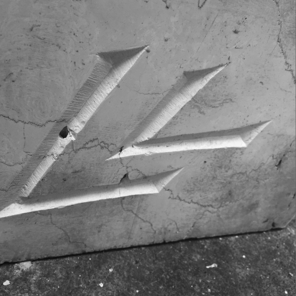
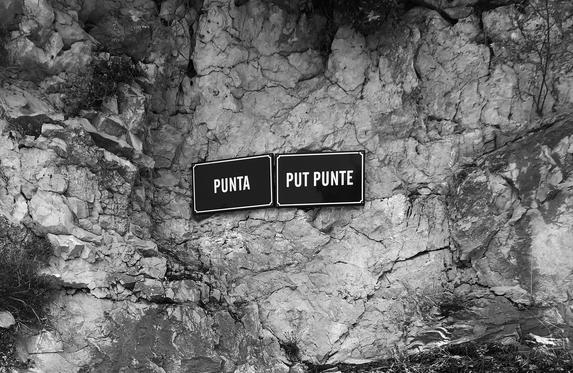
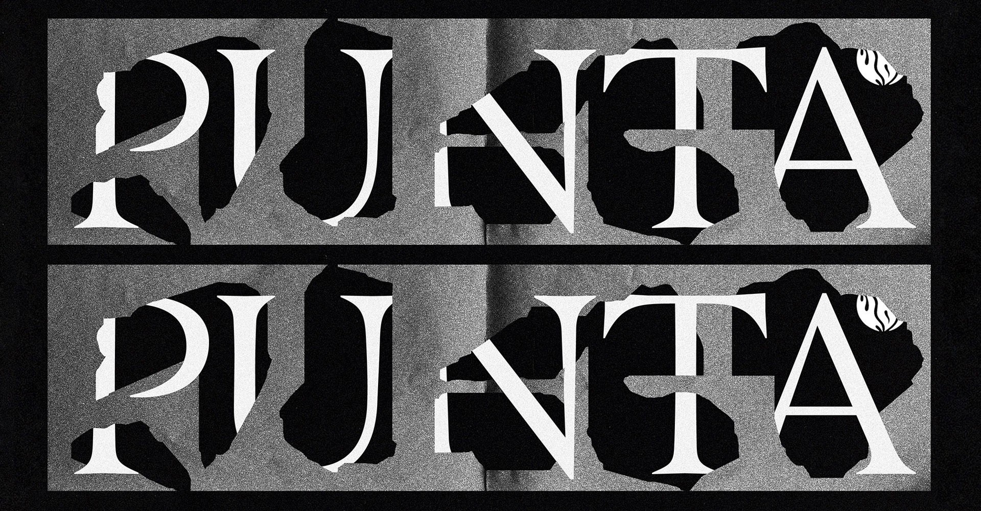
Contemporary high contrast serif family characterized by extremely sharp & pointy details. The type family ranges from Light to Black with corresponding italics. A unique texture, large lowercase proportions, and compact spacing make this inviting typeface perform well in titles, headlines, or shorter paragraphs of text in bigger sizes.
10 Styles
€70.00 Single style
/ €700.00 Complete
FONTS
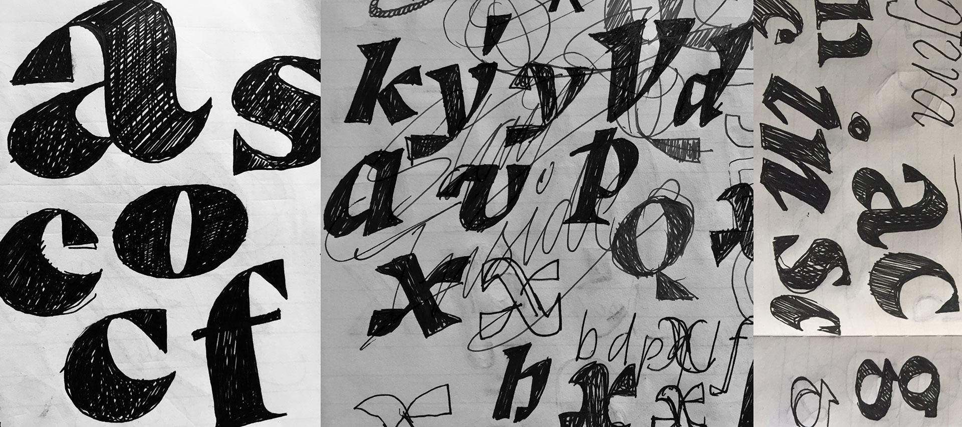
Concept
LOADING
Punta Light
Punta Light Italic
Punta Regular
Punta Italic
Punta Medium
Punta Medium Italic
Punta Bold
Punta Bold Italic
Punta Black
Punta Black Italic
Buy Punta
Packages
Punta complete family
30% OFF
€700.00
€490.00
Add to Cart
Added
Single styles
Punta Light
€70.00
Add to Cart
Added
Punta Light Italic
€70.00
Add to Cart
Added
Punta Regular
€70.00
Add to Cart
Added
Punta Regular Italic
€70.00
Add to Cart
Added
Punta Medium
€70.00
Add to Cart
Added
Punta Medium Italic
€70.00
Add to Cart
Added
Punta Bold
€70.00
Add to Cart
Added
Punta Bold Italic
€70.00
Add to Cart
Added
Punta Black
€70.00
Add to Cart
Added
Punta Black Italic
€70.00
Add to Cart
Added
Cijena ne uključuje PDV.
Prices shown without VAT.