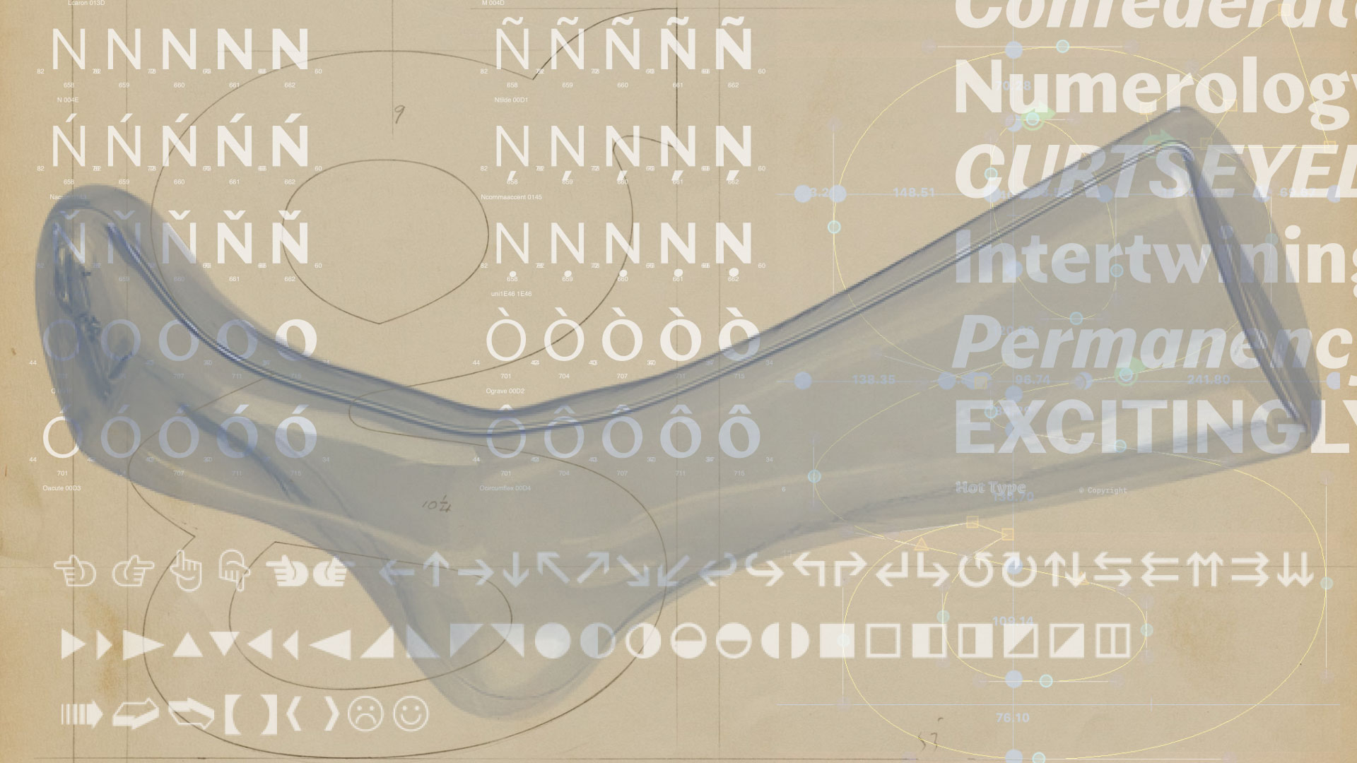
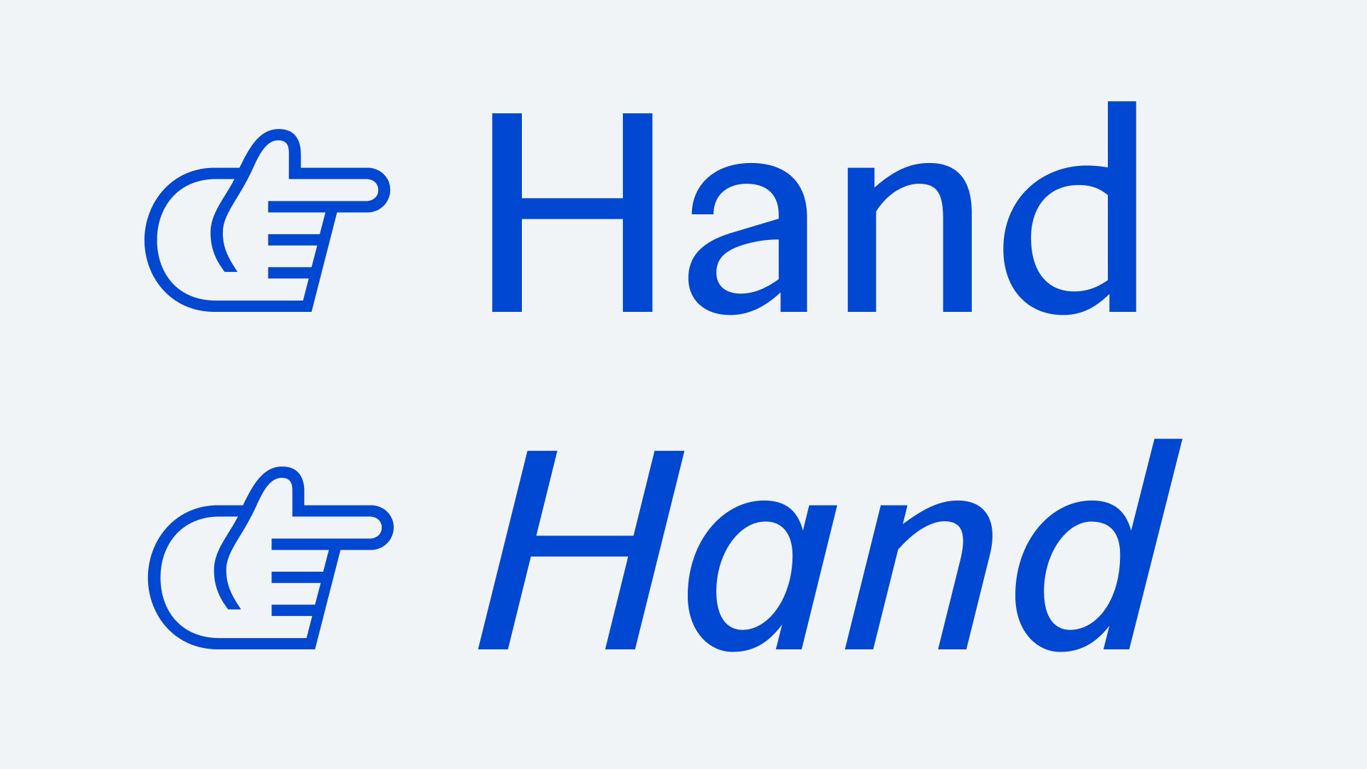
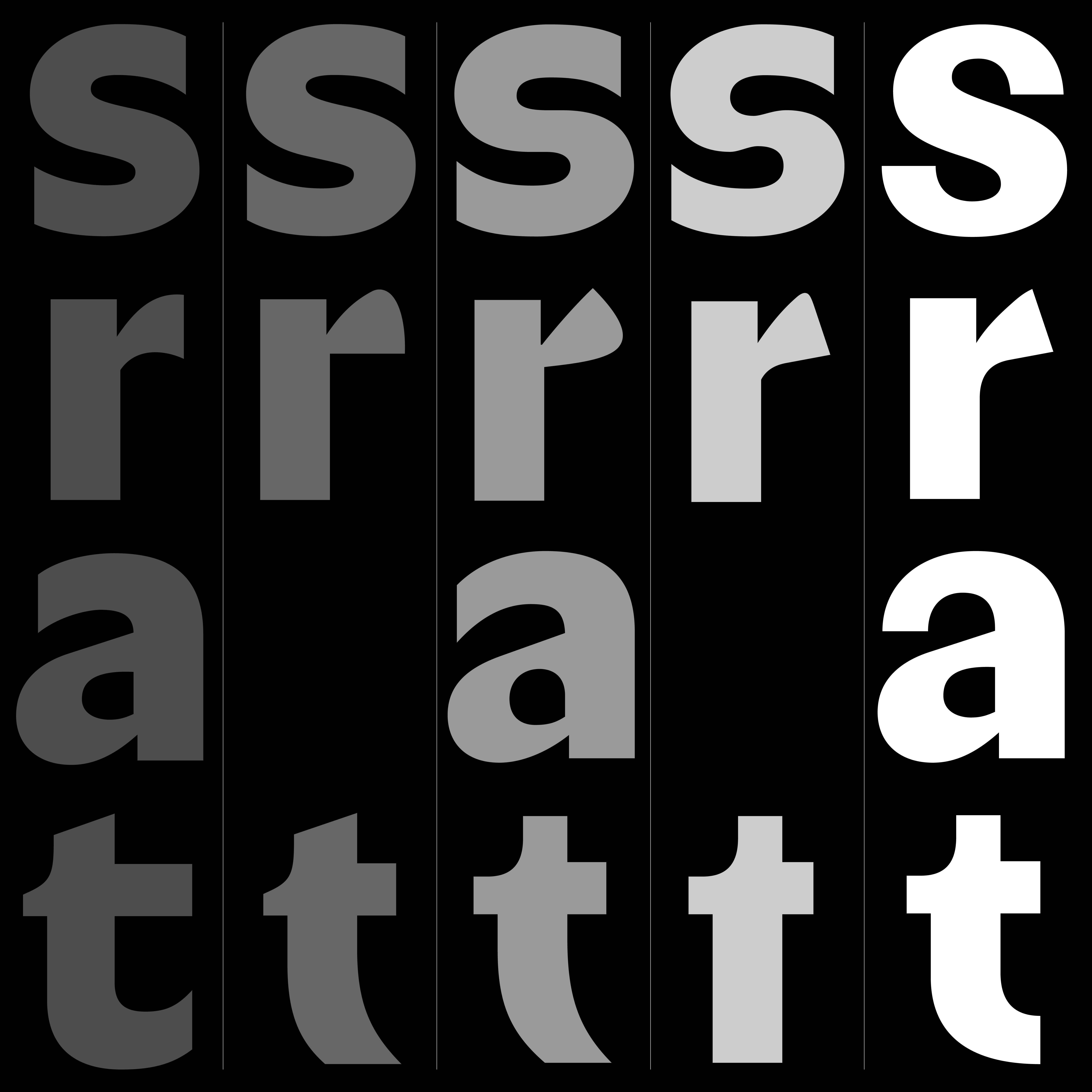
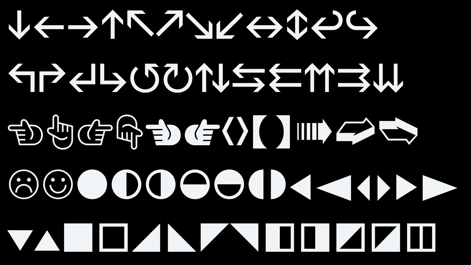
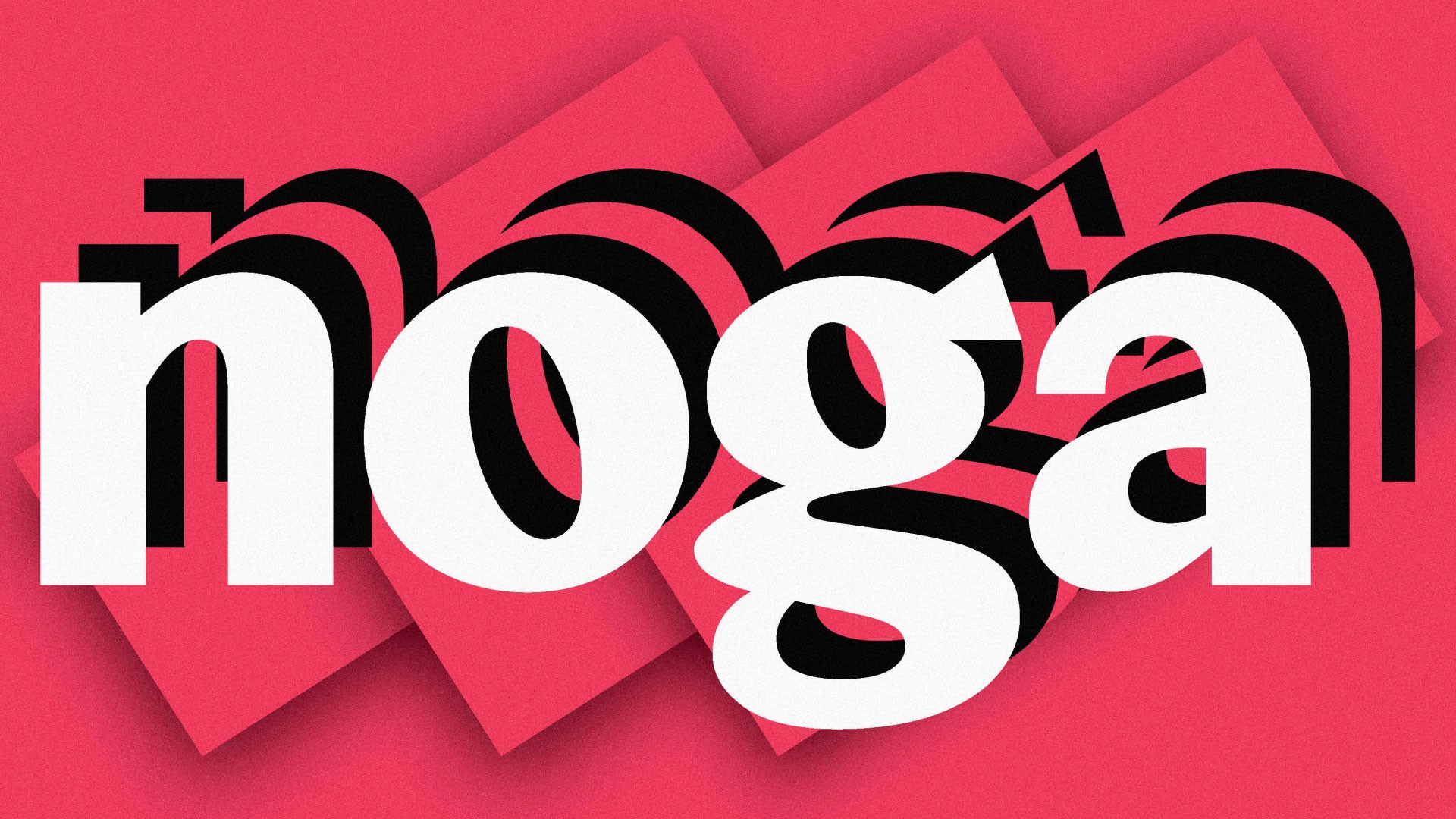
Noga is a geometric-humanist typeface family that’s all about taking unexpected turns when it comes to contrast flow. Letters are shaped by common sense and sensibility for the adequacy of things. It is an attempt at forging a contemporary typeface that has a recognizable and formidable personality in bigger sizes — while its energetic stroke modulation maintains a distinguished form amidst longer texts.
Noga
10 Styles
€70.00 Single style
/ €700.00 Complete
FONTS
Concept
LOADING
Noga Light
Noga Light Italic
Noga Regular
Noga Regular Italic
Noga Medium
Noga Medium Italic
Noga Bold
Noga Bold Italic
Noga Black
Noga Black Italic
Buy Noga
Packages
Noga complete family
50% OFF
€700.00
€350.00
Add to Cart
Added
Single styles
Noga Light
€70.00
Add to Cart
Added
Noga Light Italic
€70.00
Add to Cart
Added
Noga Regular
€70.00
Add to Cart
Added
Noga Regular Italic
€70.00
Add to Cart
Added
Noga Medium
€70.00
Add to Cart
Added
Noga Medium Italic
€70.00
Add to Cart
Added
Noga Bold
€70.00
Add to Cart
Added
Noga Bold Italic
€70.00
Add to Cart
Added
Noga Black
€70.00
Add to Cart
Added
Noga Black Italic
€70.00
Add to Cart
Added
Cijena ne uključuje PDV.
Prices shown without VAT.