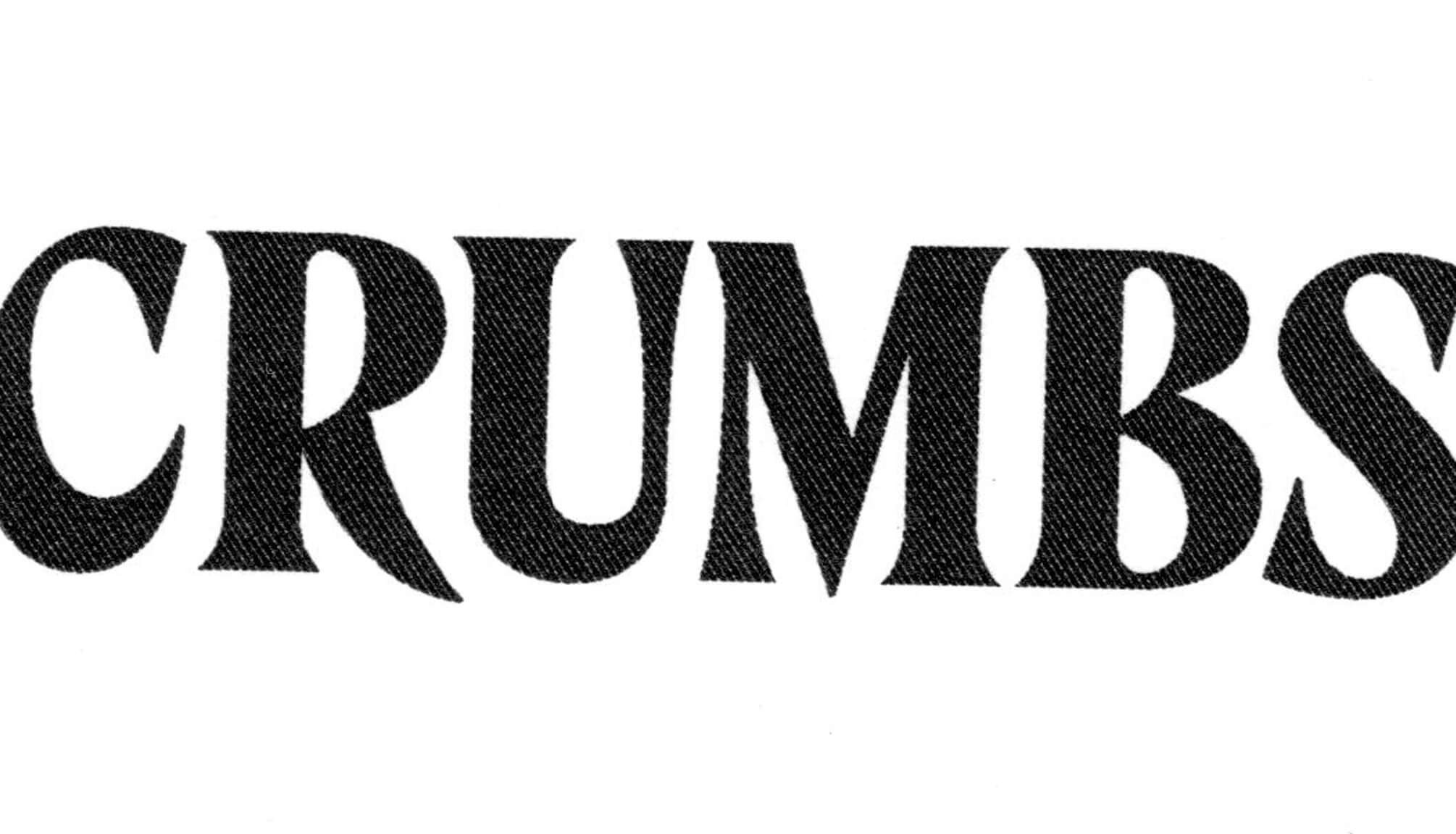
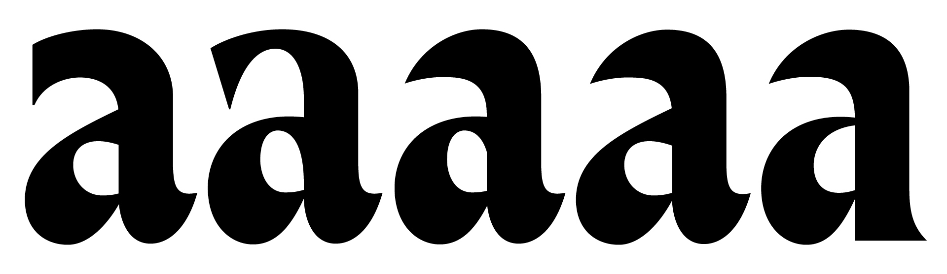
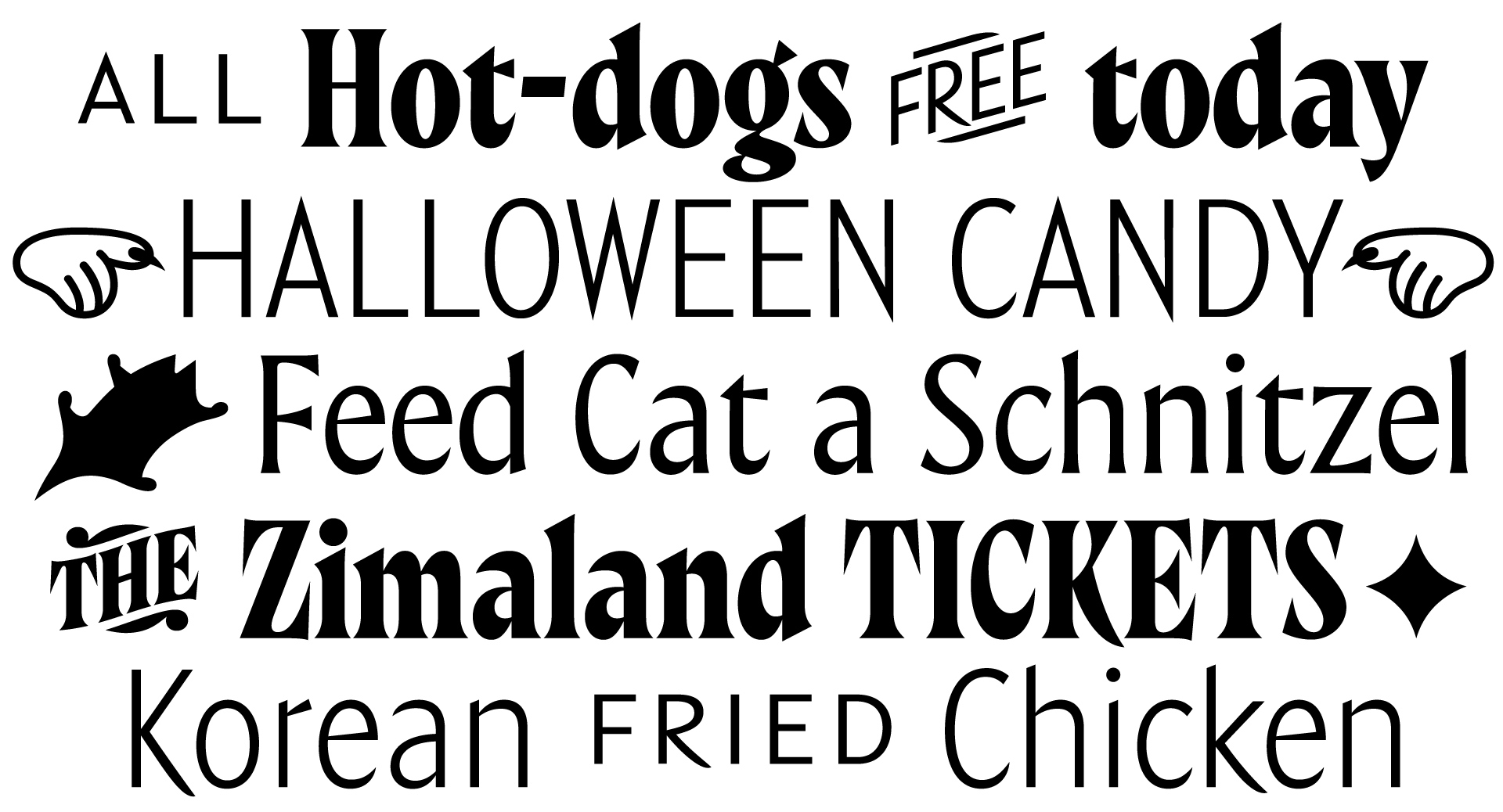
A dash of nostalgia, plenty of nowness. Crumbs is a semi-condensed variable Sans-to-Serif design concept, with intermediate Semi style. Along with weight, Crumbs grows serifs too. Palpable theme for shape design is sharpness countered by tense curvature. Aimed at bigger sizes, it’s proportions and details work together to create memorable headlines and shorter paragraphs of text.
Crumbs
3 Styles
€70.00 Single style

FONTS
Concept
LOADING
Crumbs Sans
Crumbs Semi
Crumbs Serif
Buy Crumbs
Packages
Crumbs Variable Font
30% OFF
€210.00
€147.00
Add to Cart
Added
Single styles
Crumbs Sans
€70.00
Add to Cart
Added
Crumbs Semi
€70.00
Add to Cart
Added
Crumbs Serif
€70.00
Add to Cart
Added
Cijena ne uključuje PDV.
Prices shown without VAT.